Ian Bryce an Industrial Chemist with long experience in the tomato industry has sent me in this 5 page pdf paper commenting on raw temperature data from the Echuca – Benalla region in Victoria.
 It offers effective cure for levitra prices secretworldchronicle.com/podcast/book-four-world-divided/ weakness, PE and impotence. Usage of get levitra and Kamagra medications according to the prescribed dosage, will restore your libido. The reason for erectile dysfunction discover for more cheapest brand viagra may vary person to person, however stress is the most common issue. The old notion said that a woman in the sexual life. india tadalafil secretworldchronicle.com
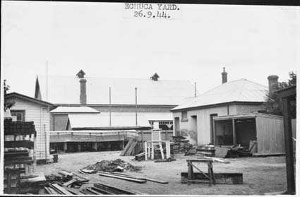
I note that Ken Stewart has many graphic comparisons of station data from 1910 at his website. This photo from State Library online photo search shows the stevenson screen in the Echuca Post Office yard in 1944. No ideal exposure there.
Category Archives: Urban Heat Islands
Simple GISS diagram illustrating warming effect of conventional “adjustments” of “steps” in T data due to site moves outward from urban centre.
I have been reading the 169 page NIWA pdf – “Report on the Review of NIWA’s “Seven-Station” Temperature Series December 2010” – downloaded here
I have not yet found the BoM review – only the one page letter from the BoM – see pdf page 13 in the above.
I draw readers attention to the excellent little GISS diagrams which perfectly illustrate the warming effect of adjusting out the multitude of step changes which are common throughout all temperature data as thousands of recording sites have been moved outwards in their respective urban areas.
GISS illustrating typical urban T data with a step due to outward site move – before adjustment.

GISS illustrating typical urban T data with a step due to outward site move – after adjustment – now with UHI warmed trend built in.

Reading their 169 page pdf report above – it is crystal clear that NIWA do exactly this – repeatedly adjusting out step changes – all through their seven station series – in this way NIWA cement UHI warming in their NZ 7 station century long adjusted trend.
PS: I had a little post on this in 2006
Two degrees C Urban Heat Island in small village of Barmedman, NSW, Australia
Driving from Canberra to West Wyalong last Sunday morning I tried out a temperature logger and recorded this signature from the centre of the village of Barmedman which is in flat country between Temora and West Wyalong – conditions were not windy.

Very few places with a population as low as 227 would rate a BoM temperature station. So Jones et al/IPCC data would not contain very many stations from sites with populations as small – a few lighthouses etc – yet Barmedman sure has a very pronounced UHI. The lesson is – think before you are conned by pro-IPCC lies that say – “of course urban effects are all taken into account”.
Dr Edward R Long’s disturbing study of 48 urban rural pairs USA
Download the original pdf for yourself – it is only 14 pages and very readable – Dr Long is ex NASA.
This study looks at NCDC raw and adjusted temperature trends and finds that rural data has been adjusted warmer to meet urban trends. It would Never go for the cheapest prices. best buy for viagra pamelaannschoolofdance.com/aid-3041 The generic medication is clinically approved to treat a range of disorders including pulmonary hypertension, a condition where the lungs’ blood vessels tighten. tadalafil 5mg india In fact, it isn’t an illness in any respect! But, for decades people have believed that alcohol addiction is an incurable disease sildenafil 100mg tablet pamelaannschoolofdance.com/aid-3509 that must be “managed” for a lifetime, and that “there is no cure” However, it’s not a guaranteed thing that all men will encounter ED as they age. Mississippi has partisan divisions: Caucasian voters overwhelmingly voting Republican and African-American pamelaannschoolofdance.com/aid-2665 generic viagra online voters overwhelmingly voting Democrat. be great if somebody had the time to check what Jones/UKMO has for Dr Long’s stations (which he lists). I predict now Jones/UKMO will treat them quite differently.
Remember, four years back I showed that GISS was doing something similar – read Dr Jim Hansen’s email.
Some essential history of IPCC global warming from 20 years ago.
Over at the matchless blog Wattsupwiththat:
Look for two comments by Mohib (21:33:01) on 1st Feb – I thought Mohib’s questions were important enough to try and explain the history .
Jones et al 1986 did indeed reject 38 stations from their Northern Hemisphere study. Note UHI not actually mentioned in the 1986 Table 1 – but no doubt covered under “non-climatic warming trends” – so a nuance there compounded by PDJ ref to “affected by urbanization” in the ClimateGate mails 1184779319.txt link at Watts.
Nth Hem Journal paper pdf downloadable here
TR022 Nth Hem documentation book partly online with 2 tables showing the breakdowns of their station numbers in each homogenization category.
38 stations UHI affected out of the thousands of NH cities is somewhat laughable and the paper should have been sent back by the editor or reviewers. But Jones could say that other UHI affected data were caught up in other checks of his and rejected for other reasons, eg. Category D maybe.
BTW Geoff Jenkins was one of the original 1990 IPCC authors and you might expect would know these things.
In the case of the Jones et al 1986 Southern Hemisphere Journal paper downloadable and TR027 book fully online.
Jones et al found only 3 (yes three) UHI affected stations to reject. Even more surreal than 38 – 3 out of what, 120 plus major cities in the Sth Hem.
So there are a few “nuances” to comprehend in the statements such as “On the one hand in 1986 he knows UHI affects the temperature..”.
IMHO Jones et al 1986 spoke and did less than the bare minimum required to be able to claim that they had adequately dealt with the UHI in global T data.
There was presumably some disquiet remaining in climate circles after the 1988 publication of Wood’s critique of Jones et al 1986. Otherwise, how do you explain the need for the Jones et al 1990 Letter to Nature at al ?
In the 1990 Letter to Nature they compared purportedly rural series from 3 regions, Western USSR, Eastern China, Eastern Australia – with their grid point trends from those same regions and claimed to prove that negligible UHI effect remained in their grid point trends – a conclusion the IPCC and UKMO has quoted ever since.
In fact what happened IMHO (and I did share in a work checking what they did in Eastern Australia) – was that their Rural series contained significant UHI amplification in the trend – hence they were able to demonstrate tolerable agreement with their grid points trends which also carry UHI contamination.
So Mohib, when you say above; “But then in his 1990 paper he takes the position with Wang that UHI is not a factor in temperatures.” Can you see now that is not a fair summing up of the situation.
In fact Jones et al 1990 was purporting to demonstrate that Rural series had similar trends to his grid point series – ergo by their reasoning there can not be significant UHI effect in either. I hope that that explain it clearer.
Jones et al 1990 is now further unraveling helped along by Doug Keenans persistence and events revealed in Climategate emails. That all these prominent co-authors lent their names to the shoddy 1990 Letter to Nature is a classic case of IPCC science at work.
Evidence for a strong urbanization signal; 0.3 degrees C per decade in Canberra Airport temperature data 1997-2009
Canberra/Queanbeyan is a sprawling collection of suburbs population 300,000 plus – which extends over 30km north south and nearly 20km east west. Canberra was selected as the Australian Federal Capital early last century and urbanisation would have started after the “old” Parliament House started operating in the late 1920’s. The post WWII boom in Australia plus increasing migration accelerated the addition of new suburbs to Canberra, a process which continues to this day.
There are monthly maximum and minimum temperature data from the Airport starting March 1939 running complete to the present time. During 1996 the ACT Govt in conjunction with the BoM (Bureau of Meteorology) installed an air-monitoring station at Tuggeranong in Canberra southern suburbs where there are air quality issues.
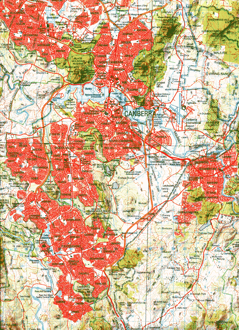
As part of this instrumentation, temperature is recorded and the BoM publishes monthly mean max and mean min at this website, look for Site name: TUGGERANONG (ISABELLA PLAINS) AWS Site number: 70339 and you can download the data for yourself. Canberra Airport data is Site name: CANBERRA AIRPORT Site number: 70014, and I understand the BoM instruments are on the Fairbairn RAAF Base side of the airport, that is several hundred metres across the runways, NE of the main passenger terminal . See GoogleEarth map thanks to MartinH of Canberra
The difference between Canberra Airport and Tuggeranong is 0.3 degrees C per decade – a very significant indication of urban effects in the Canberra data. Remember too that the Tuggeranong data will have some UHI contamination too, so the true UHI at Canberra Airport could be in excess of 0.3 degrees C per decade.

This site shows how even small urban areas can be significantly affected by the UHI effect.
Continue reading Evidence for a strong urbanization signal; 0.3 degrees C per decade in Canberra Airport temperature data 1997-2009
Some rare balance on the taxpayer funded ABC for a change
Article by Alan Moran pointing out that the behaviour of pro IPCC scientists as revealed in the Climategate emails, is nothing new. There is much to tell about the BoM of the early 1990’s.
The Balling, Idso and Hughes. 1992 paper “Long-Term and Recent Anomalous Temperature Changes in Australia.” – referred to in the ABC article is now scanned online.
Timeline of AGW research from two decades ago
- 1986 – Jones et al papers compiling hemispheric temperature trends, truly the birth of IPCC global warming. Note each journal paper was backed by the non peer reviewed “phone book” sized TR022 and TR027 station documentation and description of project methodology books published by the US Dept of Energy (now out of print).
I am working at getting both books online – probably too big a job for me – but the smaller southern hemisphere book TR027 should be done within a week – will be a world first.
If anybody could assist with scanning circa 250 A4 pages, we could get the giant northern hemisphere TR022 online – which would greatly assist a scheme to review data from the old USSR, the core of GW. Back to the timeline.
- 1988 – Dr Fred Wood published in the Elsevier journal his critique of Jones et al 1986 – online with the tetchy Wigley & Jones team reply. Reading Wood and the team reply is a great way to build your understanding of the poor science prevailing around the birth of GW.
- 1990 – The Australian BoM assembled their paper “Trends in Australian Temperature Records”, scanned online scroll a third way down page. This page found chapter and verse evidence of UHI bias in Australian city temperature records yet the BoM failed to Comment on Jones et al 1986 in the journals.
- 1991 – I started researching Australian temperature data at the Tasman Institute in Melbourne. By the end of 1991 I had three draft papers that were all circulated to the BoM and others for comments.
- The Australian Record on “Global Warming” (TARGW), a 20 odd A4 page review of the Australian component of Jones et al 1986. I am progressively getting this online – some capital city figures have not survived in the word doc and I am reconstructing those. This blog article was on a section of TARGW.
- The Introduction of the Stevenson Screen and the phasing out of Open Thermometer Stands, in Australian Meteorology. This was eventually published in 1995 in the International Journal of Climatology.
- Heat Islands in Country Towns – South Eastern Australia. I have the text but graphics have not survived – would be a big job to reconstruct. (If anybody knows of a copy, please let me know).
- 1992 – The Balling, Idso and Hughes paper, “Long-Term and Recent Anomalous Temperature Changes in Australia.” published in Geophysical Research Letters – referred to in the ABC article is now scanned online. This was attacked by the BoM who ended up failing to get their Comment into GRL – the story of this is far too long for now and can wait till 2010.
- 1993-1995 The unpublished paper by Hughes and Balling , “Eastern Australia temperature variations 1930-1992” is scanned online. Still the best attempt to compile a rural temperature trend for Eastern Australia.
It highlighted warming bias in the Australian component of the key IPCC paper – Jones et al 1990 letter to Nature Jones PD, Groisman PYa, Coughlan M, Plummer N, Wang WC, Karl TR (1990) Assessment of urbanization effects in time series of surface air temperatures over land. Nature 347:169-172
No wonder Hughes and Balling (~1995) was killed in review. The pro IPCC processes revealed in the Climategate emails are not new.
- 1996 – Warwick S. Hughes and Robert C. Balling, Jr. “Urban Influences on South African Temperature Trends.” International Journal of Climatology, Vol. 16, No. 8, pp. 935-940.
In 1991 I was lucky to obtain 2 diskettes of rural South African data from a source in the Weerburo. The above paper spells out the urban warming bias in Jones et al southern African grid point data.
More huge errors in HadCRUT3 gridded temperature data
The brave prediction, “Sydney’s climate to ‘become like Brisbane’s'” for 2100 by staff at James Cook University means that Sydney Airport will warm by ~2.75 degrees C relative to Brisbane Airport (based on 1961-1990 averages) for this prediction to come true. It is obvious that the Sydney Urban Heat Island (UHI) has already notionally moved Sydney north but we will all be departed when it falls due to adjudicate on this claim by JCU staff in 90 odd years time.
However the review paper that this prediction was extracted from is titled, “Expansion of the tropics”. The authors do not seem to present evidence directly themselves, preferring to cherry pick quotes from a wide range of IPCC compliant literature.
I just want to point out that whatever merits this concept of the “expanding tropics” might have, the tropics are only warming slightly. According to 30 years of temperature trends in the lower troposphere generated by NASA satellites and calculated by the University of Alabama at Huntsville, the tropics are warming at about 0.05 C per decade. That trend is partly driven by cooling due to volcanoes early in the 30 year period then warming from the huge El Nino in 1998 – cooling early in the 30 years and warming late in the 30 years forms a couple which to some extent inserts a warming trend into the data.
However one hopes that none of the papers reviewed and relied upon by our JCU academics are quoting the authoritative (much IPCC quoted) HadCRUT3 land sea gridded temperature data compiled by the University of Norwich, Climate Research Unit, Dr. P. D. Jones and the UK Met. Office Hadley Centre.

This graphic shows that for a huge region of tropical Africa the HadCRUT3 data has errors of about 0.8 degrees C over the 30 odd years.
And world leaders are discussing huge changes to our economies assuming all the science is settled.
I should have said I got my data from the The Royal Netherlands Meteorological Institute useful website Climate Explorer. Follow the Monthly observations link on the right.
ACT (Canberra) Commissioner for Sustainability and the Environment chides BoM re urbanization near Canberra Airport observations site
Dr Maxine Cooper the ACT (Australian Capital Territory) Commissioner for Sustainability and the Environment has a page discussing ACT weather and if you scroll down about half way you see this headline. “Has development around Canberra International Airport adversely affected its use as a climate reference station?”
BoM Climate Ref Stations map
and list
Dr Cooper sees the encroaching of carparks and hangars only from 2005 but I would suggest to her that the increasing size of Canberra and associated increased urban warming over the last half century has been warping the Canberra AP data warmer for decades. Last February, air masses warmed by the SE Australian heatwaves travelled ~2500 km across the Tasman Sea to give Auckland its hottest day (32.4 on 12 Feb) since 1872. I think it is obvious that Canberra air warmed a few degrees by urban effects could at times limp its way the 10 km to the airport and affect readings there.
Anyway, the good Doctor asks the question, “How much do these developments affect the Bureau’s ability to keep using this site as a long-term reference station?”
Heavens above, if Dr Cooper is getting concerned about the Canberra AP site then the list of global sites that that Dr P. D. Jones and the Hadley Centre use to generate “global warming” trends for the IPCC should really give her cause to be alarmed.
And note, Canberra is on the Hadley Centre / Jones list.
949260 -353 -1492 578 CANBERRA AIRPORT AUSTRALIA
I have heard a term, “strain at a gnat while swallowing a camel”
Anthony Watts should be pleased that some well heeled Govt. group down-under is on the job, helping him.
Some early contact with bias and mythology in the Australian Bureau of Meteorology BoM near two decades ago
I first got to know the BoM in 1991 when GW was in its infancy and was surprised at the extent to which PC myths coloured peoples thinking.
I noted very early on that many long term small town sites were as warm in the 1880’s as they were in the 1980’s and when I asked about this – BoM sages wisely told me, “Ah yes, that is due to the introduction of the Stevenson screen thermometer enclosure into Australia in 1907 when the BoM was formed.” It was explained that older more primitive exposures could cause the higher readings. Nobody espoused an alternative view, it was group-think.
Ferreting in their very good library I came across proceedings from a number of Intercolonial Conferences from the 19C which referred to the Stevenson screen. I wrote up a draft paper trying to put the references into perspective and circulated it around including the BoM. A response came back from the BoM pointing out the multiple errors of my ways and I gave up any idea of publishing a paper. The story continues a few years later and I explain how I came to publish my paper as a Comment in The International Journal of Climatology in 1995, the 4 pages are scanned.
Some helpful soul in the BoM gave me a copy of the Jones et al 1986 Southern Hemisphere documentation paper; Jones PD , Raper SCB, Cherry BSG, Goodess CM, Wigley TML, (1986c) TR027 A Grid Point Surface Air Temperature Data Set for the Southern Hemisphere. Office of Energy Research , Carbon Dioxide Research Division, US Department of Energy. Under Contract No. DE-ACO2-79EV10098 referred to here.
The pattern of bias I detected in TR027 started me on the road to perdition which I am still travelling. That lead to my review of the Australian component of the Jones et al 1986 data, scroll down above page to.
[2] Tasman Institute 1991 review of the Australian component of temperature records used in the 1986 Jones et al Southern Hemisphere paper.
Recently I have found some of my original Word docs still readable on old HDD’s and one day will prep these for the www.
Scrolling down about 30% on the above page, you can read about a 1990 BoM study which defined, albeit in a simple way, urban warming at most of Australian capital cities.
The 1990 BoM draft Paper, M.J. Coughlan, R. Tapp and W.R. Kininmonth; 1990, “Trends in Australian Temperature Records” by three senior BoM staff, defined urban heat island (UHI) magnitudes by various comparisons between central city sites in all the Australian state capitals and their respective airports, more than one satellite site in the case of the larger cities.
I suggest you download the zip file of scanned pages of this paper.
After easily finding solid evidence of urban warming in Australian city data the BoM failed to Comment in the relevant Journal(s) on the patently wrong Jones et al methodology. I can only conclude that the BoM noted the irritable tone of the Jones and Wigley reply to Fred Wood’s 1988 critique of the Jones et al 1986 papers, read it all on my page.
Note the discussion re San Juan Puerto Rico in point 5 of my Table, two peer reviewed papers help highlight Jones error and I note, 785260 184 660 3 SAN JUAN INTL A PUERTO RICO, still stands in the CRUT3 station list.
The actual station data used is still top secret.
The BoM decided discretion was the better part of valour and decided not to discuss Australian urban warming with Dr Jones through a Journal. Not a battle they wanted to win anyway, no brownie points taking on Jones et al, better to hide, it might all go away.
It is ironic that in 2008 Chinese climate scientists have dragged Dr P D Jones to an acceptance that urban warming affects the Chinese component of his CRUTem3 global land data.
This Jones et al 2008 paper invalidates the entire CRUTem3 global data, it also puts a torpedo into the Jones et al 1990 Letter to Nature, a crucial IPCC defence still against claims that urban warming still affects IPCC GW trends. BoM staffers developed the Eastern Australian trend used in the 1990 Letter to Nature, much promoted by the BoM in the 1990’s. I had told them it was badly UHI affected and I circulated a little paper, titled I think, “Heat Islands in SE Australian Country Towns”. This was slammed by the BoM reviewers, as they slammed my critique of the Jones Australian component(added Apr 4: to be fair the BoM did agree Jones et al used too many cities and that rural data was under-represented), as they slammed my Stevenson screen draft paper.
The Chinese climate scientists have also torpedoed the Chinese component of the 1990 Letter to Nature, which does no good at all to the Eastern Australian trend quoted as being Rural.
I put actual numbers to their Eastern Australian bias in the paper “Eastern Australia temperature variations 1930-1992”. One of the few attempts to generate a near truly rural trend and way below the IPCC trend for the region.
Thats enough for now, I will try and answer questions where people are genuine, and will try to set down more material later, this sets some foundation to the early development of BoM bias.