A Tale of Two Sydeys
[Apologies to Charles Dickens and Juan Antonio
Samaranch...]
The treatment of the temperature record of Sydney, Australia in Jones 1994 displays major methodological flaws and disproves the widely held view that moving a station to an airport somehow eliminates or compensates for an artificial urban warming signal.
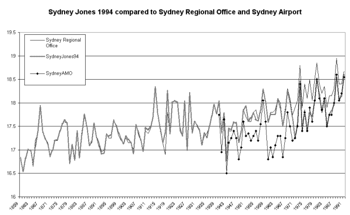
Careful examination of the graph below shows exactly what Jones did. For the years 1859 to 1970, his record for Sydney closely tracks the official Bureau of Meteorology (BoM) record for Sydney Regional Office. But starting with 1971, the Jones data flips over to the Sydney Airport (AMO) record, which as the graph shows, started in 1940.
The 1971 switch to the airport introduces a large cooling step into the Jones data, which is obvious on the graph below. There is nothing in the CRU1991 documentation to suggest that their Sydney data is in fact a composite.
Despite this large, non-climatic cooling discontinuity, Jones’ Sydney data still warms by 0.95 degrees over the 130 years to 1990. If Jones had stuck with the Sydney Regional Office record, the warming would have been 1.3 degrees.
There are inhomogeneities between Sydney Airport and Regional Office prior to 1971 but these do not concern us here. We are interested in the point that from 1971 onward the Jones 1994 data suddenly switches from Sydney Regional Office to the airport.
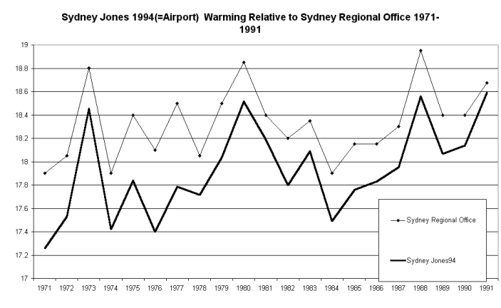
Taking this examination further, let us now compare the city and airport data from the year of the switch, 1971, until the end of my Jones data in 1991. In the graph below we find that Jones’ record, based on the airport, warmed by 0.65 degrees in these two decades, i.e. more than the claimed global warming of 0.6 degrees during the whole of the 20th century! Over the same period, Sydney Regional Office crept up a further 0.3 degrees.
After 1991, Sydney Airport continued to expand rapidly in the run-up to the Olympics. At the time of writing in 2000, temperatures at the airport have warmed so much they have just overtaken those at Regional Office.
Discussion
Many questions are raised by the strange data substitution uncovered in this review, and it is unlikely that we will ever know the whole story. A few quick points:
* Both Sydney Regional Office and Sydney Airport are located in a large city and are subject to a substantial urban heat island effects. Neither station was at all suitable for inclusion in a composite that purports to measure “global warming”.
* If Jones et al. nevertheless felt they had to use data from the two Sydney's, they should have included them as two separate stations. The fact that the discontinuity in the composite record was not noticed and checked out demonstrates inadequate internal processes in the CRU/Jones work.
* The glaring problems exposed here show how a slack standard of refereeing is inevitable with huge databases such as the CRU 1991 and Jones 1994 global compilations.
* The CRU 1991 documentation explains that, because of a perceived step at 1912, they have adjusted pre-1912 data by +0.045 degrees. This creates a spurious -- indeed, almost comical -- impression that they are alive to the slightest nuance in the data. Compare this piffling correction with their overlooking a UHI warming 13 times as large from 1971 to 1991!
* In 1994 Dr Jones brought out a revised southern hemisphere temperature series. Despite that paper’s very small graphics it was clear that his new long-term trend for Australia agreed quite closely with that established by this writer in 1991 in a critique of the CRU Australian component that was circulated to the BoM and no doubt forwarded to Dr Jones.
* But whatever improvements CRU might have made by 1994, Australian policymakers attending the 1992 Rio Conference had been high on questionable global warming data of just the kind reviewed here. Australian taxpayers who can remember Mrs Ros (Whiteboard) Kelly’s antics at Rio might wonder why our BoM did not set her straight on CRU’s use of UHI-affected Australian temperature records.
* To go back even further, CRU’s initial data publications in 1985 - 1986 were key events at a time when global warming was becoming a political issue. The 1991 compilation was even more widely publicised. Why did the BoM, with its hundreds of highly qualified professional staff, not make a single "comment" to the journals concerned about the errors and non-climatic warming in Jones’ Sydney record? Why have they still not said anything about the inclusion to this day of the six Australian state capitals in data the CRU claims prove “global warming”?
How big is Sydney’s UHI effect?
In 1991 I was given a BoM draft of a 1990 unpublished paper
later sent to
the IPCC (scroll down under past reviews to [1] The 1990 BoM draft Paper,
M.J. Coughlan, R. Tapp and W.R. Kininmonth) - which examined
the UHI in our state capitals
using the (faulty) methodology of comparing city centre records
to airports. This study found a "mean annual heat
island" for Sydney for 1947, 1961 and 1981 (census years) of
about 1.4 degrees. For 1980, comparing Sydney Regional
Office to Sydney, Richmond and Nowra Airports the heat island
works out at 2.75 degrees.
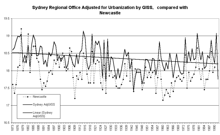
The heat island at Sydney Regional office has been around for a
long time. The GISS urban adjusted version of Sydney shown
in the graph below contains an urban adjustment of about 1.2
degrees relative to the start of the record in the 1860s.
The graph compares GISS adjusted version of Sydney with the record from Newcastle, a smaller city to the north. Readers may be amused to learn that our BoM climatemeisters believe Newcastle, like other coastal and rural SE Australian records, is faulty before 1907. Perhaps it is, but it is interesting to see that the GISS team’s urban adjustment brings Sydney’s trend into almost perfect alignment with Newcastle’s.
You guessed it, they are both cooling over 100-plus years!
You read it first here
© Warwick Hughes, 2000-2001
Posted 8, June 2000, re written 23, June, 2001
globalwarming-news.com