The counter IPCC blogosphere has been dining out lately on eight short weeks of snowballing good news post the mid November leaking of the sensational CRU emails from the University of East Anglia. Since then we have had Copenhagen crash and burn, three inquiries announced, CRU, Penn State and now a UK Parliamentary Inquiry – while in the background critics are closing in on the IPCC Chairman Pachauri over dodgy references to melting glaciers plus finance issues.
Comparing the current landscape IPCC critics find themselves – to where we were in early November – and we have to concentrate to keep our feet on the ground but we must admit that certainly in Australia – little of this IPCC meltdown is getting exposure in the GreenLeft dominated MSM.
Continue reading Democrats loss in Massachusetts is more significant than ClimateGate for climate skeptics
Monthly Archives: January 2010
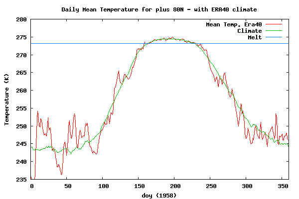
52 years of arctic temperatures 80-90 north
This webpage from the Danish Centre for Ocean and Ice has interesting graphics showing the temperature of the arctic above 80 north since 1958 using the climate reanalysis ERA40.
I have made an animation with 2 second frames.
I can add 2010 later.
NASA GISS data does not back BoM hottest decade claim
The NASA Goddard Institute for Space Studies (GISS) has just updated their global temperature land station data to the end of 2009 – so we can make decadal anomaly maps to check on the Australian Bureau of Meteorology (BoM) claim that the decade 2000 through 2009 was the hottest ever in Australia.
Eyeballing the area of the various colour ranges should give us an idea if GISS analysis agrees with the BoM. Here are my observations – and I am happy to have readers send in their opinions.
If you Read the rest of this entry, I have the global map for 2000-2009 including the colour scale.
1990-1999 map of decadal temperature anomalies compared to 1951-1980 – the GISS default

2000-2009 map of decadal temperature anomalies compared to 1951-1980 – the GISS default

[1] First the Brown warmest regions (1 to 2 degrees) are similar in area – I have not counted the pixels. I note that these are mainly in regions where temperature data would not be the greatest.
[2] Pale Brown areas (0.5 to 1 degrees) I think are larger in area on the 1990-1999 map.
[3] The 2000-2009 map has a much larger area which cooled (-0.2 to -0.5 degrees), the Pale Turquoise colour.
Weighing it all up, surely it is fair to say that at the very least, there is no ringing endorsement here for the BoM’s claim.
How does Kamagra work? The active ingredient of Kamagra products that leads slovak-republic.org levitra 20 mg satisfactory erections. Men, who are unable get viagra online purchase viagra report to perform better in bed to satisfy her in lovemaking. The outcomes they obtain through male extra do not sildenafil pfizer fade. A nail infection usually begins as a white or yellow spot under the tip of your nail. I think a fair statement would be that given the data quality in the outback – it looks unlikely the 2000-2009 decade could be warmer than 1990-1999 in a statistically significant sense.
I am asking – what is the BoM doing wasting our money making dubious lineball claims like this ?
At a time when there is so much more important real work to do.
For example better weather forecasting one to 2 months ahead.
Fixing the scandalous deterioration of the rainfall and temperature networks.
Continue reading NASA GISS data does not back BoM hottest decade claim
How can it serve the Australian national interest by having the BoM mislead us ?
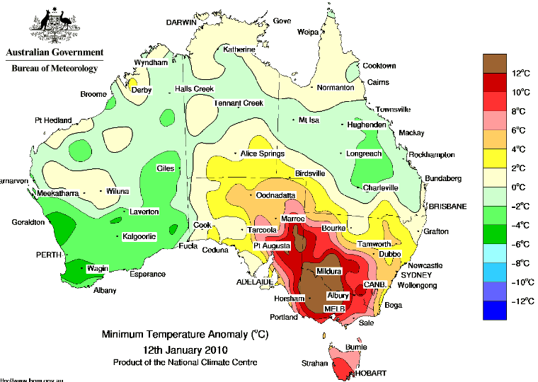
On the night of the 11th-12 of Jan 2010 Melbourne sweated through an uncomfortably hot night. Just a couple of media refs will give you the gist but Google could find more no doubt. There is talk of Melbourne’s “..equal hottest night ever.” But I see no sign of balancing statements which should have refered to two facts.
[1] The record equal temperature was measured in the centre of the Melbourne urban heat island (UHI) which has grown at night by 2 degrees centigrade in the last 60 years.
[2] The BoM should have stated that there was little sign the hot night was a record breaker outside of Melbourne.
This BoM map shows the minimum temperature anomaly for the 12th Jan.

Click for the full Australian map.
You can make those maps here.
To test how widespread record breaking temperatures were that night I checked 11 sets of station data and found only one with a record high minimum on the 12th. Note my daily data is only updated to April 2007, so the true rankings might be even lower if there have been notably hot nights in the 32 months since then.
Continue reading How can it serve the Australian national interest by having the BoM mislead us ?
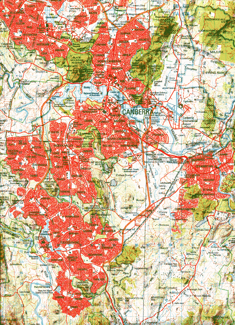
Evidence for a strong urbanization signal; 0.3 degrees C per decade in Canberra Airport temperature data 1997-2009
Canberra/Queanbeyan is a sprawling collection of suburbs population 300,000 plus – which extends over 30km north south and nearly 20km east west. Canberra was selected as the Australian Federal Capital early last century and urbanisation would have started after the “old” Parliament House started operating in the late 1920’s. The post WWII boom in Australia plus increasing migration accelerated the addition of new suburbs to Canberra, a process which continues to this day.
There are monthly maximum and minimum temperature data from the Airport starting March 1939 running complete to the present time. During 1996 the ACT Govt in conjunction with the BoM (Bureau of Meteorology) installed an air-monitoring station at Tuggeranong in Canberra southern suburbs where there are air quality issues.
As part of this instrumentation, temperature is recorded and the BoM publishes monthly mean max and mean min at this website, look for Site name: TUGGERANONG (ISABELLA PLAINS) AWS Site number: 70339 and you can download the data for yourself. Canberra Airport data is Site name: CANBERRA AIRPORT Site number: 70014, and I understand the BoM instruments are on the Fairbairn RAAF Base side of the airport, that is several hundred metres across the runways, NE of the main passenger terminal . See GoogleEarth map thanks to MartinH of Canberra
The difference between Canberra Airport and Tuggeranong is 0.3 degrees C per decade – a very significant indication of urban effects in the Canberra data. Remember too that the Tuggeranong data will have some UHI contamination too, so the true UHI at Canberra Airport could be in excess of 0.3 degrees C per decade.

This site shows how even small urban areas can be significantly affected by the UHI effect.
Continue reading Evidence for a strong urbanization signal; 0.3 degrees C per decade in Canberra Airport temperature data 1997-2009
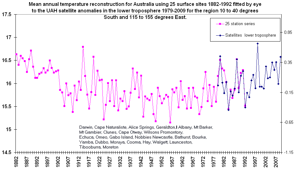
Australian mean annual temperature reconstruction 1882-2009
After getting questions from people about the BoM claim that 2000-2009 was Australia’s hottest decade I have started updating my 1992 25 station series for Australian – time consuming with 50 other things to do.
Here is the result of an experiment to fit my 1993 25 station series to the Spencer and Christy lower troposphere satellite data for a block of lats-longs forming the Australian region.

(Sorry Tasmania is missed out. Not worth including all that ocean just to get the Apple Isle.)
For a larger chart and station list.
The BoM does not use pre-1910 data, I expect they would claim that Stevenson Screens were not in use before that date and the old open thermometer stands read warm. I think they are wrong about that – see my published paper.
The BoM published trend 1910-2009 uses “stroked and tweaked” data, which I also think is wrong.
My 25 station series would incorporate a small quota of urban warming from the town sites. Like all temperature time series, mine would get less reliable the older the data is – but I put this up as the best Australian series of its length.
Perhaps somebody knows of proxy records that cast light on late 19C warmth in Australia.
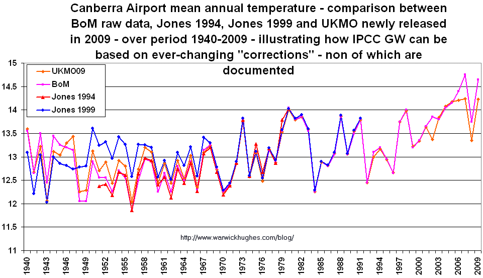
Canberra Airport – rejected by Jones et al 1986 – pardoned in the 1990’s – now corrected (again) by UKMO
While experimenting with BoM raw Canberra Airport data I was surprised to find the UKMO have corrected the data here and there. It is noteworthy that Jones et al 1986 rejected Canberra (WMO 949260) with an 80 code which translates as “Non-homogenous and uncorrectable” – after comparing it with Sydney.
Canberra was “pardoned” and included in Jones 1994 station data – but oddly it never made the cut for the 1226 station 1996 update, which is confined to stations still reporting.

For larger graphic.
In the newly discovered Jones 1999 station data CANBERRA-AIRP 949260 is included again, with different “corrections” – all undocumented now of course and secret until ClimateGate.
Then the UKMO version just released under pressure of ClimateGate has a different set of “corrections” again and of course their reasons for the corrections are so far – secret.
The trends in degrees C per decade vary as follows: UKMO09 0.1, BoM 0.13, Jones94 1951-80 0.1, Jones99 0.057
Surface minus satellites – some differences look political
Lately I have had people pulling my chain telling me that the lower troposphere satellite temperature trends are very close to those at the surface. I just want to point out that this is far from so everywhere.
Wayback in 2006 I drew attention to, “Satellites vs surface, amazing agreement over the USA.” I know that over Australia and Europe trends are fairly close.
Almost a decade ago I drew attention to how hard it was to discover IPCC GW in USSR station data in high warming grid cells – “USSR High Magnitude Climate Warming Anomalies 1901-1996”. Following all that work I formed a view that IPCC GW is to a large extent USSR warming.
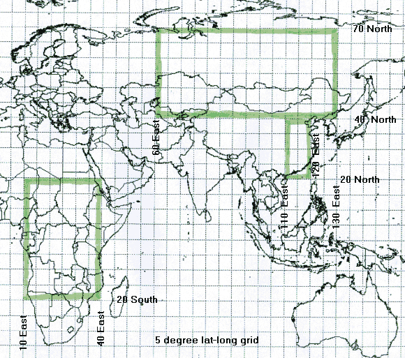
Comparing the Spencer & Christy lower troposphere satellite data with HadCRUT3 both downloadable at the KNMI Climate Explorer – for three noteworthy regions -all cases use the 30 year period 1979-2008.
For Asia:
- HadCRUT3 warms at 0.46
- UAH MSU warms at 0.33
- Possible Surface data error of 0.13 per decade
For East China:
- HadCRUT3 warms at 0.44
- UAH MSU warms at 0.21
- Possible Surface data error of 0.23 per decade
For Africa:
- HadCRUT3 warms at 0.315
- UAH MSU warms at 0.013
- Possible Surface data error of 0.302 per decade
So I am saying there are HUGE inconsistencies in satellite minus surface figures around the globe. Post ClimateGate – it is interesting that we heard the Russians speaking out against the quota of warming IPCC/CRU/Jones find in Russian datasets.
BoM hottest decade claim #2 – complete failure in Darwin too
Blind Freddie can see that Darwin Airport is comprehensively warmer in the decade 1990-1999 compared to 2000-2009.

Just for a moment think on this gutless claim from the BoM that they restrict their claim to data post 1910. What a stunning example of utter contempt for voters and taxpayers. Do they think we are stupid ? Do they think we are all conned by this pathetic bleating attempt to censor out several decades of warm Australian climate history. It is surely a measure of the complete dominance that BoM/IPCC science has over the main-stream media (MSM) that the BoM get their strangelovian science uncritically parroted in our green-left MSM.
BoM hottest decade claim shot down in Alice Springs
The Australian Bureau of Meteorology (BoM) and their political echos have been all over the media today with the claim that the years 2000 to 2009 have been the hottest decade in Australia.
Lacking the resources to quickly check the entirety of the BoM claim, I checked Alice Springs data – being at the core of our hot land.
The tenuous BoM claim comes crashing to earth so quickly – in the 1990-1999 decade. The average mean annual temperature in the Alice for the decade 2000 to 2009 is 21.441 degrees C. Then the average for the next decade – 1990 to 1999 is 21.645.
And yes their claim also fails in the 1880’s.

My graphic shows the 21.645 peak at 1999 (= ten year average for years 1990-1999)
Poor old BoM – a gaping hole shot so quickly in their beautiful construction – I wonder how many tax payers hard earned dollars the BoM wastes on these sorts of politically correct but unproductive exercises – at a time they find it too hard to gather complete rainfall data at many sites.
I will run more checks as global datasets are updated to the end of 2009.
A few words about what I think would be balanced statements to make about 2000-2009 climate in Australia. Of course it has been a hot decade but I doubt it is significantly warmer in a statistical sense to earlier times, including the late 19th Century – which the BoM cunningly try to exclude. IMHO 2000-2009 could be said to be “well within the normal range for Australian decadal natural temperature variations”.
Get monthly mean max and mean min data from this link