I decided to check what BoM temp data there was for Nowra – just south of the Shoalhaven River south of Wollongong in NSW.
I found there is an ancient Nowra Council Offices 68105 which has data from ~1912 to ~1934 with gaps then nothing at Nowra.
WW2 increased activity at the HMAS Albatross Navy airfield a bit S of Nowra and BoM started max n min t from 1956 for – Nowra Ran Air Station
68076. Then in year 2000 I assume it changed to AWS as Nov 2000 was the last month for 68076 and Nowra Ran Air Station AWS 68072 the current station started with Nov 2000 the first full month.
So BoM monthly data tables at CDO imply there was only a one month overlap in switching to AWS.
I downloaded the data from CDO and pasted to a spreadsheet and I was surprised at the large increase in both max & min readings for Nov 2000 in AWS over what I assume was liquid in glass thermometer.
I emailed what I had found to an expert in BoM data and he reported that there were only a few days data in Nov 2000 to make the presumed overlap. You could not make this up.
The relevant four links are below and just now the BoM pages will not show the daily data for me.
I have not tried looking at either “siteinfo” pdf yet.
What do readers think about BoM not doing a decent overlap (several years?) at this site where staffing could not have been an issue. Links below to monthly data at BoM CDO (Climate Data Online)
Monthly mean maximum temperature Nowra Ran Air Station 68076 www.bom.gov.au/jsp/ncc/cdio/weatherData/av?p_nccObsCode=36&p_display_type=dataFile&p_startYear=&p_c=&p_stn_num=068076
Chris Gillham has updated his chart (Mar 2012 to Feb 2023) of ACORN V2.3 mean t(Aussie land stations many affected by UHI now stroked & tweaked by BoM) vs NASA UAH lower troposphere temps from satellites. His page is headed – Australian climate plateau since 2012 – Datasets show no warming for more than a decade www.waclimate.net/australia-cooling.html
BoM three-monthly mean temperature anomaly for Australia 1Dec2022 to 28Feb2023 www.bom.gov.au/jsp/awap/temp/index.jsp?colour=colour&time=latest&step=0&map=meananom&period=3month&area=nat
At this BoM page you can also easily checkout the max anomaly (Daytime) and Min anomaly (Night time) maps.
This summer has been marked by amazing BoM publicity about heatwaves – perhaps readers can report their experience of heatwaves this summer – thanks.
In a few days the UAH Global map of lower troposphere T anomalies for Feb should appear at link below. www.nsstc.uah.edu/climate/
The ample MDB rains of 2022 following two good years have lead to the 46 Sydney Harbours (23,377GL) flowing into South Australia. www.bom.gov.au/climate/maps/rainfall/?variable=rainfall&map=percent&period=12month®ion=md&year=2022&month=12&day=31
This eye watering volume of fresh water has originated as rainfall. The MDB is ~1million sq km so if 500mm rain fell on average in 2022 that is 0.5GL x 1million or 500,000 GL or 1,000 Sydney Harbours of rainfall.
Now there is evaporation, soakage into the ground, recharging of acquifers, filling dams of all sizes, as these colossal floods move on their pathways over the MDB landscape and make their way to the Murray R.
The Minister for the Environment and Water Tanya Plibersek is still demanding NSW & Vic waste more water to the sea by way of Environmental Flows agreed to years ago. Water ministers fail to agree on way forward as Murray-Darling Basin Plan deadline looms 24Feb23 www.abc.net.au/news/2023-02-24/states-fail-to-agree-as-murray-darling-basin-plan-deadline-looms/102018886
Four months ago I blogged –
MDB floods widespread but GreenLabor planning huge enviro flows 31Oct2022 www.warwickhughes.com/blog/?p=6989
I said then [The Minister seems to be gloating about stopping previous Gov dam projects, already stalled in antidam State bureaucracies, and using the $Bns to buy water out of the MDB plan for future flushing down to the sea.
Making the MDB a smaller & less important future food-bowl and the wide brown land will be a weaker food producer.]
I also blogged before Christmas 2022 –
So irrigation is only 1% of the Murray–Darling Basin!!! 22Dec22 www.warwickhughes.com/blog/?p=7050
Thats 1% of the area.
Remember the Sun Cable plan for a giant solar farm in the NT and a submarine cable to Singapore and how in Jan the news was a dispute between Twiggy Forrest and Cannon-Brookes drove the move into Administration.
Sun Cable collapses after dispute between billionaire investors Andrew Forrest and Mike Cannon-Brookes 11Jan2023 www.abc.net.au/news/2023-01-11/sun-cable-enters-administration/101845100
(WSH comments) Proposed cable to Singapore running along then crossing one of the great ocean trenches on Planet Earth.
The trench is location of colliding tectonic plates, subduction zone, heightened seismic activity, plus elevated volcanic risk think Krakatoa.
I wonder if behind the scenes efforts are going on to get Fed Govt taxpayer $dollars to boost the loony-toon scheme?
Even the comparatively tiny Basslink cable has been a financial disaster for Tassie taxpayers and TasHydro.
Reported by the ABC and the term SOI (southern oscillation index) is not referred to in the article.
Bureau of Meteorology considering change to El Niño and La Niña definitions 11Feb23 www.abc.net.au/news/2023-02-11/bureau-of-meteorology-considering-redefining-el-nino-and-la-nina/101959160
The GreenLeft/Albo/ALP/ABC/BoM article never mentions the term SOI???
I think it is certain that the grouping “GreenLeft/Albo/ALP/ABC/BoM” want to be able to say whatever they choose, make any claim they choose, linking “IPCC climate change or global warming” to any natural phenomena be it drought, rain, fire, flood at any time across the wide brown land. I hope the Qld Govt Department of Environment and Science keeps on producing the longpaddock time series of the SOI. www.longpaddock.qld.gov.au/soi/
The raw articles for this whole blog idea have been provided for me by Lance Pidgeon AKA Siliggy around sceptic circles so it is mostly a guest post by him – thanks Lance.
On the 2nd of July 2017 the BoM weather station at Goulburn Airport recorded a very nippy morning and if you were quick at checking the BoM www page you might have been lucky to see minus 10.4 logged.
The story was told at the time by Dr. Jennifer Marohasy at her web site – “Bureau Erases Goulburn Record Minimum Temperature: Set Sunday 2 July 2017 – 4July 2017” jennifermarohasy.com/2017/07/bureau-erases-goulburn-record-minimum-temperature-set-sunday-2-july-2017/
I chipped in after a few days with: – “BoM fiddling Goulburn minimum temperature 2nd July 2017 reveals extent of errors in BoM AWAP temperature maps 6Jul2017” www.warwickhughes.com/blog/?p=5206
and I also blogged a wrap after a “month of BoM shooting itself in the foot” Wow – reminds me how sceptics made front page of “The Australian”
“Persistent truth telling climate sceptics cause the BoM to shaft itself again 1Aug2017” www.warwickhughes.com/blog/?p=5246
Graham Lloyd’s well informed series of articles for years in “The Australian” critical of BoM gave the hypersensitive pompous bureaucracy plenty to hyperventilate to itself about. Add to that the truth-telling comments by climate sceptics high-lighting the Goulburn Airport and Thredbo July 2017 temperature reporting irregularities by BoM also reported by the press understandably lead to the apoplectic giant BoM setting up a 2017 “Review of the Bureau of Meteorology’s Automatic Weather Stations” by an international panel. The panel had five members – three from New Zealand and two from the BoM.
A pdf of the BoM’s 2017 “Review of the Bureau of Meteorology’s Automatic Weather Stations” can be downloaded here. www.bom.gov.au/inside/Review_of_Bureau_of_Meteorology_Automatic_Weather_Stations.pdf
There must have been FOI requests for correspondence surrounding this 2017 review because two pdf’s of FOI30-6150 can be downloaded off the BoM www site – the newest by data is labelled Part1 www.bom.gov.au/foi/release/FOI30-6150_DocumentSet_ForRelease_Redacted_r_Part1.pdf
The oldest by date is labelled Part2. www.bom.gov.au/foi/release/FOI30-6150_DocumentSet_ForRelease_Redacted_r_Part2.pdf
Both redacted pdf’s of the FOI30-6150 release are shown here search.bom.gov.au/s/search.html?query=FOI30-6150&collection=bom&Submit=Search
along with the top URL “Disclosure Log” which is an interesting list of FOI material released by BoM since 2010. Plenty to research there. www.bom.gov.au/foi/disclosure.shtml
Now to the meat of todays blog by Lance. If I add any point it will be [in brackets]
BoM tried to blame a faulty AWS but Lance points out how in the pdf doc ITR637 testing in 1994 at the makers “ALMOS” in the US – BoM only ever specified that AWS to record down to -10. Not colder than minus 10.!!
Lance text below here
From a Bureau of Meteorology FOI release the following internal email contents after the public had noticed temperatures not being recorded below -10.4 degrees.
“The equipment wasn’t faulty. The purchase specification required operation down to -10 ˚C, so the words need to be carefully written.”
Just how independant is this advice?
Page 77 of this PDF www.bom.gov.au/foi/release/FOI30-6150_DocumentSet_ForRelease_Redacted_r_Part1.pdf
Where was this specified? I
A big clue is in this same BoM document mentioned on page 88 of the PDF. So hard to aquire it needed to be sent from New Zealand.
“Bruce Hartley has kindly forwarded ITR 637 summarising the tests on the AWS ADC cards.
The test results on P4 indicate that the 4-wire resistance measurement (which answers an
earlier question of mine) does not perform as well as might be expected”
And from that document we read;
“4. CONCLUSIONS
a) The performance of the resistance channels of the ALMOS AWS does not meet Bureau
Specification A2671 [1] requirement for electrical system accuracy over the full scale range of -10
to 55 °C.”
Here is that hard to obtain document. See attached. ITR637 INSTRUMENT TEST REPORT NUMBER 637 – Summary Report on ALMOS A.W.S. Tests – Jane Warne Senior Physicist Physics Laboratory BoM 21Oct1994 www.warwickhughes.com/agri16/ITR637.pdf
So the “full range” specified in A2671 was -10 to +55. When Australia had recorded much colder.
“Testing of the MSI1 card at the Bureau’s metrology area and the vendor’s facility in
1994 determined that the card would not report temperatures where the resistance
was equivalent to a temperature below –10.4°C. Subsequently, a new model card
(MSI2) was developed and procured from the vendor, with testing at the Bureau’s
metrology area in 1999 showing this card could operate accurately and successfully
at temperatures down to –25°C.” www.bom.gov.au/inside/Review_of_Bureau_of_Meteorology_Automatic_Weather_Stations.pdf
Not only did problems pop up in Goulburn and Thredbo in 2017, with automatic weather stations being the primary instrument from late 1996, this problem was general until sometime after the mentiond 1999 test. ITR657 also attached.
Link to ITR657 INSTRUMENT TEST REPORT NUMBER 657 www.warwickhughes.com/agri16/ITR657.pdf
There are even odd accuracy specs mentioned in it.
Lance
[Later when I (wazz) have time there is much BoM pomposity to puncture in the two FOI30-6150 pdf’s – just now I lack the time but readers are welcome to post any examples that gets them laughing]
We have probably all seen TV or www news of the Auckland floods of a week ago tomorrow.
I have assembled the links below and also listed points A to F to provide some perspective.
No news items mention basic facts that –
[A] – Rain gauges were very sparse in the 1800’s and pre-WWII compared to today.
[B] – Unbuilt vegetated land and natural bush that would have soaked up rainwater and impeded water flow was much greater in area in the 1800’s.
[C] – Tarmac, roads and buildings that increase the rate of runoff were greatly less in the 1800’s and pre-WWII.
[D] – It would be doubtful that custodians of the few rain gauges in the 1800’s and pre-WWII were systematically noting rain over periods shorter than one day.
[E] – So making claims about recent rain when we have dozens and dozens times the rain gauges now than we did in the 1800’s risks conclusions that are unscientific.
[F] – Research into early newspaper archives should reveal reports of rainfall causing floods which may add to data to compare with recent times.
Auckland’s historic flooding explained in five charts 31Jan23 by Marc Daalder www.newsroom.co.nz/sustainable-future/aucklands-historic-flooding-explained-in-five-charts
It could have been mentioned re the last chart that the UHI(Urban Heat Island) effect would be adding to warmth in Auckland.
Marc Daalder is to be congratulated for venturing into the subject area of charting rainfall data which is rarely seen in the main-stream-media.
Good on you Marc. However it is a shame NIWA took 1965 as a starting point when I bet Kiwis have been recording rainfall for at least a 100 years before that.
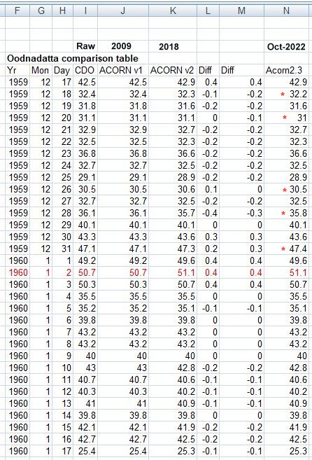
BoM says, our National daily max temperature record is SA, 50.7, 2 January 1960 Oodnadatta Airport 17043 www.bom.gov.au/climate/extreme/records.shtml
Just over a year ago Onslow in WA equalled the 50.7 see my blog – “BoM equal record hot day at Onslow a nothing-burger 14Jan2022” www.warwickhughes.com/blog/?p=6850
My table comparing four versions of Oodnadatta daily max from 17Dec1959 to 17Jan1960 shows 4 columns of daily max – CDO (Climate Data Online) referred to be some as Raw, the original ACORN from 2009 which shows no changes from CDO, Acorn V2 from 2018 and ACORN V2.3 from Oct 2022. There are two columns of differences, the first is ACORN V2 minus ACORN 2009, the second is ACORN V2.3 minus ACORN V2.
I have marked with red asterisks the five days in 1959 where ACORN V2.3 is different to ACORN V2. www.warwickhughes.com/agri16/oodna-various-acorns.jpg
What a debt of gratitude we owe BoM for the $multi-millions of dollars they spend correcting for the poor eyesight of the Oodnadatta weather station custodian in 1959-1960.
2022 ended up cooler than normal towards the end see Chris Gillham’s great www pages –
Australian climate cooling since 2012. www.waclimate.net/australia-cooling.html
And today Sydney Observatory Hill just recorded over 30 degrees – read about the significance at Weatherzone. www.weatherzone.com.au/news/sydney-ends-nearrecord-run-below-30-degrees/1050804
Sydney ends near-record run below 30 degrees 18Jan23. Quote [ Prior to today, Sydney’s last day above 30ºC was on February 21, 2022, meaning the city just had 331 days between temperatures over 30ºC.
This is the city’s second longest gap between 30ºC days in records dating back to 1859. The only longer period between 30ºC days lasted for 340 days, between December 31, 1882, and December 6, 1883.]
Weatherzone also note at the end of their article – Quote[Considering Sydney’s near-record run of days below 30ºC in the broader context of climate change makes it an even more impressive feat for the city. Observations from Observatory Hill show that the city’s mean annual maximum temperature has increased by around 1ºC between 1910 and 2021.]
How stunning that they would “touch their forelock” to “climate change” but not mention the location in the largest urban heat island in all the wide brown land.
2023 In Australian is starting cool but what else is due this year? Will add to this post later.