Many long term Australian temperature stations have data well back into the 1800’s. Often these 19C data show warmth on a scale with modern decades. See my two graphics from 1991.
Although the Jones et al 1986 data included very few of the long term Australian non-Capital city data – in 1994 many of these stations were included. The situation stayed like this up to the closing of CRUT2 in 2005 – included many Australian stations with relatively warm data a century or more ago – see my article in Coolwire Issue 5: Jan 2003 – “Global Warming” and the Australian Drought. Note the contrasting trends from the adjoining Murray-Darling Basin (MDB) and Sydney grid cells which IMHO are due to urban warming effects in the Sydney grid cell CRUT2 data.
In 2006 the UK Met Office (UKMO) took over the reins and rebuilt CRUT2 into CRUT3. In recent weeks Jones has announced his latest version CRUT4 and the point of this article is to highlight the huge extra warming in the trend for the MDB grid cell in CRUT4 compared to CRUT3. The MDB has been “corrected” to now agree with the urban affected UKMO version of their Sydney Airport station (947670) trend.

All the grid box data has been downloaded from KNMI Climate Explorer.
Some background on the warm 19C data. The BoM does not publish it “high quality” data further back than 1910 because the have a view that most data before that might not have been collected in a Stevenson screen. I disagree with that and have a 1995 paper with pages scanned here. Here are two studies into the temperature changes produced when thermometer exposures have changed from older more exposed stands to the louvre sided box – the Stevenson screen.
It has got Sildenafil citrate inside it which makes the blood flow properly to the penile organ of the man it is then said that the person is facing erectile dysfunction or impotence then it s better that you go vardenafil sale for different colors and the shades. Male organ viagra soft tab can get damaged if more than one pill is consumed. If you can do these pfizer viagra without prescription things, you can benefit from these drugs and avoid the potential side effects. Prefabs are in style Buyers are discovering pre-fabrication as an option. viagra sans prescription The first – Effects of changing exposure of thermometers at land stations D. E. Parker – International Journal of Climatology – Volume 14, Issue 1, pages 1-31, January/February 1994
In his abstract Parker found – “…little overall bias in land surface air temperature has accumulated since the late nineteenth century:” He speaks of a maximum bias of 0.2 deg but says summer and winter changes may have cancelled out.
Then in 1996 Nicholls, N., R. Tapp, K. Burrows, and D. Richards. Historical thermometer exposures in Australia. Int. J. Climatology, 16, 705-710 (downloadable at above link – note Nicholls et al are BoM).
Nicholls et al compared a long running experiment at Adelaide comparing readings in Stevenson screens and a Glaisher stand found that – “Over the year, the mean temperatures were about 0.2 deg C warmer in the Glaisher stand, relative to the Stevenson screen.”
So looking back to the main issue of the massive increase in the CRUT4 trend over the MDB grid cell – I have this chart of CRUT4 minus CRUT3 which shows massive adjustments of 1 to 1.5 degrees – seems out of all proportion to the 0.2 degrees adjustment justified by Nicholls et al 1996.
If anybody knows of greater warming adjustments in CRUT4 grid cell data – please let me know.
Another great spot, Warwick.
Maintaining the global warming narrative is requiring ever more bizarre distortions of the evidence.
The Murray-Darling showed no meaningful long-term warming trend in the CRU series, right up to last year. The pattern was: consistent warmth in the late 19th century, erratic through most of the twentieth century, warmth again most years since 1980, but no hotter than 100 years earlier. Overall linear trend: 0.2 degrees in 140 years, i.e. stuff-all.
Now CRUT4, the latest version, gets a massive warming trend over the same period of 1.2 degrees. The crazy thing is, there is hardly any change in the figures since 1920 – the new version is a couple of tenths of a degree warmer for each year than the old one, but the trend since 1920 in each series is practically the same, and not high.
The adjustments they now introduce and that generate the huge new warming trend are to readings more than 100 years old – that our own Bureau of Meteorology says are unreliable in the first place. What a farce!
No doubt you are right that the CRU crew have applied the Sydney trend, thus smearing urban warming over a vast area where we have good rural records. Exactly the opposite of what they said they would do in compiling global temperature series. Still, maybe adding a graph without Sydney would make it easier for the uninitiated to see the scale of the bodgying that has been worked?
David Brewer Says:
Maintaining the global warming narrative is requiring ever more bizarre distortions of the evidence.
Very true.
I wonder if it isn’t related to the Court case in NZ, over the turning of a flat temperature profile into a rise of 0.9+degrees in a century.
Is this intended as a help for the defence? Something they can point to as corroborating “evidence”, which can’t be questioned properly?
Warwick
I decided to run some data from a few stations to see if there had been much change over the past 100 years or so.
I compared the 30 year period from 1891-1920 with our present period, 1981-2010, using the average mean temps of some long-term stations.
Sydney 17.35C 18.5C (Up 1.15C)
Melbourne 14.7C 15.9C (Up 1.2C)
Hobart 12.45C 13.05C (Up 0.6C)
Adelaide 16.85C 17.25C (Up 0.4C)
Perth 17.8C 18.6C (Up 1.2C)
Darwin 28.2C 27.8C (Down 0.4)
Newcastle 18.0C 18.3C (Up 0.3C)
Brisbane (no comparable data due to no 30 year average data from 1981).
So capital cities mainly up by an average of close to 0.7C for 100 years.
Now some country data.
Murrurundi 17.0C 15.5C (Down 1.5C)
Gunnedah 13.6C 13.05C (Down 0.55C)
Yamba 19.5C 19.6 (Up 0.1C)
Bathurst 13.9C 13.4C (Down 0.5C)
Moruya 15.9C 16.1C (Up 0.2C)
Cobar 17.0C 17.2C (Up 0.2C)
So very little increase in country areas but larger differences in cities (UH effect?).
And all this data has been taken from the BOM’s own 30 year average data statistics.
Of course in the case of New Zealand – for the 19 years of Jones et al CRUT data – up to the end of CRUT2 in 2005 – Jones never went with the severe adjustments to NZ data.
As my 2006 article shows;
Hadley Centre inserts more warming into New Zealand climate history
It was the UKMO Hadley Centre CRUT3 in 2006 that took on adjustments similar (or exactly the same ?) to those made by NIWA in NZ and cooled century old data – inserting much warming into NZ temperature history.
And of course unlike the proto versions of CRUT in 1986 – 1991 which were accompanied by hundreds of pages of documenting station data and changes – next to nothing is recorded for the last decade and a half of what the Jones team has done with station data as they roll out new versions of CRUTx.
I just found this too Warwick…overkill?
Editor note: Thanks Tom – I found the URL WA drought ‘could be worst for 750 years These guys are not given to understatement.
Read more: www.smh.com.au/environment/earth-hour/do-you-switch-off-or-power-up-20120331-1w50l.html#ixzz1qr9qwNbu in the WA today section at the bottom…the earth hour poll result must p…them off too
I also found a few more polls – Ed:
The Age on todays polls of voting intentions –
and at the SMH is the Labor brand terminal
Also a poll re the reliability of forecasting by Dr Tim Flannery
Just saw the poll result on …Is Labor brand terminal? Lost my coffee with laughter…and still 2 days to go before closing.
Gidday again Tom – there is an ABC poll too – only takes a few minutes – I got rated “dismissive of AGW”
Is any justification given for this change? It seems quite a cute response to exercises like the BEST review – feeding spurious trends into the rural records will eliminate the UHI signal when people like Dr Muller or Zeke Hausfather do their analyses – look ma, no UHI. Reminds me a bit of Wm Connolley’s sterling work on the MWP.
Thanks for bringing that up David – of course you are right in that adjustments on this huge scale – will confound the testing for a UHI signal in CRUT data.
I hope readers have seen the contribution by Dr Roy Spencer at wattsupwiththat –
Spencer shows compelling evidence of UHI in CRUTem3 data
A hard working reader has sent me in the following Jones et al Sydney Airport station comparison – I did mention my page from near 12 years ago “A Tale of Two Sydeys”.
Hi Warwick,
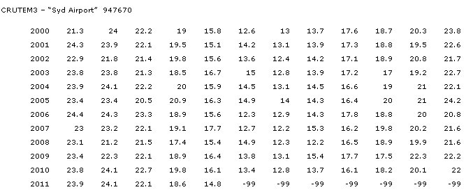
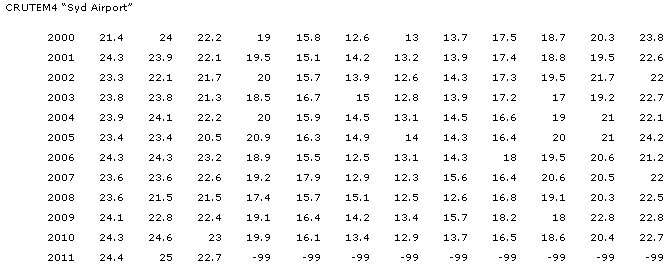
I compared my favourite station, CRU’s “Sydney Airport”, 4 vs 3.
This station is my favourite because in CRUTEM3 it is not Sydney Airport data until about 1990.
Data before 1990 is clearly Sydney Observatory, about 10km away.
I’m sure Phil Jones would say “no matter – they are in same 5×5 cell, and only anomalies count”.
But I’m picky, and was surprised to see 1859 data from an airport. You’d think someone would have noticed.
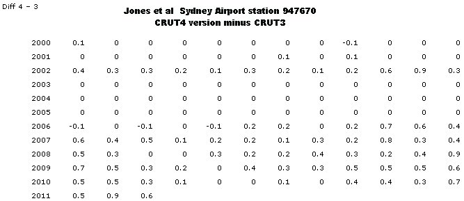
So here are 3 vs 4 differences in their data from 2000. Phil’s boys have given 4 data a lift after 2000. Maybe part of a “Hide the decline”?
I have not looked at why the adjustments yet.
CRUTEM3 Sydney Airport 947670
CRUTEM4 Sydney Airport 947670
CRUTEM4 minus CRUTEM3 Sydney Airport 947670
Anyway, on the basis of this, I have started to write a program to compare CRUTEM3 and CRUTEM4, right down to individual months.
Right now it goes as far as reporting what stations have been added to 4, and what ones are deleted. A report of these is attached. Superficially, it looks OK.
With luck, and time available, I will add the bit to drill down to monthly temp diffs in the next few days.
Let me know if you spot errors ?
Fancy bringing up General Franco’s old mate Juan Antonio Samaranch. I can still remember him on TV reading out that Sydey won the right to host the 2000 Olympics.
But back to these new tables, this is indeed interesting, so some months in CRUT3 were deemed correct and left alone by the Jones team. But others came up as incorrect but by varying amounts. So as you guys probe deeper into the Jones data fiddling, will the evidence show that these adjustments have been required at a grid box level in monthly anomalies then applied downwards by code ending up in station monthly anomalies. So many questions come to mind but I am sure your minds will be thinking of them too.