Lately I have had people pulling my chain telling me that the lower troposphere satellite temperature trends are very close to those at the surface. I just want to point out that this is far from so everywhere.
Wayback in 2006 I drew attention to, “Satellites vs surface, amazing agreement over the USA.” I know that over Australia and Europe trends are fairly close.
Almost a decade ago I drew attention to how hard it was to discover IPCC GW in USSR station data in high warming grid cells – “USSR High Magnitude Climate Warming Anomalies 1901-1996”. Following all that work I formed a view that IPCC GW is to a large extent USSR warming.
Comparing the Spencer & Christy lower troposphere satellite data with HadCRUT3 both downloadable at the KNMI Climate Explorer – for three noteworthy regions -all cases use the 30 year period 1979-2008.
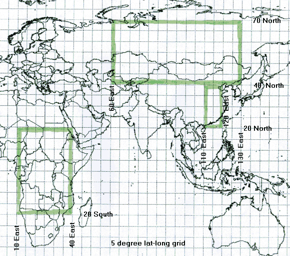
For Asia:
- HadCRUT3 warms at 0.46
- UAH MSU warms at 0.33
- Possible Surface data error of 0.13 per decade
For East China:
- HadCRUT3 warms at 0.44
- UAH MSU warms at 0.21
- Possible Surface data error of 0.23 per decade
For Africa:
- HadCRUT3 warms at 0.315
- UAH MSU warms at 0.013
- Possible Surface data error of 0.302 per decade
So I am saying there are HUGE inconsistencies in satellite minus surface figures around the globe. Post ClimateGate – it is interesting that we heard the Russians speaking out against the quota of warming IPCC/CRU/Jones find in Russian datasets.
Bob Tisdale did a similar analysis on Anthony Watts site with UAH vs. GISTEMP. I noted here that the three surface regions with the biggest divergence between Satellite and Surface were Africa, Antarctica, and the Arctic, which exactly correspond to the three areas with the worst coverage and biggest spacial gaps in the surface temperature network.
I concluded:
Totally agree, coyote. If you go to:-
data.giss.nasa.gov/gistemp/
you will find that the Annual Summations graphs from 2001 to 2008 show consistently that those three regions always come up red (Arctic, Russia and parts of Antarctica). This seems to be where the bulk of the warming is being generated. However the Russians, and now the Scandinavians, are questioning the ‘homogenized’ v the raw temperature data for their areas.
Hi Warwick
Before reading your papers I had not fully appreciated the size of the UHI effect in China and Russia. You have opened up my eyes. I also liked your inclusion of the Alice Spring data in another blog entry. You can’t get more remote than Alice. The MOB is a bit naughty in using only post 1941 data. Does the MOB cooperate with the UK’s Met office in devising ways to word their press releases?
Thanks again for your work in this area.
As both Russia and china will experience large population declines over the next 70 years the positive UHI effects on these countries’ temperature records may go into reverse. What will Jones et al do then?
A long time, though, to wait to prove a point!
Regards
Martin J
Similar results for New Zealand for 1979-2006:
HadCRUT3 warms at 0.289 C/decade.
UAH MSU warms at 0.097 C/decade.
Using www.co2science.org/data/temperatures/hadley.php
Alice Springs’ Post Office raw data goes from 1878 to 1953 at
www.bom.gov.au/jsp/ncc/cdio/weatherData/av?p_nccObsCode=36&p_display_type=dataFile&p_startYear=&p_stn_num=015540
Raw data for Alice Springs Airport goes from 1942 to the present day at
www.bom.gov.au/jsp/ncc/cdio/weatherData/av?p_nccObsCode=36&p_display_type=dataFile&p_startYear=&p_stn_num=015590
The trend maps (which combine both stations go back to 1910 and can be found at
www.bom.gov.au/cgi-bin/climate/hqsites/site_data.cgi?variable=maxT&area=nt&station=015590&period=annual
Note the changes to earlier data between the raw temps and the trend map
ie 1915 raw temp – 29.7C
1915 temp as per trend map – 29.2C
The AS PO data seems to be ‘dumbed down’. I must admit where the two data sets overlap (1942 to 1953), PO reads higher by around 3C to the airport. so they could argue that PO temps need to be lowered,
However the trend map appears to be consistent with the raw data when the AS airport data is used.
Check the GISS trend maps for Alice Springs. The raw data trends show little warming but the ‘homogenized’ trends show heaps because they only start from 1950s.
Raw data
data.giss.nasa.gov/cgi-bin/gistemp/gistemp_station.py?id=501943260004&data_set=1&num_neighbors=1
Homogenized data
data.giss.nasa.gov/cgi-bin/gistemp/gistemp_station.py?id=501943260004&data_set=2&num_neighbors=1
Mr Hughes, Bob Tisdale found exactly the same relation between GISS and MSU by checking the trends for given areas with KNMI Explorer. Africa and Asia had big positive differences in warming rate, both Americas and Europe were in good agreement though.
I think you have a minor error in the error calculation for Africa. Should it be 0.202DegC/decade?
Oops, my mistake.