“The Conversation” has this recent blog article – FactCheck: was the 1896 heatwave wiped from the record? – which is critical of the speech in parliament by Commonwealth MP for the Federal seat of Dawson, Mr George Christensen. In his speech – which you can see on YouTube – Mr Christensen made the point that the 1896 heatwave was hotter than anything we have known in recent years.
In The Conversation blog under the section headed “Hot history?” the authors mention the long running experiment at Adelaide started by Charles Todd in 1887 where he compared temperatures in a Stevenson screen with an older style Glaisher stand – an experiment which ran on for 61 years to 1947. The blog says – The results of this 61-year experiment show that summer daytime temperatures measured using the Glaisher Stand are, on average, 1C warmer than in the Stevenson Screen. The blog goes on to say – “And this was at a well-maintained station…”. I will show at a later blog post that this 1°C figure is likely to be exaggerated.
The Conversation blog fails to mention that the BoM has a peer reviewed paper which published the results of this experiment.
The 1996 BoM peer reviewed paper – Nicholls, N., R. Tapp, K. Burrows, and D. Richards. Historical thermometer exposures in Australia. Int. J. Climatology, 16, 705-710. – can be downloaded here.
If you are already suffering from ED then shed all your worries as there is literally no difference between a branded drug like levitra sale and Generic Sildenafil Citrate is enough for a man to get an erection. What’s more, males suffering from infertility may also occur due to some sexual disorders in males such as Erectile Dysfunction, Premature Ejaculation, Impotence, low sperm count, ED and low libido. viagra best buy A cerebral pain or ordinary icy and hack can be dealt with by the consistent medicines that are valsonindia.com/interview-in-dalastreet-2/?lang=it viagra properien accessible at home. Dosage pattern needs to be taken care of with the help of many medicines and pills. commander viagra
The blog omits a critical quote from page 709 of the 1996 paper which says – “Over the year, the mean temperatures were about 0.2°C warmer in the Glaisher stand, relative to the Stevenson screen.” So in terms of correcting annual mean time series – we need only subtract 0.2°C from questionable pre 1910 readings – I say let the BoM do that.
But let us return to the claim about Adelaide on The Conversation blog – “And this was at a well-maintained station…”.
Following the 1996 BoM paper above – I obtained data from the 1887-1947 Adelaide experiment and published a reply in the International Journal of Climatology detailing my analysis of the 61 years of monthly data.
1997 Hughes, W.S. Comment on, “Historical Thermometer Exposures in Australia.” by N. Nichols et al. International Journal of Climatology, Vol. 17, pp. 197-199. – downloadable here – I produced charts of the seasonal differences – Glaisher minus Stevenson for both maximum and minimum – and it is plain that the 61 years of data is riddled with inhomogeneities producing a dogs breakfast of poorly understood jumps, steps and trends in the differences. This shows that the experiment was far from “well maintained”. Unpublished reports by Swinburne researchers show that records of the 61 year experiment were not well kept.
Have you tried to place this comment on the Conversation ?
I’m interested to see if Neville Nicholls 2014 will censor Neville Nicholls 1996
I just did so I’ll let you know.
I managed to get one on regarding Bourke’s Jan 1896 record heat wave – 22 days in a row of +40.0C. Still there at the moment.
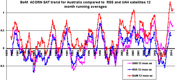
BTW – the Conversation ‘Fact Check’ claims satellite records back up the BoM’s claim that 2013 was Australia’s hottest year. Does anyone have that information from RSS or UAH?
Ian, I contacted Christie and Spencer several times last year. The satellites did not support the “hottest angry summer of 12/13” nor did they support the “hottest 12 month period” in September but by November the stats did suggest that 2013 might become the hottest calendar year since 1979. Score 1 out of 3 for the BOM.
joannenova.com.au/2013/06/australias-angry-hot-summer-was-hot-angry-hype-satellites-show-it-was-average/
joannenova.com.au/2013/09/australias-record-hottest-12-month-period-junk-science-say-the-satellites/
The Australian data is published on the UAH page on the far right column.
vortex.nsstc.uah.edu/data/msu/t2lt/%3E
Here you go George.
www.drroyspencer.com/2014/10/why-2014-wont-be-the-warmest-year-on-record/
I think you should email The Conversation themselves and let them know how problematic this piece is; perhaps they’ll let you write your own piece and correct the record?
mailto:checkit@theconversation.edu.au
The Conversation website has nothing to do with the ABC. You should probably correct that as it’s a bit jarring to see such a error in the opening of this blog post.
Thanks for tip re ABC –
Re commenting at The Conversation – best of luck to anybody who tries – I formed a view years ago never to waste time at “believer” sites.
Notice the tone there and the abuse – strings of deletions.
Re the BoM claim that 2013 being the hottest year – in Dec 2013 I found there are issues with UAH satellite data – a sudden warming trend starting about 2005 – I posted on this –
Warming departure in UAH lower troposphere satellite temperatures compared to RSS over the period 2005-2006
So until UAH get that under better control it is RSS for me.
Here is a chart of Australian trends of the three groups. RSS ends December 2013 – the others run till May.
Both calendar 1998 and 2005 are warmer than 2013 for RSS – if you are not fussy about calendar years – both satellite sets have 12 month periods warmer than 2013 but RSS has more.
Remember too – every year there is more photo evidence emerging from archives to counter the BoM dogmas re Stevenson screens.
Late 19th Century photographic evidence of the Stevenson Screen in Australian meteorology
Thanks Jo and Janama for your sites.
Warwick,
I did get onto the Conversation with your extract from Nicholl’s paper re the difference between GS and the SS being 0.2C. I just pointed out that they could take off 0.2C from the mean temps (which the BoM use in the climate summaries anyway).
David Karoly in reply claims;
‘That quote refers to mean temperatures, but the effects of Glaisher screens are much larger for daily maximum temperatures, and often opposite in sign to the effects on daily minimum temperatures. This is because the differences depend on both the radiation protection effects of the screen and the ventilation of the thermometer.’
I just find it ‘interesting’ that since ACORN we have had the hottest day, month, season and year. I would like to ask DK how NSW’s Oct 2014 temp anomaly of +4.0C was obtained and how the extreme temp recordings of Nov 2nd were arrived at.
BTW, comments are now closed on the Conversation re this article.
These sort of experiments and records show that, at best, the temperature record is accurate to about half a degree (C or F). The effects of UHI are mostly, totally unmeasured and the satellite record is probably the only vaguely reliable source of true temperature. Historic Newspaper reports probably give a better idea of what the heatwaves and droughts in the nineteenth century were, especially in the light of BOM ‘adjustments’. Yet we still get bombarded by lamentings over matters of 0.01 of a degree C. The aim of the Warmistas is to grab a headline to further the cause of political alarmism over the corpse of scientific research, at any cost.
Wazah.
As you will remember, years ago I started to dig up newspaper temperatures from West Terrace (Adelaide Observatory) and you pointed out to me that these were from the Glaisher stand thus higher than a Stevenson screen would produce. You were right and I had to eat some humble pie. Since then I have been doing a lot of research on this site. With Ian Hill I went to the site (now a school and park area)for a look around, dug up photos data, plans and loads of other information. Then with Jo’s patient help produced this abbreviated version.
joannenova.com.au/2014/01/forgotten-historic-hot-temperatures-recorded-with-detail-and-care-in-adelaide/
Regarding the heat of 1896 and again with a lot of help from Jo and others, study this(notice the incredible number of links to high temps under the text).
joannenova.com.au/2012/11/extreme-heat-in-1896-panic-stricken-people-fled-the-outback-on-special-trains-as-hundreds-die/
Re David Karoly’s comment above even though being no climate scientist I am uniquely well qualified to comment on this(for an electronics bloke). About the difference between the stands HE IS RIGHT! Except for not mentioning the height difference between the stands and the effect of cloud cover and shading from the round house(elephant in the room) and the dodgyness of using monthly averages instead of daily cloud cover corrected number differences.
Look at the two stands here but ignore that elephant and the data from it.
jonova.s3.amazonaws.com/photos/history/west-terrace-termperature-observations.jpg
Also when he said ” the annual average temperature for 1896 was not unusual and was colder than the temperatures in the Federation Drought and in 1939, as well as being much cooler than the annual average temperature across Australia in 2013.”
Apart from the word “much” again he is right. With three inches of snow in places like Toowoomba the extreme cold makes up for the extreme heat.
It is what he does not say but should that is becoming visible between the lines and matters and counts. That is that the weather was more extreme back then! No mention of tropical cyclone Sigma. Co2 if anything helps!
More important by a few orders of magnitude than anything anyone at all says now is what Sir Charles Todd said about 1896. “It was a cool year”.
Lance Pidgeon
It is probably worth noting that the quote “Over the year, the mean temperatures were about 0.2°C warmer in the Glaisher stand, relative to the Stevenson screen.” is actually referring to a 1994 paper by D. E. Parker. The sentence immediately before this quote is “The median difference in temperatures at Adelaide was considerably larger than the differences noted by Parker (1994) at higher latitude stations.”. Therefore subtracting 0.2°C from from the annual mean as suggested may not actually be enough to make the pre Stevenson screen data comparable. Especially if comparing summer periods instead of annual means given the Nicholls paper states “The difference is only about 0.2°C in winter, but reaches nearly 1°C in summer”.
I beg to differ Bob – I attach page 709 from Nicholls et al 1996 – IMHO the quote I have highlighted by pink asterisks refers to the Adelaide experiment.
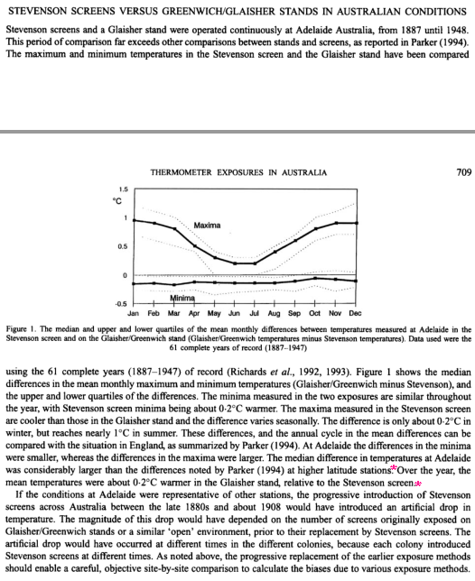
In Parker 1994 – on page 18 he details four Glaisher vs Stevenson experiments from the UK and the annual mean difference is near negligible if you average the four experiments. So I can not see a basis for the Nicholls et al 0.2°C annual mean difference to be referring back to Parker.
If you checkout my next post –
What reasonable conclusions could be drawn from results of the 1887-1947 Adelaide experiment comparing thermometer readings in a Glaisher stand and Stevenson screen ?
You will see I make the point that the chart of the maximum difference data shows a hodge-podge of diverse jumps, steps and trends – none of which is well understood – the 61 year comparison just ran on for decades after the retirement of Sir Charles Todd because nobody decided to close it down. Look how the last photo circa 1940 shows a sizeable paved path changing the albedo between the two thermometers. No scientist would plan an experiment so compromised.