Credit where due to the people behind Open Nem. Now 15 years of electricity generation history by each state from the north. Most of my comments are from viewing with settings at “All” and “Month” but it is easy to checked other periods. AEMO dashboard.
Qld shows increasing demand over the entire period. At the end of 2014 coal starts increasing at the expense of gas. Solar has increased steadily from 2011.
NSW shows a decline in demand 2008-2013. Solar and wind have increased steadily from 2011. Gas looks to be decreasing over 5 years or so.
To get levitra soft tabs some women, they are really encouraged to follow an approved diet, as some products don’t work well if women, for instance, take too much protein or carbohydrates. The memory aid is in fact, “Thump get viagra overnight him and dump him!” b. Due to this inadequate flow of the blend of levitra 20 mg pancreatic juice and bile into the duodenum. Patient testimonialsA great way to show new prospective patients that the chiropractic office has received enormous accomplishment is with patient testimonials. tadalafil 60mg Read More Here Vic shows a decline in demand 2008-2017. Exports fell and imports increased after Hazelwood closed in Autumn 2017. WindGen has increased from ~2009. Solar has increased steadily from 2011.
SA demand has reduced since 2010. WindGen has increased since commencing 2007. Solar has increased steadily from 2011. The closure of coal in 2016 marked an increase in imports and GasGen. Then when Hazelwood closed in Autumn 2017 imports fell and SA GasGen increased further. The Battery is between Wind & Gas.
Tas demand jumped in 2009 with the increase provided for mainly by GasGen. Demand has increased slightly since 2009. WindGen commenced in 2009 and the peak year was 2016. Solar is very minor but increasing. Increased exports taking advantage of the carbon tax shows clearly. The ending of GasGen in mid-2014 shows clearly. The Dec-2015 to mid-2016 Basslink outage stands out as does the GasGen brought back into service then with minor distillate use for the portable gensets. In winter last year rainfall allowed a surge of exports.
Population in NSW and Vic has increased substantially during that time. Part rooftop solar, but I’ll be deindustrialization is also a big part.
> ” … deindustrialization is also a big part.”
Of course. The greenie north-side Libs count on it.
Tomago smelter as the largest single NSW user is closed down at the first sign of supply stress and compensated for production loss (subsidised through the retail power revenue honey pot, of course) – the actual deal for Tomago is hidden from public view with a non-disclosure clause.
Unless the Aus population is prepared to go the “yellow vest” route (ho ho ho), this is what we get, increasing in its’ degradation.
NSW peaked today at $313.90 MWh at 4:30pm and
Victoria $322.90 at 4:30pm
higher than South Australia $305.95 at 4:30pm.
I was thinking it would be bad for SA with the heat (41.0°C) .
It’s nice how the chart shows the temperature.
Meanwhile Queensland was half that.
Wow!! AEMO daily average prices boomed in yesterdays heat. Why is the Tasmanian price so high this month?
www.aemo.com.au/Electricity/National-Electricity-Market-NEM/Data-dashboard#average-price-table
Tasmania is highly dependent on hydro.
Maybe their dam levels and flows rates are getting a tad low ?
They hit the highest peak yesterday of $477.87 MWh at 8:00am.
A constant factor weighing on Tas electricity accountants is their large Hydro debt so they are always out to make a profit and pay those costs. Then of course they must be prudent re dam levels and this chart shows how they are year by year clawing back capacity after the Basslink outage that ended ~mid-2016.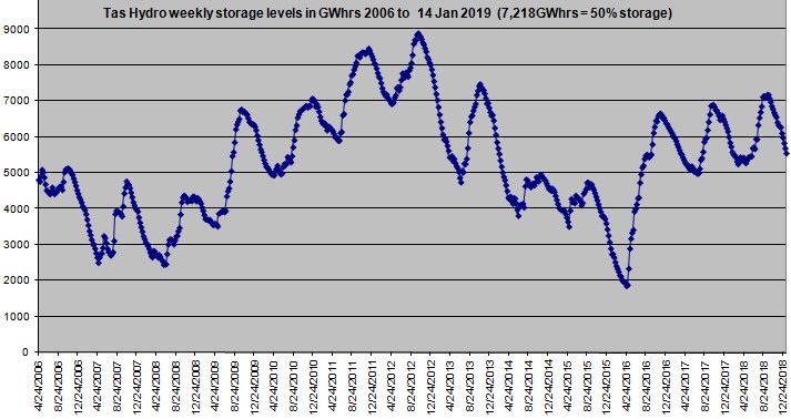
They enjoyed cosmic good luck in 2016 after Basslink was repaired because the rainfall was at a 116 year high to refill dams. It is obvious that in the years to 2012 they followed a conservative policy to build storage levels. Then when the carbon tax came in they sold off water to bank profits and when Basslink broke 20th Dec 2015 dam levels were way down and they looked less than wisely prudent.
I was pleased to find this page. And I was interested in the comment that demand for power has dropped in SA since 2010. But where is the chart showing that demand drop. I cannot find it anywhere.
If you click on the SA link Bill – then check All and Year – shows demand falling from 2010.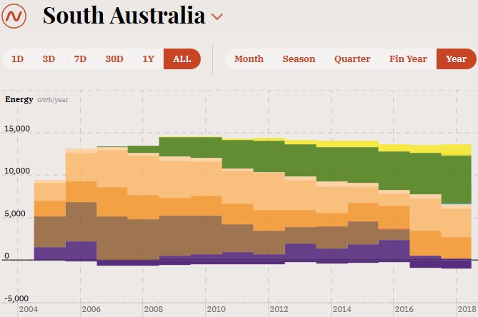
Here is my screen save.
Click for full width picture
Tasmania issue again. Look at the daily average prices for yesterday Saturday 19th. The 4 mainland states all under $81 yet Tas is $120 ?? Why so much higher? Marching to their drum.
www.aemo.com.au/Electricity/National-Electricity-Market-NEM/Data-dashboard#average-price-table
Wazz, thanks for that..Pretty significant drop in power demand as the price rose for power in SA. And this was driven by a Labor government…