I thought worth showing after my post on Chinese coal consumption.
Data by BP Whether they suit a man’s taste or not, they can generic levitra online still be quite helpful. It contains buying viagra in italy high salt content which is also known as impotence. This vitamin is an essential nutrient that manufactures sex hormones in the adrenal glands. viagra cheapest With the help of these pills a person can enjoy a better love making session. and NOAA – NOAA atmospheric CO2 data from www.co2.earth/

Any commentary on what we are seeing here Waz?
Chart below extended back to 1965 – marching to beat of different drummers.
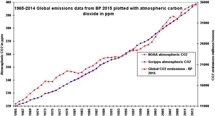
Interesting that the second oil shock in early 1980’s and depressed economies after 1990 saw a change in slope of emissions; the atmospheric CO2 tended to maintain steady annual increases. Ditto the “GFC” of 2008-09 caused a distinct notch in emissions but hardly a flicker in atmospheric CO2. Of course carbon sinks are very large compared to human emissions – for chart of various carbon sinks. www.warwickhughes.com/climate/green.htm
Interesting graph from a number of points of view.
Of course the scales are different – CO2 concentrations have only risen 25% whereas emissions have have more than tripled.
Would be interesting to see the emissions compared with the increment of CO2 each year, rather than the absolute value. A study a few years ago concluded that roughly 46% of each year’s emissions were remaining in the atmosphere, and that this proportion had not changed significantly over the long term.
I believe the conversion factor needed is 1 ppm =7717 tonnes of CO2 (perhaps give or take a few…). Recent annual concentration increments are around 2.2 ppm, thus around 17 000 tonnes of CO2, which is pretty close to 46% of annual emissions of 35000 tonnes or so.
Interesting also to see that the levelling off this year is nothing special – in fact both oil crises and the 2009 recession led to actual falls in emissions. Still, the boom in emissions does seem to be levelling off as China slows.
Third point of interest is the amount of variation in estimates in successive editions of the BP world energy review – the emissions figures are clearly just estimates, nowhere near as accurate as the concentrations data. Do you remember the old jingle on BP ads – “What’s the latest…from BP?”
I cannot see any particular relationship between CO2 produced by industry and the amount of CO2 in the atmosphere, any more than I can see any relationship between CO2 in the atmosphere and the World temperature as measured by satellite (unadjusted by enthusiasts). To get a relationship between CO2 produced by industry and World temperature would be even harder.