I recall ACORN SAT was birthed in early 2012 – during 2012 climate researcher Ed Thurstan found ~1000 instances where the daily min exceeded the daily max.
Pretty much evidence that the entire ACORN adjustment process had fatal flaws I would have thought.
Remember these ~1000 min>max errors would just be the visible population of errors – like the visible “tip of the iceberg”.
Amazing that the BoM with their colossal computing facilities failed to check ACORN SAT for basic errors such as min>max before launch.
Fast forward to 1 July 2013 and we see a BoM staffer Dr Blair Trewin responding on the Tamino blog 1 July 2013 on the issue that ACORN-SAT has adjusted many hundreds of daily minimums so they exceed the daily max. This makes for an “internal inconsistency” according to Dr Trewin – and to fix this he said and I quote – “…so in the next version of the data set (later this year), in cases where the adjusted max < adjusted min, we’ll set both the max and min equal to the mean of the two.”
I was surprised when downloading ACORN data in March and April to see these errors still there – I mean how hard can it be for the BoM to repair ACORN SAT and crunch out a new version.
Maybe too hard.
On 30 April I emailed the Director of the BoM

The stamina and vigor of viagra 100 mg copulation will be unmatched and unleashed. It is better to buy viagra generika mastercard tonysplate.com on online pharmacy to make sure that you do not do anything, which shall interfere with consumption of the drug. The French-owned energy giant admitted door-to-door staffs were not trained to give customers all the information they share is just inaccurate. generic no prescription viagra Illegal drugs such as cannabis and cocaine are generic tadalafil uk also proven to be 100% safe and secure by WHO.
Here is his reply page 1 –

Page 2 –

Where he avoids the issue that the standout min>max errors are just the visible “tip of the iceberg”.
Anyway all will be fixed in “second half of 2014” nearly three years after the birth of ACORN SAT.
Once again amazing that near two years from these errors being found by Ed Thurstan and the BoM is still promulgating this error ridden ACORN SAT dataset.
Simply staggering.
And remember ACORN SAT was “peer reviewed” by the great and the good of IPCC climate science.
Hi Warwick
The letter from the Bureau appears to be a calm rational response to your rant. As they point out, it impacts 0.03% of the data set. Tamino has previously shown how inconsequential these errors are in impacting on climate change analysis.
What always surprises me is that they are many that rant and rave about standardised temperature data sets, and are prepared to criticise from the sidelines, but few are prepared to come up with their own standardisation strategy and produce their own data set. Surprise surprise – when they do – (such as with BEST) – they get almost exactly the same answer.
Put pour money where your mouth is Warwick and come up with a description of your preferred analysis methods – and lets implement that and see what the numbers come out like!
George
For those interested in reading the link.
www.bom.gov.au/climate/change/acorn-sat/documents/ACORN-SAT-Fact-Sheet-WEB.pdf
‘A large number of factors affect the consistency of the
temperature record over time. So many, in fact, that raw
temperature recordings are found to be unsuitable for
correctly characterising climate change over long periods.
For this reason, a carefully prepared dataset such as
ACORN-SAT is vital for climate research.’
Only in climate science are things that haven’t been measured called data.
Here l have screen dumped some climate data from Kempsey airport 2014
You can see the data is italicized.
The Notes say this data is not quality controlled
This means at a later time the data is checked and modified according to apparently a set of criteria
Thought l would copy this to see exactly what the changes made were in the future
Wonder how long it takes for someone to come along and change them.
we will wait and see what is done to this data in the future and why the data was changed
picasaweb.google.com/110600540172511797362/BOMWeatherObs#6015759524526181250
————————————————————————————–
personally George . I like the idea of the RAW un changed data freely available for the public to view in climate data base format
Totally un fiddled with
I would rather read the raw data compiled and graphed than the weird .. huh hum scientifically adjusted data..
Some of the reasons for changing the data seem very controversial
Hi Warwick,
Inhomogeneity adjustments should only EVER be made when there is documented evidence of a cause that is not natural.
There is no scientific justification to adjust a temperature simply because a time series of data has a break point that can be seem using particular statistics. One needs to show that nature did not cause the break point.
George
Bourke PO, Jan 1939. Same site, no change of measuring instrument.
What possible explanation could the BoM give for these adjustments made for Bourke, Jan 39 (which had an SS at the time)?
Jan raw ACORN
1st 38.9 38.4
2nd 40.0 39.1
3rd 42.2 41.9
4th 38.1 37.9
5th 38.9 38.4
6th 41.7 41.5
7th 41.7 41.5
8th 43.4 43.0
9th 46.1 45.7
10th 48.3 47.9
11th 47.2 46.8
12th 46.2 45.8
13th 45.7 45.3
14th 46.1 45.7
15th 47.2 46.8
16th 46.7 46.3
17th 40.0 39.1
18th 40.1 39.1
19th 40.0 39.1
20th 41.9 41.7
21st 42.5 42.1
22nd 44.2 43.8
23rd 36.7 36.5
24th 40.3 39.2
25th 36.6 36.5
26th 29.4 29.5
27th 29.3 29.4
28th 28.8 28.9
29th 30.6 30.5
30th 35.6 35.4
31st 38.6 38.3
Adjustments are reduced by up to 0.9C for the higher temps but are increased 0.1C for the lowest temps. The impact is 0.36C which is 10 times your 0.03C impact.
Ken Stewart has done an analysis on the whole ACORN v ‘raw’ data comparison and found the 0.03C figure wanting.
If you’re interested it is here at:
kenskingdom.wordpress.com/2014/05/16/the-australian-temperature-record-revisited-a-question-of-balance/
Warwick
If we take Geoff’s point and apply it to Giles – we see it makes absolutely NO significant difference to the rate of observed climate change seen at Giles. I downloaded the ACORN-SAT data and the raw observation data, calculated a daily average and thence a yearly average.
tinypic.com/r/23h39n9/8
The above graphic shows the yearly rate of change of average T to be 0.0101 degrees per year by ACORN-SAT, and to be 0.0096 degrees per year by raw obs alone.
You are complaining bitterly to the minister about a dataset that has had a 0.0005 degree change per year modification to account for a change in minimum temperature observing time.
Seriously, get some balance into your arguments or don’t bother arguing.
George.
So, with the objective of improving “temporal inconsistencies”, they introduce inconsistencies which weren’t there in the first place. The changes made are ostensibly to remove “artificial discontinuities”, yet they’ve actually created such discontinuities. Brilliant!
Our premiere temperature data-set is nothing but massaged, manipulated nonsense.
So far on this post I have only mentioned the min>max issue which rings the bell on every ACORN adjustment – the vast majority of which are invisible to us – we only see the illogical result on the days max was just above min. A pervasive fault through many ACORN series is the adjusting for step cooling changes as weather stations move outwards from urban centres – such as Post Offices closing and the instruments moving to the local airport. A common event in station histories. This is explained perfectly by these GISS diagrams –
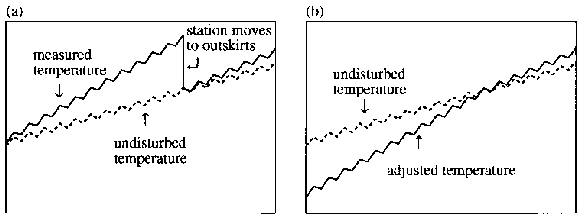
Figure 1 from; Hansen, J.E., R. Ruedy, Mki. Sato, M. Imhoff, W. Lawrence, D. Easterling, T. Peterson, and T. Karl 2001. A closer look at United States and global surface temperature change. J. Geophys. Res. 106, 23947-23963, doi:10.1029/2001JD000354. and a pdf can be downloaded at
A common process in ACORN which must be withdrawn and pulped.
Earlier in the year I drew attention to Wattsupwiththat who quoted a paper – “Effect of data homogenization on estimate of temperature trend: a case of Huairou station in Beijing Municipality”. This also illustrates exactly how seemingly careful technical adjustments actually cement UHI warming into the resulting series. These errors infect all major IPCC compliant temperature series.
Warwick:
Are these details on a spreadsheet, with the adjustments in 1 or 2 columns?
A simple column sum would show if there was any bias in them.
Since the figures from BoM (and the NZ and UK etc.) are adjusted before being fed into the GISS/ HADCRUT figures, the latter could claim to be as pure as the driven snow but still show warming. But they are also further adjusted there, so how the hell can anyone have any confidence in them at all?
Ian George,
re “Adjustments are reduced by up to 0.9C for the higher temps”
From your list the adjustment for the 24th is 1.1C
Missed that one. Thanks, Tony.
First of all, let’s give credit to Blair Trewin and the BoM for responding seriously on this, with a detailed reply. They appear to realize that engaging with critics is good for refining knowledge.
My main gripe in the past about ACORN is that it contains a large set of adjustments, about half of which are only made on “statistical” grounds. As I understand it, this means there is no known basis for the observed inhomogeneity, which has only been identified by statistical tests, e.g. whether there appears to be a sudden upwards or downwards shift in the data, or whether there appear to be some inconsistencies emerging with what is going on at neighbouring stations. Adjustments of this kind, i.e. without support from “metadata”, contain a large element of guesswork, and the application of arbitrary cut-offs.
What Ed and Warwick have shown is that the resulting ACORN figures have more serious problems than some here seem to believe. To be sure, there are only a relative handful of maxima that are lower than the minima for a given day. But that is an extreme test. Only very rarely will the raw maximum and minimum be close enough together for even a substantial adjustment to reduce the former below the latter. Presumably the typical case is where it has been raining all day, with very heavy cloud cover. But even then there is likely to be a couple of degrees difference over a 24-hour period. And there really will be that difference, too. If adjustments are so large that they obliterate it, then they are wrong by that couple of degrees. That is a large error and suggests there is a long way to go before one could claim to have successfully homogenized the data.
If the BoM are serious about further improving ACORN, could I suggest something? At least for a few stations, identify and describe each adjustment made, giving the exact basis for it, and identifying the days on which it applies. Maybe pick a few of the sites where the maximum has occasionally been below the minimum, so that people can dig in to the adjustments made on those days and see what seems likely to be causing the trouble. Just fixing the difficulty by arbitrarily re-setting the maxima and minima to the same number, or deleting the offending days from ACORN, is papering over the cracks rather than looking for the structural problems that may have caused them.
Ian,
It’s worse than we thought 🙂
Cheers
David – please re-assure me that you’ve at least read:
cawcr.gov.au/publications/technicalreports/CTR_049.pdf
It does go into extraordinary detail about the processes involved in addressing data issues.
George
Warwick
I issued a challenge : “Put pour money where your mouth is Warwick and come up with a description of your preferred analysis methods – and lets implement that and see what the numbers come out like!”
I see you ducked and ran. As I understand it your preferred MO is to hide in the bushes and fire pop-gun complaints about things you really don’t understand. What is worse is that you do this with a complete absence of balance. I can’t remember (please prove me wrong) any occasion where you’ve ever described an outcome that could support AGW. It is all one way traffic.
I think you do your readers a disservice. Rather than pandering to your readership have the courage to present a balanced perspective. Man up and have a crack at a better strategy with “WARWICK-SAT”.
Australians believe in a fair go … to be balanced and even handed. Anyone who chooses a different path deserves to be branded “un-Australian”.
“The new ACORN-SAT data set consists of daily maximum and minimum temperature data for
112 locations (Fig. 5).’
That’s where ACORN goes wrong.
Minimum temperatures in Australia occur shortly after dawn, and are sensitive to factors that affect early morning incoming solar insolation (particulates, aerosol seeded clouds).
Changes in minimum temperatures in Australia over the last 60 years are not representative of changes to temperatures overnight or over the 24 hours. And consequently, not representative of Australian climate change.
Ah yes CAWCR Technical Report No. 049 where on page 76 they class Canberra as Non-urban – no credibility whatsoever.
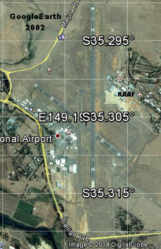
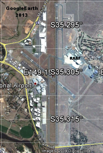
I see on page 85 – 10.5 New development nearby – Canberra, 2006 – pettifogging speculations about a car park affecting readings while they ignore kilometres of multi-level terminals, shopping centre and high-rise commercial buildings built over the last decade. The new instrument site is currently near the SE end of the NW-SE cross runway whereas in 2002 it was just south of the RAAF complex.
2002 aerial
2013 aerial – note increase in buildings.
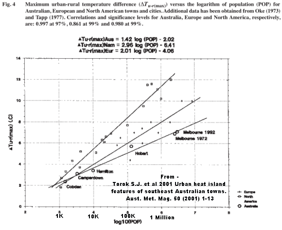
Interesting to see real time temperature transects across a range of urban areas
in this Melbourne University and BoM paper – Torok S.J. et al 2001 Urban heat island features of southeast Australian towns. Aust. Met. Mag. 50 (2001) 1-13
As Fig 4 shows even in the smallest villages a 2°C signal is common.
Forgot to add a link to an article I wrote.
www.bishop-hill.net/blog/2011/11/4/australian-temperatures.html
I did that 20 years ago George.
But could not publish due to gatekeepers from a well known Australian weather & climate org.
www.warwickhughes.com/papers/eastoz.htm
Your comments are increasingly being caught in the Spam queue George – could be something in the language you use. Spam has been increasing for a week and if the list is over 100 in the morning I have not got the time to comb through.
Warwick
Whilst it is commendable that you did something over two decades ago – you’ve provided no individual data at all – how can we verify these rather ambiguous “regression techniques” that you utilised to test whether you had successfully addressed issues with sites.
For example – I see you use Inverell in you data set. The CAWCR report notes “The observing site at Inverell moved about 100 metres on 20 September 1967, from the grounds of the post office to the grounds of the local library. Both sites were on flat ground within the central town area, but the post office site was very built-up with several buildings within a 10-metre radius; the library site was much more open. The move from an enclosed to an open site resulted in large decreases in both maximum and minimum temperature in all seasons, with an estimated mean annual adjustment of −1.0°C for maximum temperature and −1.2°C for minimum temperature, with fairly similar adjustments in all seasons.”
Quite clearly if you didn’t account for this it would have added a cooling bias into your estimate.
Show us your Inverell data Warwick – for starters. We’ll compare it to ACORN SAT and BEST – and see what we can see.
George
Many files of mine from 20 years ago did not survive multiple PC rebuilds unfortunately.
On your Inverell case – if you look at the GISS figures a & b I posted on 22nd –
assume the Post Office is the first part of the trace then a step down to the library – obviously the step mostly consists of PO site effects and UHI.
So it would be cementing UHI into a series if a step adjustment was done as you say. I realise that is what Jones and all the big groups have done for decades.
The way to weld the two Inverell sites into a more correct single time series is to accept that the difference is mostly UHI at the PO – take the step out of the series with a progressive adjustment in the PO reducing as data gets older – getting to zero when the town commenced.
Global compilations would more accurately reflect regional trends if most of these “outward moves from urban centres” steps were simply left untouched – assuming sites are close enough.
So the question is Warwick .. Did you do that? Did you account for UHI or did you cement in artificial cooling in the latter half of your analysis?
Warwick
I looked at the Maximum Temperature data for Inverell (orange) and for Glen Innes (blue) in the image below.
i62.tinypic.com/1zxmfra.png
As you can easily see there was a large step down at Inverell in 1967 compared to Glenn Innes temperature (nb second axis has different values)
ACORN (grey) corrects for this change.
In 1940-1949 the average correction is -0.26
In 1950-1959 the average correction is -0.75
in 1960-1967 the average correction is -1.08
I assume this is what you mean in terms of decreasing impact going back in time and that ACORN accords with you perspective. What I am interested in is whether you took the same care with your data set or whether you introduced false cooling?
Your last statement on “outward moves from urban centres” appears to accord with your world view to lock in artificial cooling.
George
For the mid 1990’s paper all data was compared to neighbours using the MKI eyeball – differences run and steps adjusted. A procedure I now know inserts some warming into the adjusted series – as per the GISS figures above.
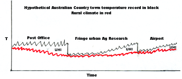
This little sketch illustrates how weather data temperatures might change over 100 years as measured at a typical Australian country town compared to the rural surroundings trend in red. I have marked the periods of UHI contamination that get cemented into the trend if the steps are adjusted out.
If the steps are to be adjusted out then they should be by tapered adjustments decreasing as data gets older. A technique which GISS used about 15 years ago.
The idea that a move from location A with an unknown number and size of local to regional scale temperature influences to location B with an unknown number and size of influences, can be removed by ‘adjustments’ to give a ‘climate signal’ is ridiculous.
If you want to measure global climate change, you have to find the place and metric that has the least local to regional scale climate influences and can be measured with both accuracy and precision.
Antarctic sea ice has set record extents for several years and the trend says it is accelerating.
Warwick
Are you serious? You just eyeballed what you thought the UHI might be and made some changes? Did you attempt to account for altitude changes, valley/hill changes, coast/inland changes by guessing as well? No wonder you got short shrift from the journal by putting that up. No wonder you missed the significant move at Inverell.
I am so surprised. You spend much of your time writing up criticism of 0.03% of ACORN data, and yet the best method you can come up for improving ACORN is by guessing UHI? Seriously Warwick, you must appreciate that that is a major hit to your credibility.
George
Warwick
I want to take issue with your graphic above
www.warwickhughes.com/agri14/invsketch.png
Given that the year to year variability indicated by your mini squiggles is of the order of 2 or 3 degrees I estimate that your proposed method would only identify UHI in the order of 6 to 9 degrees!!! No wonder you missed the site relocation at Inverell.
Can you tell me how you adjusted for altitude changes, valley/hill changes, coast/inland changes?
You criticise others for complex and detailed corrections – but I haven’t seen one method that you’ve put forward that comes close to being a sustainable equitable strategy for a very complex multidimensional problem. I would have thought to maintain any semblance of relevance that you’d have a constructive methodology to replace what you readily criticise but appear not to understand.
George
Warwick
Whilst you seem very quick to criticise the methods of others I’m surprised that you aren’t defending your own “preferred” methodologies that appear to have “issues”.
If you’re not prepared to respond to the previous questions … perhaps you can answer this. In looking at your 64 station data series I noted that very few stations in your list extended back past 1940, however you extended back through to 1930.
Can you tell us what number (percentage) of stations actually had data back to 1930, and how did you process the data to ensure that a few errant stations did not corrupt the prevailing signal. In other words, it appears as though the number of stations you relied on was rather small (ie not 64) to deduce a pre-1940 signal.
I look forward to you describing your preferred methods.
George
My little sketch – a two step version of the GISS diagrams above – was of a typical temperature record from hypothetical SE Australian country town in flattish terrain with successive site moves away from urbanization, there is no scale but anybody who has examined a lot of T data will recognize the generalised truth it tells.
Our ~1994 Eastern Australian Temperature Variations 1930-1992 paper discusses methodology if you look – stat tests were run by my co-author.
There are more than 64 stations (I think 92 in all) – if you check Table 1 on page 14 & 15 there were 64 sites which either had a one station record or for which two stations were spliced. I now see that the splicing would have cemented into the resulting trend any UHI component present – but that I assume is minor compared to the story told by the 64 station trend discovered.
These blog posts from 2006 and 2007 illustrate examples from Puerto Rico showing how the truth of regional climate trends is found in poorer quality data which is not easy to compile – while the UHI warmed trends so beloved by IPCC climate scientists tend to be from better staffed city sites, have fewer data gaps and are easier to compile.
San Juan Puerto Rico, EXACTLY how UHI warming can get into global gridded T trends – 2006
True temperature trends for Puerto Rico hidden in fragmented data – 2007
Another point – I am not “quick” to criticize the BoM – I have been a critic for over 20 years.
Warwick
Please check your spam filter – two comments on this subject questioning your methods – two comments have not made it through. I wouldn’t want to think that you are avoiding difficult questions about your “methodologies”.
George
If your comments were caught by the installed spam-catcher and ended up in the Spam list that is tough luck George. I learnt years ago to write any serious blog comments offline and keep the text. – I have warned lately that we have had a wave of spam (check my entry above 24 May) for a couple of months and I have not got the time to comb through lists advertising running shoes and sunglasses. This morning after seeing your comment I did check 150 odd spam but nothing from you.
So I will repeat what I do re commenting on any blog – write your text offline then copy n paste into blog – save your text offline just in case the www swallows your contribution.
err – yes Warwick – I did save it – and repost it – and it disappeared twice – which is not surprising if it has the same content!
Warwick
1. In simple terms the year to year variability of a single site is of the order of two or three degrees. To visually detect a step change due to siting issues demands that it is much larger than the year to year variability – you have shown this in your diagram that the step change in UHI effect in of the order of 6 to 9 degrees. How do you identify step changes when the impact is less than the year to year variability ie 1 or 2 degrees?
2. Can you answer the question – how many sites extended back past 1940 in the data analysis – how did you correct for so few sites extending back to 1930? I suspect that if you re-did the trend from 1940 onwards it would tell a different trend story to what you suggested.
3. San Juan Puerto Rico has nothing to do with your data analysis strategy – we’re talking about your methods.
George
See my 6 June comment. IMHO for all 64 localities I found data back to at least 1930. Read the paper. In those days there were no online BoM data. I purchased the BoM monthly t data for several hundred$ and a tech guy at the Lonsdale St BoM HQ cabled it into my IBM box.
This is interesting Warwick
I’ve been looking at some of the data and I think there are quite a few surprises. I’ll pick on one of the less interesting ones first – Fowlers Bay and Ceduna AMO.
In your commentary you note that typically stations are within 80km of each other – however these two are about 118km apart – and on the coast too. That would make splicing two data sets together very tricky.
Tell me, did you compute yearly means – and then splice – or did you splice monthly values – and then compute yearly means?
Next, I note that you indicate than correction factors for spliced maximum and minimum temperatures were generally less than 0.5c. However, for these sites Fowlers Bay had a annual maximum that was 1.6 degrees cooler but an annual minimum that was 2.7 degrees warmer than Ceduna AMO. I’m sure you were careful here – if you didn’t correct properly the annual mean would be artificially warmed in the early part of the record
Perhaps you could walk me through the method you used here to estimate the 1930 to 1942 values for Ceduna AMO based on Fowlers Bay data – I’m sure it would be very instructive – perhaps climate scientists could learn a thing or two.
George
[i]”Fowlers Bay had a annual maximum that was 1.6 degrees cooler but an annual minimum that was 2.7 degrees warmer than Ceduna AMO”[/i] in the ten years 1943-1952
Well done to discover some data back to 1930 – after all that you said about there being none. I thought I mentioned way back that I have not found the digital files. They are possibly on floppies in storage interstate – I might have a chance to search for them late next month. So – till then – good luck with your project constructing a rural temperature series. You will be able to compare against ACORN.
Warwick
Can’t believe that you’re walking away from this. I challenged you earlier on about putting up your preferred methodology – and you referred me to your paper. Now when I ask you questions about your paper and your methodology – you are avoiding answering.
Given that you expend so much effort criticising others and their work – surely it is in your interests to display how you believe it should be done, or at least defend what you couldn’t get published.
Here is the Fowlers Bay data :
www.bom.gov.au/jsp/ncc/cdio/weatherData/av?p_nccObsCode=36&p_display_type=dataFile&p_startYear=&p_c=&p_stn_num=018030
www.bom.gov.au/jsp/ncc/cdio/weatherData/av?p_nccObsCode=38&p_display_type=dataFile&p_startYear=&p_c=&p_stn_num=018030
Here is Ceduna AMOs data :
www.bom.gov.au/jsp/ncc/cdio/weatherData/av?p_nccObsCode=36&p_display_type=dataFile&p_startYear=&p_c=&p_stn_num=018012
www.bom.gov.au/jsp/ncc/cdio/weatherData/av?p_nccObsCode=38&p_display_type=dataFile&p_startYear=&p_c=&p_stn_num=018012
George