I noticed the BoM minimum temperature Outlook map for November was a blaze of red predicting that huge areas of the wide brown land had an 80% chance of having way-way-hot nights. And not 1 square centimetre of Oz was predicted to enjoy cooler than average nights. Larger map.

If you go to the current month Min anomaly map and choose weekly – you can tick back to earlier weeks and it is obvious the BoM min t Outlook map for Nov is a monster fail.
Warwick,
Re: Current Sydney Max Temp ‘record’ for this November weekend.
I notice from Geoff Derrick analysis of the William Dawes early temperature observations ( 1788-1791) vs BoM observations (1859-2018)- (see reference link below) that the Nov Max Mean from Dawes was much higher than the Nov Max Mean of the BoM observations.
It is remarkable, given all the development around Observatory Hill (leading to an increasing UHI effect), that this is so.
Ref:
Naturally this weekend’s heat is being highlighted in the MSM with implications of further poof of ‘Global Warming’.
Your comment would be appreciated.
Cheers, John Barrett, Perth.
I heard TV news John but I see the BoM have not yet settled on the max for Sunday at various sites. I have not gone into the details of the Dawes data. Note too that Astronomer Tebbut’s data from near Richmond was collected 1863-1897 – I have monthly data for Tebbut but have not seen dailies just now – might be still in hardcopy. This blog from January 2018 refers to Tebbut’s data. www.warwickhughes.com/blog/?p=5508
More later John. I see Michael Smith reporting on a BoM tweet re their 47 degrees reading from Badgeries Creek – Bureau of Meteorology admits yesterday’s Sydney record hot temperature reading was dodgy 29Nov20 and subsequent to the that Today’s first lemming – so-called academic Wendy Bacon takes the bait using bullshit statistics to push climate change 29Nov20
Just saw this wrap of last few days records.
Weekend heatwave sent records tumbling in SA and NSW — and it isn’t over yet
www.abc.net.au/news/2020-12-01/weekend-heatwave-sent-records-tumbling-in-sa-and-nsw/12935088
Thanks Warwick for the links. Here is a slide I constructed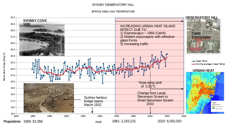 of the historical Spring mean max temperatures at Observatory Hill (graph is from the mean of the monthly mean max temperatures for October-November posted on the BoM website). The annotations and photos come from various sources on the internet.
Although, people like ourselves understand that these record temperatures should be taken with a grain of salt, the way they are presented by the MSM give the impression that the so called green house emissions are the sole cause. For larger image
Actually, for the whole month, the BoM’s outlook does not look so bad, although they still failed to predict the below average temperatures parts of northern Queensland and Western Australia: www.bom.gov.au/jsp/awap/temp/index.jsp?colour=colour&time=latest&step=0&map=minanom&period=month&area=nat
On closer inspection though, the BoM’s accuracy is “worse than previously thought”, to use a trademark warmist phrase.
The medians that they use for their forecasts are 1990-2012 (see www.bom.gov.au/climate/ahead/about/#tabs=Medians). But the means that they use for outcomes are 1961-90 (see note under each mean map).
This set-up leads to a couple of undesirable effects. First, every outlook is biased warm, since on the BoM’s figures temperatures these days are are at least half a degree warmer than during 1961-90. That may not sound much, but if the median is even slightly too low, it significantly increases the probability that any given month will exceed the median. That in turn makes the models seem more accurate than they are. If your median is too low, you will be constantly predicting that it will be exceeded, and you will be right most of the time.
The second problem is that the BoM’s outlook and outcome maps are not directly comparable, in two dimensions. First, the base period is different; second, the median isn’t the same as the mean. It almost seems as if the BoM are deliberately making it harder to judge the reliability of their outlooks.
In reality, though, these incoherencies are probably just accidental results of the fact that “The ACCESS–S climate model is a collaboration between the Bureau of Meteorology and the UK Meteorological Office (UKMO).” The parameters of the outlook model may well have been set by Granny Met Office in the UK.
Still, if its outlooks are to have any use at all, the BoM should at least fix the first problem by updating the 1961-90 medians. It is just crazy to predict practically every month is going to be warmer than usual over most of the continent, when “usual” refers to a period centred on 1975. Doing it this way gives farmers and graziers virtually no idea what to expect relative to more recent conditions, even assuming the outlooks were accurate.