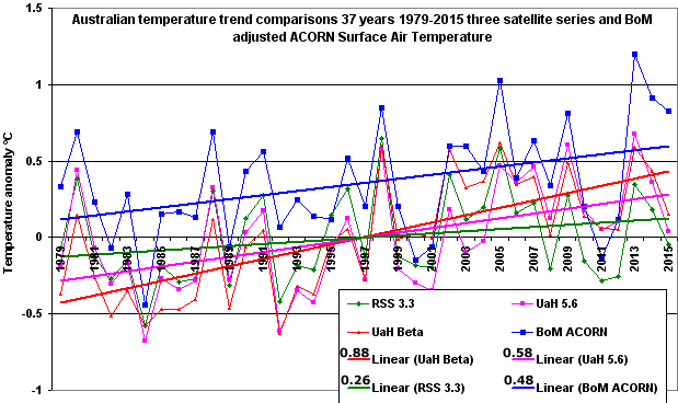
Comparing data for RSS V3.3, UaH V5.6 and the UaH V6Beta for the exact 37 years 1979-2015 (data from KNMI Climate Explorer using the Australian mask) – The trends using the Linest function in Excel are RSS V3.3 – 0.26°C, UaH V5.6 – 0.58 and the UaH V6Beta is an eye watering 0.88. IMHO huge differences shown in these KNMI charts.
First RSS –

Then UaH V5.6 –

Finally UaH V6Beta

I have posted on these issues a couple of years ago – I think the differences in overall trend are increasing.
Warming departure in UAH lower troposphere satellite temperatures compared to RSS over the period 2005-2006
and –
Difference between UAH and RSS satellite lower troposphere T anomalies has a distinct step change 2004-2005 over the USA 48 States – not as marked as Australia
I see this ABC article
BoM climate report finds 2015 among top five hottest years for Australia
www.abc.net.au/news/2016-01-06/2015-among-top-five-hottest-years-for-australia-bom/7070258
None of the satellite charts have 2015 ranking near 5th. Can you do a chart showing the data the BoM are relying on?
The closest BoM series I can find is the ACORN annual mean t anomalies at Time Series –
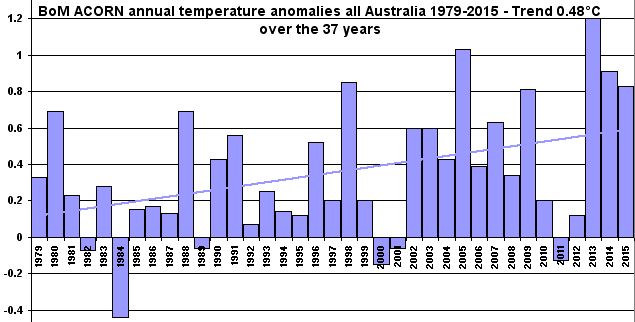
www.bom.gov.au/cgi-bin/climate/change/timeseries.cgi
Here is chart I made of those BoM ACORN data –
When the 3 satellite series are charted with the BoM ACORN series – this is what shows –
note the BoM series sits higher than the satellites because it is clipped from a 1900 – 2015 series.
Remember that over the 37 years, RSS trends @ 0.26, BoM @ 0.48, UaH V5.6 @ 0.58 and the UaH V6Beta @ 0.88.
For BoM 2015 is the 5th warmest year.
For RSS 2015 is the 17th warmest year.
For UaH V5.6 2015 is also the 17th warmest year.
For UaH V6 Beta 2015 is the 11th warmest year.
Just when you think the satellites have got it all worked out – now that the RSS and UAH series match in global trends down to a hundredth of a degree a decade – one finds these strange discrepancies and major adjustments. Good sleuthing, Warwick!
It’s strange that while the global trend in the UAH series has declined, the trend for Australia has gone up.
Another weird aspect is the uneven nature of those adjustments to the Australian record. The UAH 5.6 and UAH 6 series are close together for much of the period, but then lurch apart, especially 1999-2004. Presumably this has to do with different mixes or adjustments among the satellites – most of which last for 5 years or so, though their longevity is increasing.
Roy Spencer’s account of the changes is here – www.drroyspencer.com/2015/04/version-6-0-of-the-uah-temperature-dataset-released-new-lt-trend-0-11-cdecade/. Presumably the explanation of the Australian adjustments is buried in there somewhere – NOAA 14 seems a likely candidate to be causing the divergence noted above for 1999-2004.