Lance Pidgeon has produced these “screenshot” Youtube videos where he takes apart BoM maps – enjoy. Daft junk maps from the Australian Bureau of Meteorology. This first video shows just how basic simple, obvious and indefensible some of the mistakes are. If you ever wondered about the climate data you see from the Aussie Government websites adding up? Primary school math is all you need to see it sometimes does not! Part 1 takes you back to the November 1925 maximum anomaly map which has a prominent peak bullseye anomaly in western South Australia – but the daily max anomaly maps show no sign of this as you click through from the 1st to the 30th. Obviously the BoM data behind these maps is not worth a cupful of warm spit. Enjoy Lance’s video. Part 1 — Part 2 begins to show how the errors seen in part one are not a one off but that the old temperature data maps are riddled with silly errors.Part2 — Part 3 — Part 3 Looks at claims about the QA process and how it has failed. Part 3 also shows the problems are not confined to just one part of the country.Part4 — Part 4 Road tests two claims from the BoM. One about estimation in data sparse areas and one about copying off some one who looks like they know what they are doing (using worlds best practice).Part 5 — Part 5 After the problems caused by data sparseness in the previous video looks at an example of missing data. It becomes obvious that missing old records have a perversion effect that the BoM is aware of but does not seem to have spent enough effort fixing.Part 6. Part 6 looks at a mystery annual square wave pattern of monthy steps in cycles that create fake colour data on the maps instead of a grey or no data indication . The square waves seem to have infected nearly all of the ACORN numerology.
Looking at video Part 1 first – Here is the Nov 1925 max anomaly map – but as Lance shows – there is never any serious anomalous heat in western South Australia on any day in November 1925!!
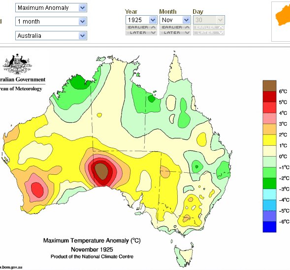
What is the BoM smoking???
It gets worse. I have just looked at part 2. Scrolling through Jan. 1925 near the end, you see max temp anomalies in southern WA of up to above plus 6 or below minus 12, separated by only a couple of hundred miles – see especially the 15th and 25th. Heaven only knows what is behind such differences – it can’t be the actual weather, you would need to have an all-day cyclone over one spot in the middle of a heat wave.
Warwick
This reminds of our discussion regarding NSW max temps in Oct last year when the BoM claimed the average was +4.03C yet the actual temps for NSW w/s averaged out at less than 3.0C.
Eucla shows daily records from 1957, but monthly from 1926, so i guess they just ignore daily and infill monthly from surrounding stations with averaged monthly conditions. the calculations for monthly average for a certain area are always wrong due to the fact that they dont actually know the average.
this is proof that they are creating a past that is not only wrong, but always wrong in the same direction.