These pages will review Bureau of Meteorology (BoM) handling of aspects
of climate change issues over the last 15 years.
In order to logically explain the entire skein of events and attitudes
that will unfold here in weeks ahead, it would appear that from the
mid-1980's the BoM favoured a prevailing attitude that greenhouse
/ global warming constituted such a threat that the entire raft of IPCC
attitudes became the preferred in house option.
This page is starting with a letter to the editor
of the Australian Meteorological and Oceanic Society (AMOS) magazine
in about 1993 by Craig Bohren, a meteorologist from Penn State
who had maybe been on a study tour in Australia. After some interesting
and perceptive comments about the impact of the entire greenhouse bandwagon
on meteorologists, the letter has some not so kind things to
say about climate modellers, ending up by suggesting in a polite way, that
climate modelling can be likened to simulated sex.
It sounds to this writer that Craig had been at least for some time
with CSIRO Division of Atmospheric Research which had/has more climate
modellers than the BoM and which generally carries on research further removed
from issues of current weather. Link to The Lavoisier Group and look
for "papers" with interesting letter from Dr G. Pearman Chief of CSIRO
Division of Atmospheric Physics. Poor Dr Pearman has been put
to explaining why unjustifiable claims re global warming were made vis a
vis the CSIRO Cape Grim trace gas measurement site. Note
the last page of his letter to the Business Council of Australia and if anyone
knows who / what he is referring to in his references to "...amateurish,
if not deceitful attempt to discredit the efforts of hundreds of scientists
around the world using half baked and poorly informed.......",
please let me know.
These pages will have more points to make about CSIRO at a later
date.
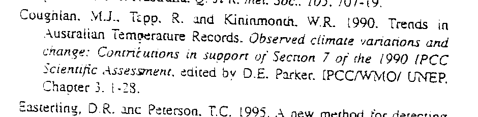
BoM Paper, Coughlan et al, 1990, "Trends in Australian Temperature Records"
This paper by three senior BoM staff, which unfortunately was not published in a Journal, defined urban heat island (UHI) magnitudes by various comparisons between central city sites in all the Australian state capitals and their respective airports, more than one satellite site in the case of the larger cities. At the outset it has to be said that this method is deficient because the airports temperature record data are also contaminated by the UHI (see page on Sydney), so in fact the paper compares a large UHI with a slightly smaller UHI at the airport. Note on the Sydney page how the airport UHI has grown faster over the last 30 years than the central Sydney site.
Irrespective of the point that the methodology of the BoM paper was
faulty in that it failed to measure the entire UHI (just the UHIcity minus
UHIairport), they still found substantial artificial warming on the
scale of global warming. A section from the Coughlan et all 1990 is
in italics below. Download 300KB zip file
of 18 gifs of Coughlan et al
3.3 Mean temperatures
Estimates of the trends in the annual average daily mean temperature also indicated warming at most of the non-urban sites except Brisbane Airport. The strongest warming over the periods examined was 0.26 C decade~1 Mean temperatures at Brisbane Airport cooled by approximately 0.03 C decade 1. Trends in urban-rural differences were all positive.
These estimates are greater than those of the trends this century, reported
by Jones et al. (1989), in annual mean Southern Hemisphere air temperature,
over both land and sea, and sea surface temperature, which have all shown
rises of approximately 0.06 C decade 1. These trends are also
larger than that reported this century for the contiguous United States,
even before any urban component of that trend was removed (Karl and Jones
1989)."
Readers can rest assured that comments to Journals are a frequent event when scientic differences need resolving or areas of disagreement need clarifying. A body with the prestige of the BoM should have had no problem getting its voice heard in the Journal if the will was there. The prevailing view in the BoM was obviously that it was more important not to "rock the new IPCC boat", than to correct blatantly bad science. Considering Australia's great interest in the development of IPCC policy as a large coal exporter, policymakers today should be asking the BoM for a public "please explain" over their 1990 meek acceptance of the bad science involved in the use of Australian temperature records containing UHI exaggerated warming trends, by the UK CRU / Jones research group and the IPCC.
And, do not forget Sydney is still being used to measure "global warming".
Senior staff from USA climate giant NOAA / NCDC are responsible for the definitive recent paper on global Daily Temperature Range (DTR).Easterling, D.R. et al., 1997, Maximum and minimum temperature trends for the globe, Science, 277, 364-367.
Read about systemic faults in their data, plus the usual "turn a blind eye to the UHI" methodology and see for yourself the most error ridden colour diagram ever to appear in a modern climate Journal.
Your taxes at work.
More to come.
Posted 30, August, 2000
Updated 13, June, 2002
© 2000-2001 Warwick Hughes,