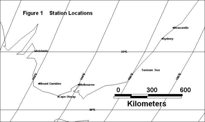
Figure 1 shows locations for Sydney, Melbourne and Adelaide with neighbouring stations.
Has SE Australia Warmed or
Cooled over the last 100 years ?
Contrasting
interpretations, GISS / NASA vs Bureau of Meteorology
This page presents three Australian State Capital
temperature records compared to nearby rural or more rural
neighbours.
This is a significant area for study because south eastern
Australia has probably the best set of long term rural
temperature records in the southern hemisphere.
GISS / NASA adjustments for urban warming are presented in
the case of the State Capitals, contrasting with the
Australian Bureau of Meteorology (BoM) adjustments. BoM
adjustments are also presented for the more rural stations.
The BoM adjustments are from the Torok and Nicholls paper,
"A historical annual temperature dataset for
Australia", Aust. Met. Mag. 45 (1996) 251-260.
For consistency, all three graphs present the data as
follows;
Note that GISS does have adjusted data for centres over 9,000
population such as Newcastle and Mount Gambier but these are not
used here. They would make the comparisons even more
marked.
Figure 1 shows locations for Sydney, Melbourne and Adelaide
with neighbouring stations.
Figure 2 shows Sydney - Newcastle comparisons and the striking
difference in trends between GISS and the BoM is obvious.
While GISS adjusts Sydney for the gross urban heat island effect
(UHI) and finds a trend very close to Newcastle.
The BoM authors adjust Newcastle and find a more warming trend
similar to the their Sydney data. The Newcastle
station is at Nobbies Signal Station on a headland at the
entrance to the Hunter River and would be influenced to
some extent by the UHI from this industrial city of 135,000
population. Sydney's population is listed by GISS as
2.8 Million.
Figure 2
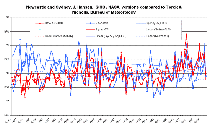
Figure 3 shows the contrasting data for Melbourne compared to
Cape Otway, a lighthouse site.
GISS takes the approach of adjusting for Melbourne's very large
UHI (2.58 Million population) and finds a mild cooling
trend. The Cape Otway raw data probably need a
pre-1900 cooling adjustment but possible not as severe is that
laid on by the BoM..
The BoM adjusts Cape Otway resulting in a slight warming trend
similar to their adjusted Melbourne
Figure 3
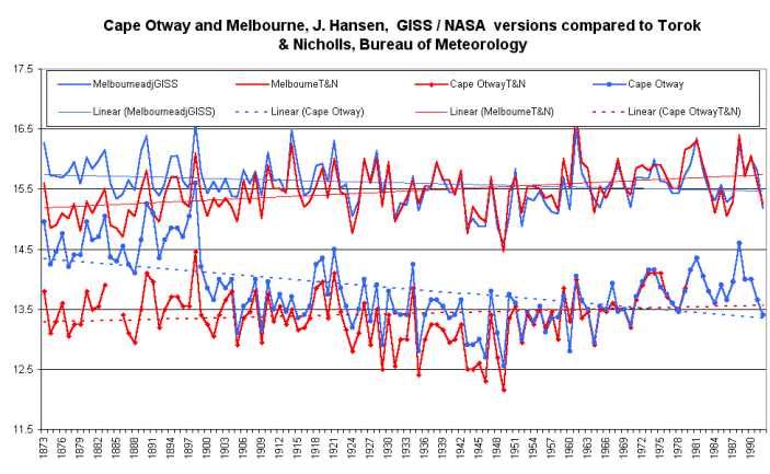
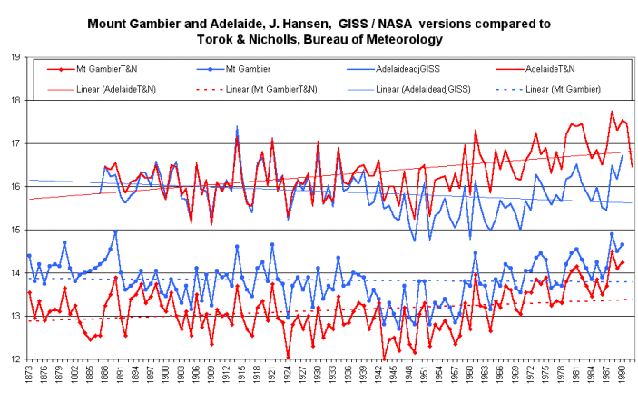
Figure 4 shows comparisons between Adelaide and Mount Gambier.
As in the previous cases GISS adjusts Adelaide and find a
cooling trend close to that for the near rural Mount Gambier.
The BoM adjusts Mount Gambier and produces a larger warming trend
than the raw data for Adelaide. Mount Gambier has a
population of 18,000.
The BoM adjusted time series for Adelaide must be one of the few
times temperature data from a city of this size (883,000
population) have been given a warming correction.
Research for the Torok and Nicholls paper was partly funded by
the National Greenhouse Advisory Committee.
Figure 4
This review highlights a fascinating situation where two research groups produce radically different results from the same raw data.
One important question raised by this review is, "has south east Australia warmed or cooled since the late 19 C." ?
© Warwick Hughes, 2000
www.globalwarming-news.com
Posted 27, Sptember, 2000
Back to National Met. Institutes Page
Back to Front Page