 Just above A the prominent red
dot indicating a strong increase in DTR, is in fact the site of
warming MIN and cooling MAX. Clearly a nonsense.
Just above A the prominent red
dot indicating a strong increase in DTR, is in fact the site of
warming MIN and cooling MAX. Clearly a nonsense. Review of;
Easterling, D.R. et al., 1997, "Maximum
and minimum temperature trends for the globe", Science, 277,
364-367.
This paper authored by eleven members of the pro-IPCC climate establishment, is one in a decade long rich tradition of obfuscating and minimising true Urban Heat Island (UHI) contamination of datasets by clever misuse of the data aided and abetted by comradely referrees and sleepy editors. The authors were, David R. Easterling, Briony Horton, Philip D. Jones,Thomas C. Peterson, Thomas R. Karl, David E. Parker, M. James Salinger, Vyacheslav Razuvayev, Neil Plummer, Paul Jamason, Christopher K. Folland.
Trends are defined for Daily Temperature Range (DTR) for the globe for the 1950-1993 period. DTR is maximum temperature minus the minimum. The occasion for this paper is the availability of the newly completed GHCN (Global Historical Climate Network) dataset of 5400 stations developed by global climate giant NOAA / NCDC of the USA.
It has been known for years that DTR has been decreasing in
many regions due to minimum (or night-time) temperatures
increasing faster than maximum (daytime) temperatures (Karl
1993).
Greenhouse sceptics have over many years often drawn attention to
the fact that most of the century long 0.6 degrees C
"Global Warming" is in fact at night and at high
latitudes and hence is fairly benign ( Balling 1992, Michaels
1992).
A striking feature of this paper is that if it was read by a
"climate scientist from a galaxy far away", he would
have no clue that there is an "enhanced greenhouse
effect" which is the focus of certain debate in climate
science circles on this planet.
Yet if the enhanced greenhouse is warping
global temperatures upwards then the signature of this process
must be present in the data analysed by Easterling et al.
The fact that Easterling et al could not find a space for the
words "greenhouse effect" in this paper shows
that either the enhanced greenhouse effect is having a very small
and difficult to quantify effect on global climate compared to
climate variation from natural processes or global temperature
data are so pervaded with errors and deficiencies that the GHCN
dataset is not capable of interrogation to the degree
required to define the elusive greenhouse signature.
Easterling et al is condemned by deficient methodology, deficient datasets, straw clutching, excursions off into irrelevancies, pathetic attempts at salvage, in the end with none of its creators paying attention it features the most astonishingly error ridden colour plate (Figure 2) to appear in a modern climate Journal. There are many signs that this paper would have presented more informative conclusions to the readers of Science if refereeing had been firmer and if the editors of Science were a little more awake on the day this paper dropped into their intray.
Comments in order of appearance:
[1] GHCN Station Population Biases: At the
bottom of column 1 on page 365 it is stated, "We examined
urban effects on global and hemispheric trends using a metadata
set developed at the U.S. National Climatic data Center. These
data indicate whether a station is in an urban or non-urban
environment, where urban is defined as a city of 50,000 or
greater population (16)."
Now (16) is a reference to the GHCN and those of us who analyse
temperature data know that the second sentence above is not
correct.
In fact the GHCN dataset generated by Easterling's NOAA / NCDC
colleagues & co-authors uses a tripartite classification of
stations by population, with less than 9,000 classed as (R)
=Rural, 9,000 to 49,000 classed as (S) = Small Town
and over 50,000 classed as (U) = Urban.
One would hope that a referee / editor might have said to the
effect, " If you choose to use the GHCN data and then
deviate from the station classification by population as set out
in the GHCN dataset, then readers of Science
would like to know why. Furthermore, the Editors will allow
you space to present your analysis using the tripartite
GHCN station classification by population."
Putting aside for a moment the nonsense of Easterling et al
claiming that stations from populations up to 50,000 are
"non-urban", the GHCN station / population is seriously
flawed in that there is systemic understating of
populations right through the GHCN station inventory file.
Some examples will show what I mean.
To keep this review short I will just use some examples from New
Zealand, Australian, SE Asian, Mexican and stations to
illustrate how out of touch the GHCN population figures
are. As a more up to date data source I have used the web
site World Gazetteer (see refs.)and have checked figures with MS
Encarta 2000 Atlas in many caes.
Examples of New Zealand Station Populations from GHCN Inventory File compared to World Gazetteer 1991
| Station | GHCN population | World Gazetteer 1991 Population |
| Invercargill | 49,000 | 55,700 |
| Christchurch | 165,000 | 289,100 |
| Wellington | 136,000 | 148,400 |
| Napier | 48,000 | 51,300 |
| New Plymouth | 44,000 | 67,200 |
| Auckland | 145,000 | 306,200 |
NB: The Auckland figures and maybe others, highlight a problem to keep in mind when finding city populations. The 306,200 could be the Auckland City Council area which is very much smaller than greater Auckland which MS Encarta puts at 970,000.
Examples of Australian Station Populations from GHCN Inventory File compared to World Gazetteer
| Station | GHCN Population | World Gazetteer Population |
| Launceston | 31,000 | 96,000 (1996) |
| Geelong | 35,000 | 146,200 (1996) |
| Ballarat | 36,000 | 64,980 (1991) |
| Bendigo | 32,000 | 57,441 (1991) |
| Albury | 35,000 | 77,800 (1996) |
| Coffs Harbour | 16,000 | 58,000 (1996) |
| Bundaberg | 33,000 | 65,800 (2001) |
| Mackay | 35,000 | 69,900 (2001) |
| Rockhampton | 50,000 | 64,200 (1996) |
| Cairns | 49,000 | 122,000 (2001) |
| Kalgoorlie | 10,000 | 28,100 (1996) |
| Mandurah | 11,000 | 35,900 (1996) |
Examples of South East Asian Station Populations from GHCN Inventory File compared to World Gazetteer
| Station | GHCN Population | Up to date Population |
| Sandakan (Malaysia) | 42,000 | 70,000 (1980 Web Gazetteer) |
| Kota Kinabalu (Malaysia) | 41,000 | 56,000 (1980 Web Gazetteer) |
| Kuantan (Malaysia) | 43,000 | 131,500 (1980 Web Gazetteer) |
| Kupang (all Indonesia below) | 49,000 | 129,300 (1990 Web Gazetteer) |
| Tarakan | 31,000 | 75,500 (1990 Web Gazetteer) |
| Sibolga | less than 9,000 | 71,600 (1990 Web Gazetteer) |
| Tanjung Pinang | less than 9,000 | 89,800 (1990 Web Gazetteer) |
| Sinkawang | less than 9,000 | 79,300 (1990 Web Gazetteer) |
| Jatiwangi | less than 9,000 | 46,300 (1990 Web Gazetteer) |
| Cilacap | less than 9,000 | 206.900 (1990 Web Gazetteer) |
| Kalianget | less than 9,000 | 21,300 (1990 Web Gazetteer) |
| Sorong | less than 9,000 | 79,700 (1990 Web Gazetteer) |
| Manokwari | 20,000 | 33,800 (1990 Web Gazetteer) |
| Biak | less than 9,000 | 37,500 (1990 Web Gazetteer) |
| Tual | less than 9,000 | 31,600 (1990 Web Gazetteer) |
| Merauke | less than 9,000 | 31,800 (1990 Web Gazetteer) |
Examples of Mexican Station Populations from GHCN Inventory File compared to World Gazetteer
| Station | GHCN population | 1990 Population from Web Gazetteer |
| Cuauhtemoc | 27,000 | 69,900 |
| Piedras Negras | 21,000 | 96,200 |
| Montemorelos | 19,000 | 35,000 |
| La Paz | 46,000 | 137,600 |
| Guanajuato | 37,000 | 73,100 |
| Rio Verdes | 17,000 | 42,100 |
| Tepatitlan | 29,000 | 54,000 |
| Tuxpan | 34,000 | 69,200 |
| Manzanillo | 21,000 | 67,700 |
| Tlaxcala | 10,000 | 50,500 |
| Cuatla | 14,000 | 110,200 |
| Chetumal | 24,000 | 94,200 |
| Salina Cruz | 22,000 | 61,700 |
| San Cristobal | 26,000 | 73,400 |
To sum up the tables above, in New Zealand, Australia,
Mexican and Malaysian stations there are frequent cases where the
GHCN understates station population having the effect of pushing
an Urban station down to a Small Town station ( non-urban of
Easterling et al), all of which constitutes a further bias in
their data and weakes their conclusions.
In the case of Indonesian records, the understating
of populations is more serious with many instances of GHCN
Rural stations (less than 9,000) actually being Urban (over
50,000). More UHI bias in the Easterling et al non-urban data.
Because the relationship between station population and UHI effect is not linear, Delta UHI is strongest in lower populations, say under 30,000 and then flattens off as populations climb into those of big cities. Easterling et al use of 50,000 as a non-urban cutoff (plus the biases due to mistaken GHCN station populations), cleverly puts them just above this zone where Delta UHI is steepest and allows them to make the utterly specious claim that UHI effects in global datasets over 100 years is only 0.1 degrees C.
[2] GHCN Homogeneity ?: The fact that Easterling et al only produce graphs from 1950-93 data raises suspicions about the homogeneity of the GHCN pre-1950.
[3] Spatial Coherence Incoherence: Mid way
down column 1 on page 366 there is talk of "....less
spatial coherence on the DTR map..."
Can I just say that if the eleven authors are so lacking in
perception that they present a colour plate grossly
affected by a software or data glitch, then they can not be
surprised when there is "..less spatial coherence...".
See analysis [6] below.
[4] Seasonal Cycle Joke: At the end
of the first paragraph in column 1 page 366 they draw attention
to the fact that the largest DTR changes [decreases]
are in the boreal winter and the smallest in the boreal summer
then conclude ( and I kid you not ) "...., suggesting that
there is an element of a seasonal cycle in the changes."
Where are the referees or Editor who could say, "What you
describe here is identical to the well documented influence
of the UHI on DTR, and UHI's surround thousands of
your data points. If you choose to ignore the UHI and allude to
an unspecified "seasonal cycle" at this point, then you
are simply making a circular reference, something so silly that
it should not appear in Science. At
this point can I suggest you state what factor in climate
science is displaying this "seasonal cycle" that
relates to the very profound seasonal variation in DTR."
It's wishful thinking I know.
[5] 1976 Jump in Temperature: Mid way
down column 2 on page 366 there is a reference to their data
being affected by the well known abrupt increase in temperatures
in the late 1970's. (Kerr 1992) Easterling et
al link this through a reference to a 1995 IPCC report to a
"...fundamental shift in the El -Nino-Southern Oscillation
phenomenon." The IPCC have been trying for some
years to spread the idea that greenhouse induced global warming
is driving the intensification in El Nino events apparent since
the 1970's. The warmers are not stupid, they can see that the
media can make the link between El Nino's and storms, then we are
practically at the Tony Blair position where "global
warming" causes any weather / storm bad news.
However it is much more likely that both the temperature jump in
1976 and the Southern Oscillation changes are driven by ocean
circulation related events.
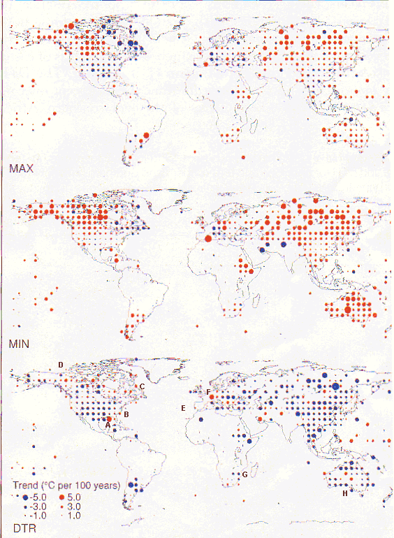
[6] Errors in Figure 2: The DTR panel below
is labelled with letters A to H to assist readers to
pinpoint specific errors which are described to the right
of Figure 2. There are many more.
Just above A the prominent red
dot indicating a strong increase in DTR, is in fact the site of
warming MIN and cooling MAX. Clearly a nonsense.
Just west of B, DTR rises yet MIN warms while MAX cools. Clearly another nonsense.
Just west of C, DTR rises while MIN cools and MAX cools more. The DTR dot west of C should be blue not red.
Just south of D, DTR is falling yet MAX is rising more than MIN is rising. Another error.
At E over S Portugal there is a small DTR rise yet MAX is cooling and MIN shows a v small rise. Illogical.
Due east of E just south of Majorca is a very prominent warming in MIN. The MAX warms much less yet the DTR dot is only very tiny blue. Does not look big enough.
Just SE of F the prominent red dot shows a rise in DTR, yet both MIN and MAX cooling looks equal in magnitude.
Just east of F the DTR rises yet the MIN warms more than the MAX. No logic there.
Just N of Scotland DTR falls yet the MAX warms more than the MIN.
Just west of G over S Zimbabwe, DTR falls yet MIN cools and MAX warms.
North of H one cell in from the Great Australian Bight, is a very large warming in the MIN yet no change in the MAX and no change in the DTR.
Just east of Lake Baikal is a prominent increase in DTR yet the MIN warms more than the MAX.
References:
Balling, R.C. (1992) The Heated Debate: Greenhouse Predictions Versus Climate Reality. San Francisco, California: Pacific Research Institute for Public Policy, xxxvi + 195 pp.
Karl TR, et al, (1993) Asymetric trends of daily maximum and minimum temperature,. Bull Amer Met Soc 74:1007,
Kerr, R.A. (1992) Unmasking a shifty climate system, Science, V 255: 1508.
Michaels, P.J. (1992) Sound and Fury: the science and politics of global warming. The Cato Institute.
World Gazetteer : http://www.gazetteer.de/home.htm
You read it first here
Posted 9, November, 2001
© Warwick Hughes, 2001
Back to Review comments
on climate
papers
by key "IPCC Supportive" scientists main page
Back to front page http://www.warwickhughes.com/
Back to 20 Anniversary Review of Jones
et al 1986
Back to Met
Institutes Page
Back to Global Warming Main Page