Comparison of three versions of  global temperature anomaly maps for 2005
These first three maps should be quite similar, they are all iterations of the same basic data.
In fact there are very significant differences that go right to the heart of serious errors that have persisted  in IPCC global compilations for over 20 years.  Now, with a new team  at the Hadley Centre seemingly in charge,   with CRU no longer updating their product after Dec 2005,  we see the Hadley team (Fig 1) has obviously abandoned  many  high North latitude grid cells of Jones et al/CRU (Fig 3) that have been a part of the IPCC "global warming landscape" over two decades.
Despite the move away from questionable far north data extrapolations, Hadley maintain pretty much the same century long global trends, which suggests to me  that they must make up the lost warming elsewhere.  One component of this is I think their tweaking of SST trends to the max particularly  in data poor southern grid cells.We need more powerful data analysis tools in our hands to nail  down exactly where the lost CRU far northern warming  is being compensated for in Hadley.
University of Alabama  satellite MSU temperature anomaly map for 2005 added 1 February 2007
Fig 1 is posted on the Hadley Centre web site

HadCRUT3 data
It looks to me as though Hadley have had to opt for higher warming oceanic areas to compensate for the loss of high north latitude land warming.
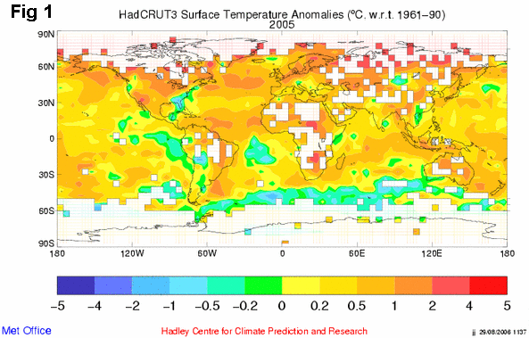
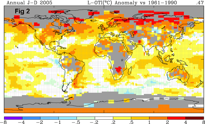
It is interesting to compare particularly southern ocean region anomaly in the 0.2 to -0.2 band in Fig 1 and Fig2.  It is perfectly obvious in the GISS Fig 2 that there are larger ocean areas in the  0.2 to -0.2 band.

Fig 2 is made on the GISS website

GISS data with Reynolds SST
It is also perfectly obvious in the GISS Fig 2 that GISS has very much greater areas of high warming anomalies in high northern latitudes than does the Fig 1 map of Hadley.
Note that GISS oceanic areas use a splice of Hadley V2 SST's up to 1982 and the Reynolds SST's (which are only available after 1982.).  Reynolds SST's  incorporate satellite data.
Fig 3 is  posted on the CRU Climate Monitor web site

CRU data for 2005
It looks clear that this CRU anomaly map relies more for its global trend on high north latitude grid cells than does  Fig 1.
To a lesser extent this is also true  for Fig 2.

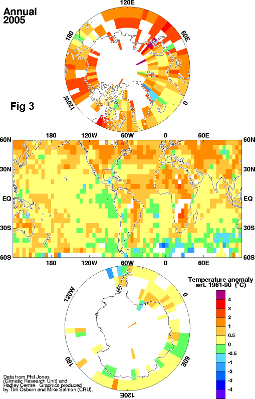
Fig 3 has a different scale for colour coding anomalies so distribution of say the 0.5 to -0.5 zones in oceanic areas is not so easy to eyeball compare  with Fig 1.

However it does look to me as though Fig 2 and 3 oceanic anomalies are more similar  while Fig 1 tends to warmer SH oceans.
Take for example the lt brown 0.5 to 1 degree zone in Fig 1 stretching solid from Durban to Indonesia.
Note  how in Fig 2 this zone is broken and in Fig 3 more dispersed again.
Ditto for an area east of New Zealand, where Fig 1 has a warmer anomaly and Fig 3 the coolest.

Clearly we need to develop our data analysis software to compare these global gridded datasets.
This is on the agenda.


University of Alabama  satellite MSU temperature anomaly map for 2005 added 1 February 2007
UAH MSU global anomalies 2005
None of the 3 surface versions above find the extensive cool anomalies over the Mediterranean and the Persian Gulf to NW Asia region.

There are many other differences to ponder.
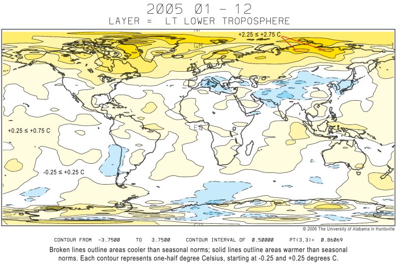
Such as, none of the 3 surface versions  high latitude Arctic contouring anywhere near resembles  the satellites finding of small peak warm areas in North Siberia.
What support is there for the southern African  surface anomalies, Hadley and CRU warmth east of Lake Chad,  the two Canadian "red patches" of GISS and the GISS red anomalies east of the Caspian Sea and over western Pakistan.
It is likely that much peak warmth in surface datsets is utterly spurious and a product of bad data.

Back to Review comments on  climate papers by  key "IPCC Supportive"  scientists main page
Nothing below here