Temperature Records in Illinois
The CRU team used a station called Chicago/O'Hare for that windy
city
that has grown rapidly over the last century. This no doubt
means
that the recording was first in the city and then moved to O'Hare
Airport.
CRU made two adjustments to Chicago.
Check the Satellite UHI Images from the main
page
to see the very large UHI signature for Chicago. How much does
this
signature mean in degrees? To find out, we compare the record
with
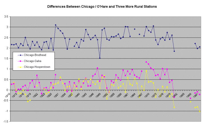
three nearby rural stations from the GHCN dataset. The graphic
below
displays the differences between Chicago and Brodhead, Galva and
Hooperstown.
All three lines show the Chicago record warming up compared to its
rural
neighbours from 1910 to ~1970. Early in the 1970's comes a
cooling
step in Chicago, possibly due to a move to O'Hare.
Since all four stations are near neighbours sharing the same general
climate,
the differences should be a "zig zag" horizontal line. The zig
zags
happen because even in close stations the annual temperature numbers
are
never perfectly in step. But creeping non-climatic warming or
cooling
in the central station will result in the differences taking on a slope
-
as we see clearly here from 1910-1970.
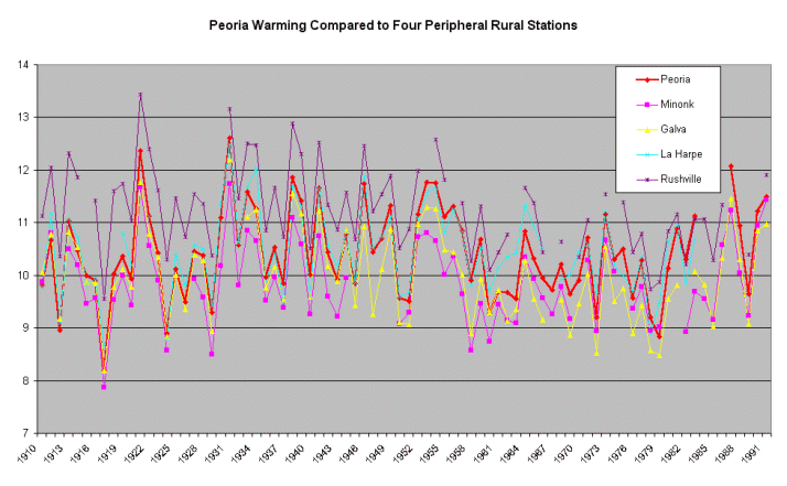
The next graph down shows how Peoria is subject to the same sort of
warming
creep as Chicago. Peoria, a much smaller center south of
Chicago,
was also adjusted by the CRU team to be slightly cooler up to
1943.
The graph compares it with four rural stations in the same area, taken
from
the GHCN database. Note how the heavy red trace for Peoria starts
off
low down in the skein of temperature traces, but gradually works its
way
through the pack until it finishes near the top.
Looking below at the differences produced by subtracting the four
rurals
in turn from Peoria, we see a steady warming in Peoria, of
roughly
the alleged magnitude of “global warming”. If you just eyeball
the
scale in Celsius you can estimate the warming indicated in Peoria for
yourself. Close inspection also suggests a cooling step down in
Peoria around 1960
and a warming step up around 1980.
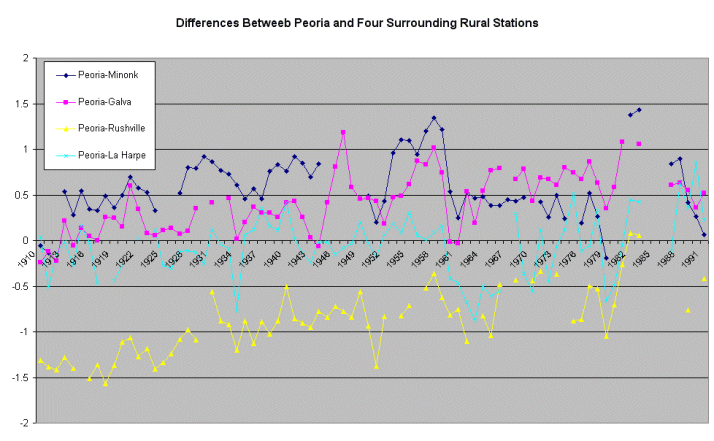
And Peoria is just a little place. Check the Satellite
UHI Images from the main page to see its small UHI signature.
But
even a small heat island like that of Peoria still produces data
contamination
comparable with the claimed rate of “global warming”.
Originally posted mid 2000
Re-written 9, June, 2001
© Warwick Hughes, 2000
Back to Cities List
Back to Front
Page