Examples of slanted
and misleading public information in the Perth water debate
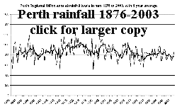 Figure 1 Why does the Water Corporation and the Government
persist in quoting Perth rainfall figures in terms of averages for the entire
1876-2003 record, when it is obvious that since the mid-1970's Perth's rainfall
regime changed to be ~10% lower but more consistent ? It must
slant the debate to quote these higher averages from pre-1975 data that have
no practical bearing on our current supply situation. For example in
Figure 3 below "Perth's Winter Rainfall for 2004" the Water
Corporation quote Perth's winter (June, July, August) average rainfall as
490mm presumably for the period 1876-2003. My data makes the figure 486.24mm
but the point is that a more relevant figure in Perth rain data when
discussing water issues for Perth in 2004 is the winter average
from 1975, the start of the rainfall regime we are experiencing and the start
point chosen by Water Corporation for their reduced stream flow years see
Figure 6 "Yearly Streamflow for Major Surface Water Sources".
The winter average over the years 1975-2003 is 439.3mm which is 93%
of average rather than the 83% in the Water Corporation "Perth's Winter Rainfall
for 2004" graphic Figure 3 below. Having illustrated
how Water Corporation statements are slanted by quoting Perth rain averages
from 1876 we now make the obvious point that PERTH RAIN DOES NOT
FLOW INTO DAMS.
Figure 1 Why does the Water Corporation and the Government
persist in quoting Perth rainfall figures in terms of averages for the entire
1876-2003 record, when it is obvious that since the mid-1970's Perth's rainfall
regime changed to be ~10% lower but more consistent ? It must
slant the debate to quote these higher averages from pre-1975 data that have
no practical bearing on our current supply situation. For example in
Figure 3 below "Perth's Winter Rainfall for 2004" the Water
Corporation quote Perth's winter (June, July, August) average rainfall as
490mm presumably for the period 1876-2003. My data makes the figure 486.24mm
but the point is that a more relevant figure in Perth rain data when
discussing water issues for Perth in 2004 is the winter average
from 1975, the start of the rainfall regime we are experiencing and the start
point chosen by Water Corporation for their reduced stream flow years see
Figure 6 "Yearly Streamflow for Major Surface Water Sources".
The winter average over the years 1975-2003 is 439.3mm which is 93%
of average rather than the 83% in the Water Corporation "Perth's Winter Rainfall
for 2004" graphic Figure 3 below. Having illustrated
how Water Corporation statements are slanted by quoting Perth rain averages
from 1876 we now make the obvious point that PERTH RAIN DOES NOT
FLOW INTO DAMS.
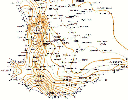 Figure 2
Perth water supply dams enjoy a higher rainfall regime in the elevated
Darling Ranges than does the city and this is illustrated well by this
map of annual rainfall contours for the SW of Western Australia (by Martyn
Keen of the WA Agriculture Dept.) Click on map for larger copy.
The Water Corporation web site only shows rainfall data over the last
six years from its dams. However there are Bureau of Meteorology stations
at Mundaring, Karnet and Dwellingup that if averaged would provide rainfall
data more representative of that falling on catchments then does Perth data.
This is discussed below.
So on top of the slanting caused by quoting averages from 1876, Water
Corporation further slants the story by using irrelevant and lower
Perth rainfall data instead of the very relevant catchments data.
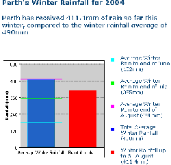 Figure 3 This style of bar chart graphic from the Water
Corporations web site is used periodically in newspaper advertisements through
the wet season and quotes Perth rain data falling short of the winter average.
A composite of Mundaring, Karnet, Dwellingup rainfall data would show that
in 2004 catchment regions have recieved above average (for the 1975 to 2003
period) winter rainfall.
Figure 3 This style of bar chart graphic from the Water
Corporations web site is used periodically in newspaper advertisements through
the wet season and quotes Perth rain data falling short of the winter average.
A composite of Mundaring, Karnet, Dwellingup rainfall data would show that
in 2004 catchment regions have recieved above average (for the 1975 to 2003
period) winter rainfall.
So the graphic on the left if constructed with catchment rain data (averages
from 1975-2003) would show the red bar higher than the purple average
line.
Not quite the pessimistic story we constantly see or hear in media
from Government water people.
Unfortunately for the Government and Water Corporation it
weakens their case that "climate change" forces them to the expensive Kwinana
Desalination Plant policy option.
The manner in which current Water Corporation statements on rainfall
tend to minimise rainfall, make it easier for distorted views on
climate change to be promulgated and also tend to cover up the issue that
regrowth in catchments is degrading our inflows.
In fact May, June, July, August rainfall this year for an average
of Mundaring, Karnet and Dwellingup (nearer to our dams than Perth) was
above the average for the last 29 years. Using winter 2004 rainfall
figures for dams from the Water Corporation web pages and making a simple
average of all stations (except Stirling which is separate from Perth catchments),
584mm of rain fell in catchments equating over the 3500 square kilometres
to 2,047 GL of water, of which only 122 GL will add to dam levels using
the figure of 6% for catchment efficiency. This illustrates starkly
that each 1% increase in catchment efficiency if work had been carried
out, would produce almost half the output of the Kwinana Desalination Plant
this winter.
A graph of Dwellingup rainfall history showing annual totals and wet season
May to October totals is at http://www.warwickhughes.com/water/
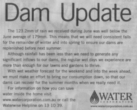 Figure 4 This statement from advertisement in
the West Australian in early July 2004 was placed alongside the the
bar graph showing June rain and dam levels, also gives a slanted
view of reality where rain and our dam levels are concerned. The first
para is dealt with above.
Figure 4 This statement from advertisement in
the West Australian in early July 2004 was placed alongside the the
bar graph showing June rain and dam levels, also gives a slanted
view of reality where rain and our dam levels are concerned. The first
para is dealt with above.
What does the start of second para mean ? Reality is that after
a very dry start to the year May had near average rainfall and stations
near catchments were over average for June. This produced the quickest
turnaround for the dams level graph on the Water Corporation web site
for four years.
Figure 5 below from the Water Corporation web pages shows
stream inflows turning around in early June, earlier than the previous four
years.
Surely a more accurate statement could have been used.
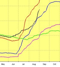 Figure 5 This graphic shows dam levels (click for
full graph) and is on the Water Corporation web site http://www.watercorporation.com.au/
click on link to Our Water Sources where the graph is updated each
day.
Figure 5 This graphic shows dam levels (click for
full graph) and is on the Water Corporation web site http://www.watercorporation.com.au/
click on link to Our Water Sources where the graph is updated each
day.
The black line is for 2004, green 2001, orange is 2000, blue 2003
and purple 2002.
To me, the relevant points for the graph is that levels have started to
rise earlier this year than previous years shown and this could
have been mentioned in their newspaper advert.
The following statements by the Premier,
(presumably with the concurrence of his water bureaucrats), which all give
a misleading impression of Perth water supply issues and science, are
commented on and rebutted in points [1], [2] and [4] on the web site;http://au.geocities.com/perth_water/july04.html
[1] "The threat of a drying climate is with us now..."
[2] "This will be the eighth year in succession that our rainfall
has been significantly below average."
[4] "Our run of dry winters has driven our quest to investigate
alternative water sources,"
The Water Corporation says they are in "..consultation with
stakeholders" over the issue of catchment bush thinning.
It seems that no minutes are kept from these "consultations" which
seem to consist mainly of series of catchment tours.
After decades of bush regrowth clogging our catchments, causing declining
catchment efficiency, degrading a colossal investment by WA taxpayers
in dams and infrastructure, it is fascinating that priorities are such
that THREE YEARS after the dry year 2001 The Water Corporation can not get
to first base and start a thinning program that by its own figures will add
40GL per year, or an extra one third of current stream inflows. Reality
is they are only considering a 12 year trial in the tiny Wungong catchment,
a miserly 3.8% of Perth catchments. Talk about "fiddling while Rome
burns".
Figure 6 "Yearly Streamflow for
Major Surface Water Sources", a title that implies that the data behind
the graph is from streamflow gauges.
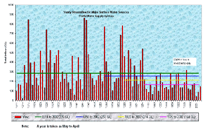 The Water Corporation and various bodies promoting the Governments
water policy commonly use this graphic of 90+ years of stream flows into
our dams. The major point they are all trying to promote is that "climate
change" has caused the drastic drop in stream flows from 1975.
The Water Corporation and various bodies promoting the Governments
water policy commonly use this graphic of 90+ years of stream flows into
our dams. The major point they are all trying to promote is that "climate
change" has caused the drastic drop in stream flows from 1975.
Water Corporation has supplied me with some information about the construction
of the graph and they say that from 1911 to 1950 the only stream
gauge data is from Wungong Brook which forms only 3.8% of Perth catchment
area.
They say the graph for those early years has been constructed be modelling
the Wungong data.
I say the graph title is misleading and it should be changed to reflect
the fact that much of the graph is modelled from data originating in a miniscule
area of Perth catchments.
A further point of interest is that the Wungong flow gauge data ends
in 1976 and I am not clear from what Water Corporation have told me whether
other gauge data starts in 1950 or 1975.
I would like to see all the time series of stream flow data
but the Water Corporation has refused to give me those data unless I sign
a confidentiality agreement not to use the results on the internet or in
any publication. I will continue to try and obtain these data and would
like to see documented the year by year evidence of measured stream flows,
which streams were measured, what instruments and equipment was utilised,
where it was located and what changes were made. There must be a report or
reports into all this archived information.
This is such a great story involving environmental and engineering data
over a century, The Water Corporation should include it on their web site.
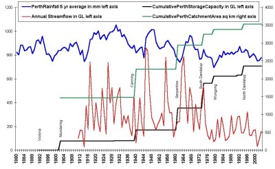 Figure 7 This graphic is my attempt to reconstruct
on one graph, a summary history of the growth of the Perth dam system
over more than a century and is here mainly for readers interest.
Figure 7 This graphic is my attempt to reconstruct
on one graph, a summary history of the growth of the Perth dam system
over more than a century and is here mainly for readers interest.
Click on the graph for a full screen picture.
It is interesting that each new dam has less catchment to feed it,
natural enough to pick the most productive sites first.
The largest dam at South Dandalup started filling in the mid-1970's
just at the time rainfall and streamflows declined.
It is interesting to calculate how many GL of water are contained
in our typical wet season rain and then work out what our streamflows are.
It is obvious that we only store a very small percentage of rain,
the figure is in fact a miniscule 6% and that percentage has been declining
recently. Data for this graphic has been obtained from the http://www.ancold.org.au/ web
site and The Water Corporation
web site.

Back to Perth Water
front page.
Back to http://www.warwickhughes.com/
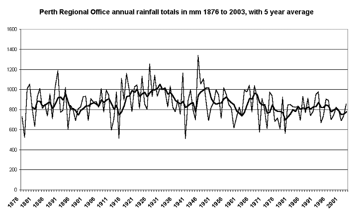
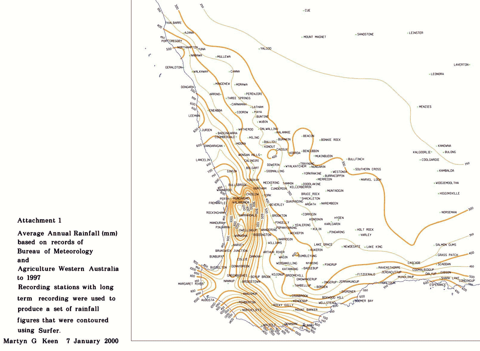 Figure 2
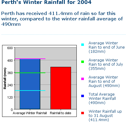 Figure 3 This style of bar chart graphic from the Water
Corporations web site is used periodically in newspaper advertisements through
the wet season and quotes Perth rain data falling short of the winter average.
A composite of Mundaring, Karnet, Dwellingup rainfall data would show that
in 2004 catchment regions have recieved above average (for the 1975 to 2003
period) winter rainfall.
Figure 3 This style of bar chart graphic from the Water
Corporations web site is used periodically in newspaper advertisements through
the wet season and quotes Perth rain data falling short of the winter average.
A composite of Mundaring, Karnet, Dwellingup rainfall data would show that
in 2004 catchment regions have recieved above average (for the 1975 to 2003
period) winter rainfall.  Figure 5 This graphic shows dam levels (click for
full graph) and is on the Water Corporation web site http://www.watercorporation.com.au/
click on link to Our Water Sources where the graph is updated each
day.
Figure 5 This graphic shows dam levels (click for
full graph) and is on the Water Corporation web site http://www.watercorporation.com.au/
click on link to Our Water Sources where the graph is updated each
day.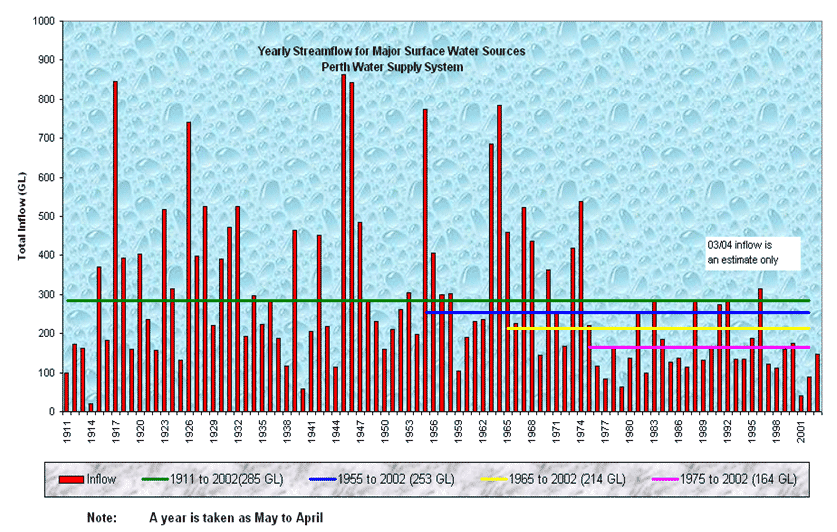 The Water Corporation and various bodies promoting the Governments
water policy commonly use this graphic of 90+ years of stream flows into
our dams. The major point they are all trying to promote is that "climate
change" has caused the drastic drop in stream flows from 1975.
The Water Corporation and various bodies promoting the Governments
water policy commonly use this graphic of 90+ years of stream flows into
our dams. The major point they are all trying to promote is that "climate
change" has caused the drastic drop in stream flows from 1975.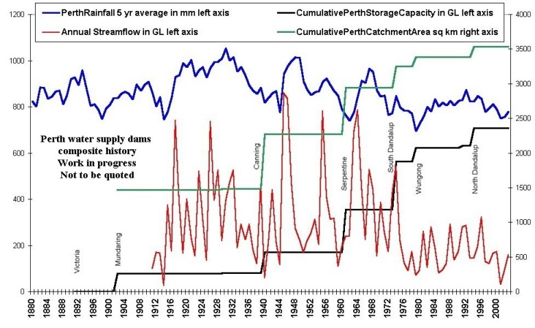 Figure 7 This graphic is my attempt to reconstruct
on one graph, a summary history of the growth of the Perth dam system
over more than a century and is here mainly for readers interest.
Figure 7 This graphic is my attempt to reconstruct
on one graph, a summary history of the growth of the Perth dam system
over more than a century and is here mainly for readers interest.