NZ CLIMATE TRUTH NEWSLETTER N0
39
24TH JANUARY 2004
DOES "GLOBAL WARMING" EXIST?
It is currently universally believed
the the "globe" is "warming". What does this mean? Surely that the average
surface temperature of the earth has increased and is continuing to increase.
Yet, what is the evidence that this is true?
In order to determine a plausible temperature
average for the entire earth's surface it is surely necessary to have reliable
temperature measurements from a representative sample of the whole of the
earth's surface over a period of at least a century.
The temperature on or near the earth's
surface is extremely variable. It is affected by local and large-scale climate,
including sun, precipitation, season, clouds and winds, by latitude, longitude,
elevation, natural phenomena such as earthquakes, volcanoes, ocean anomalies,
land usage changes..Measurements capable of determining the trend of
average temperature conditions simply do not exist, and cannot be put
into place.
We have to make do with such measurements
as are available and assume that they bear some sort of relationship with
actual averages.
An important step in approaching such
a partial knowledge was the suggestion by Jim Hansen of the Goddard Institute
of Space Studies that, instead of trying to pursue the impossible goal of
an average temperature, we should determine temperature anomalies, the deviation
of an average temperature in a particular place from a longer term average.
In this way we can study a trend rather than actual values.
There are three teams of scientists who
have published plots of temperature anomalies at the earth's surface as
a function of time., the University of East Anglia, UK (Jones), which is
the series favoured by the Intergovernmental Panel on Climate Change, The
Goddard Institute of Space Studies, New York (Hansen) which pioneered the
work, and the National Organisation of Atmospheric Administration (NOAA),
National Climate Data Center (NCDC), (Karl, Peterson), at Asheville, NC,
USA. The records do not entirely agree with one another, but they are sufficiently
similar to provide a consistent picture for discussion.
71% of the earth's surface is ocean.
A temperature record from ocean readings alone is therefore likely
to provide a fair picture of global temperature change, if allowance is
made for possible long-term bias. Many thousands of temperature measurements
have been made from ships and fixed buoys over the past century or
so.The variability of the sampling, instrumentation, location and recording is
great, and the coverage was poor in the early days. Folland and Parker in 1995 attempted to derive some order
from this chaos and their methods are the basis of ocean anomalies used
by all three groups. The two US groups use radiometer readings
from satellites from 1980 to back up this system. Although ocean temperatures
are likely to be biased upwards by increasing size and better heating of
ships, ocean temperatures do not need to deal with differences in elevation
or land use, and they are uninfluenced by human activities except
those on the ship itself.
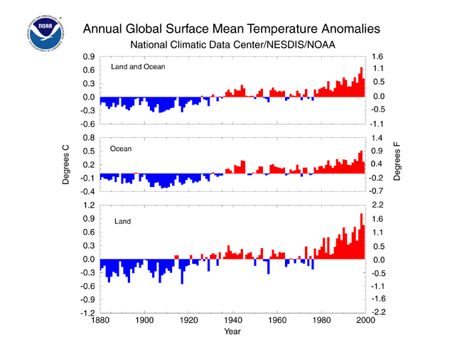
The plot of ocean temperature anomalies
is the central graph of NCDCTemp (attached). which is the NOAA/NCDC version
of Global Surface Mean Temperature Anomalies.
It shows the following behaviour:
A fall in temperature between 1880 and
1910 of about 0.3°C
A rise between 1910 to 1945 of about
0.6°C
A fall between 1945 and 1980 of about
0.2°C
A rise between 1980 and 2000 of about
0.3°C
This pattern is extremely difficult to
explain with computer models based exclusively on the greenhouse effect,
although the IPCC has had a good try, using as many highly variable parameters
as it can find to "fudge" a match.
The first IPCC Report (1990) expressed
the view that the early part of the record (1880 to 1945) was most likely
to be connected with a recovery from the "Little Ice Age" which afflicted
the globe at the latter part of the 19th century. The behaviour can hardly
be attributed to emissions of greenhouse gases, which were well below current
values at the time.
The temperature fall from 1945 to 1980
is also difficult to explain on a greenhouse theory, as there was a significant
increase in greenhouse gases over the period. The IPCC has to assume
an overwhelming cooling effect of clouds to get an overall negative
trend.
..
It is only for the period since 1980
that it is possible to claim some credence for the greenhouse effect, but
you have to ask, why does it suddenly become important when it had no effect
from 1945 to 1980? But there are other possible explanations. Increased
size and temperature of ships, change of measurement to ships' engine intake,
increase in solar activity, unusually high El Niño effects. relative
absence of volcanoes are some possible contributors.
But, what about the 29% of the earth's
surface that is land? It is this part that provided the first claim for
global warming in 1988. It was based on annual temperature anomalies from
the large number of weather stations. The results are shown in the lower
graph of NCDCTemp.
There are several disagreements between
the "ocean" and :land" graphs. The period before 1935 is below the average
for both, but the "land" graph is much more variable. But the biggest difference
between the two is after1975. The "land" graph shows a much greater
increase than the "ocean" graph. The rise in mean ocean temperature from
1975 to 2000 was only about 0.4°C, whereas for "land" it was double,
about 0.8°C. No computer model based on the greenhouse effect
has predicted such a difference. It must be due to other effects, not present
on the ocean. These may include
Poor representativity of weather station
location such as closeness to cities, buildings, vehicles or vegetation
Changes in instrumentation, such as a
transition to automatic measurement
Changes in land usage
This distorted temperature record for
land areas has been amalgamated with the ocean record to give a "global"
record" which is also distorted, shown in the top graph of NCDCTemp. Here,
the temperature rise from 1975 to 2000 is about 0.6°C instead of the
0.4°C of the ocean.
But is either record reliable? Take a
look at my second attachment, JonesGlob which comes from a recent paper
by Jones. It shows a map of the world with coloured areas indicating the
temperature changes from 1977 to 2001.
Let me draw your attention to the areas
enclosed by black boundaries. These are areas where the temperature change
shown was significant at the 95% level. The total area of the earth which
showed a significant temperature change, up or down, from 1977 to 2001 is
shown in the bottom left hand corner of the graph. It was only 19%!. It
included some areas where the temperature fell.
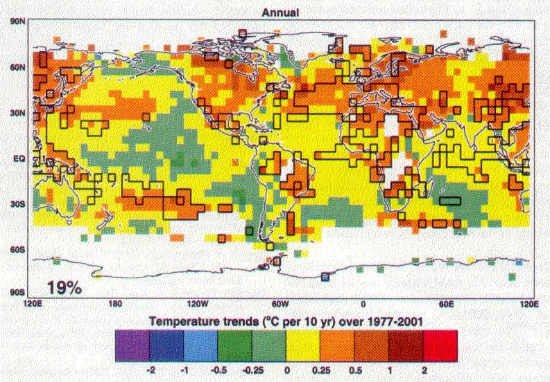
Most of the ocean, according to this
graph, did not suffer a significant temperature change from 1977 to 2001.
Two modest areas, one in the North Atlantic and another in the South Pacific,
and a few smaller ones , off the East coast of South America South of South
Africa and off the West coast of Australia, showed a significant rise. This
could easily be attributed to bigger and hotter ships. A small area of the
East coast of South Africa showed a significant fall and large areas
of the North, Central and South East Pacific, South Atlantic
and Indian Ocean also fell in temperature. It is clear that, as a whole,
the mean ocean temperature did not show a significant rise from 1977 to
2001.
The major part of the global temperature
rise from 1977 to 2001, and the whole of the reason for its significance,
was in land-based measurements, only 29% of the earth's surface. These rises took
place mainly at night and mainly in the winter, incompatible with the computer
models, and showing that they are most likely due to better heating
as well as more buildings and land-use change. Against the trend there were
land-based temperature falls in parts of the Arctic. Antarctic, Australia,
Africa and South America.
Most of the land is in the Northern Hemisphere,
so the difference in temperature change between the Northern and Southern
Hemisphere, inconsistent with the computer models, is due to the temperature biases
of the land-based measurement system.
CORRECTIONS
The three teams who compile the surface
temperature record all carry out "corrections" to the weather station measurements which are intended to convert
the land-based records to genuine temperature figures. These corrections
involve
* Comparisons between
"urban" and "rural" weather stations in order to eliminate "urban bias".
They may involve identifying stations with minimal or zero illumination
at night.
* "Homogeneitty adjustments" which are
intended to eliminate bias due to differences or changes in instrumentation
(which is amazingly variable), time of observation, elevation and latitude
These corrections are unlikely to be
successful, for the following reasons
* They require a large number of well-supervised
"urban" and "rural" stations . Such a system exists only in a few countries,
particularly in the continental United States. There are several parts of
the world with only one or two weather stations in a designated area.
*They require peiods of at least ten
years to give a fair comparison. This means that recent figures are never
"corrected".
* They ignore possible biases with "rural"
stations, which often may be defined as in an area with a population less
than 10,000 several years ago. Changes in local buildings, roads and vehicles,
and vegetation growth can happen at the most remote sites.
We are bound to conclude that, based
on the more reliable ocean record, there is no evidence of a significant
recent change in global temperature.
Vincent Gray
75 Silverstream Road
Crofton Downs
Wellington 6004
New Zealand
Phone/Fax (064) 4 9735939
Email vinmary.gray@paradise.net.nz
"It's not the things you don't know that fool you.
It's the things you do know that ain't so"
Josh Billings