Well, try it now and see what you get.
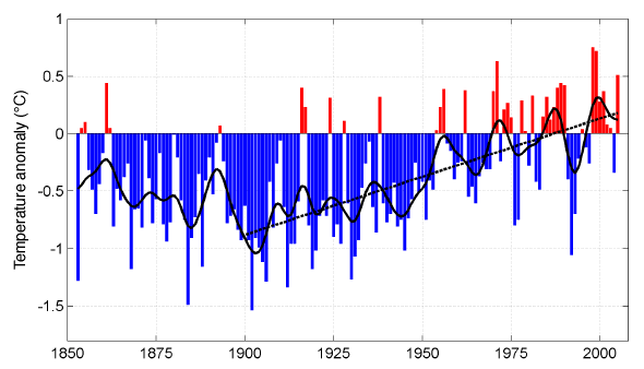
It is my second attachment (NZTEMP2.gif) which is a
desperate
attempt to cover up the damage that has been done already by the
first graph, and pretend that the temperature is really going up when
it is going down.
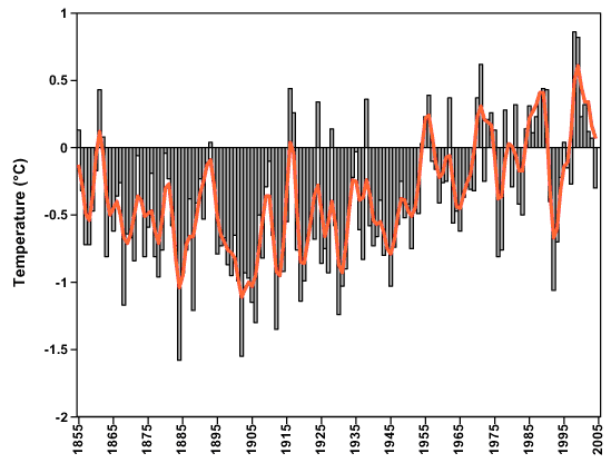
I suggest that you treasure the
original graph and spread it around as widely as you can. You can also
try removing the straight line from graph 2 to reveal the truth. What
did I tell you about the evil effects of linear regression!!!!