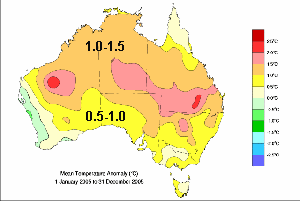
BoM colour anomaly fields are; Yellow = 0.5 to 1.0 deg. Brown = 1 to 1.5 deg. Pink = 1.5 to 2 deg. Red = 2 to 2.5
Coolwire
17
January 2006
In many recent media articles and on their Media Release web page the BoM claim 2005 was Australia's hottest year.
The BoM began making
this claim on 14
November and Warwick Hughes has been
critical on two main grounds.
[1] Oddly, none of our State Capitals felt the
heat extremes over 2005 as shown by the first map below.
[2] The areas .claimed by the BoM to be the hottest
are generally remote, tend to have sparse data points and these tend to
have relatively short data span compared to better settled regions
of the continent. Furthermore these remote data tend to be
noisier with greater interannual variation, thus being more prone to
indicating spurious trends.
On 4 Jan 2006 the BoM definitively claim "2005 Australia's warmest year on record", in a BoM Media Release by Greg Hunt the Parliamentary UnderSecretary.
|
This
map is from the 4 Jan 06 media release, "
Annual Australian Climate Statement 2005", Mean Temperature Anomaly map for
2005. BoM colour anomaly fields are; Yellow = 0.5 to 1.0 deg. Brown = 1 to 1.5 deg. Pink = 1.5 to 2 deg. Red = 2 to 2.5 |
As a check on the BoM claims Warwick Hughes is thus asking, "Which of the major
climate research groups agree with the BoM ?"
The first comparison between BoM claims and results from a major
global climate group is from those "doyens of Global Warming" at
the Climate Research Unit (CRU) at the University of Norwich lead by Dr
Phil Jones. The Climate Monitor website of CRU
publish global
maps of grid box anomalies for each month in each year from 1960. I
have cropped out the Australian region of their maps for 1998 and 2005
and juxtaposed the two years in the panel below.
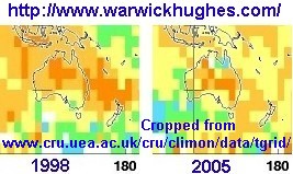 |
"Blind Freddy" can see that
CRU measure 1998 to be warmer than 2005 over Australia. So, CRU DO NOT agree with the BoM that 2005 was "Australia's warmest year on record" as the BoM claims. The CRU anomalies for 2005 are similar to those of the BoM. |
Temperature anomalies for 2005 and
1998 from NOAA
Tiros satellites which have data from December 1978
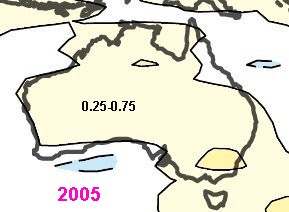 |
Let's
look at an alternative map of global temperature
anomalies
for 2005 just generated by Dr John Christy at the University of
Alabama at Huntsville (UAH) using data from NOAA
satellites measuring the Lower Troposphere layer of the
atmosphere approximately up to 5 miles high. Full global
map. It is interesting that UAH say 2005 is second warmest
year in their global record, equal to 2002. The pale yellow zone covering the vast area of Australia is indicating an average temperature anomaly of only 0.25 to 0.75 degrees C. This suggests that the east-west Central Australia warm zone so prominent in the BoM map above became established prior to 1979. |
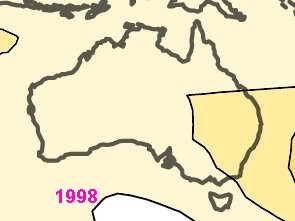 |
Invoking that well respected
Antipodean authority "Blind Freddy", it is clear from the global UAH T
anomaly map for 1998 that
Australia was warmer that year in the Lower Troposphere than in 2005. Another gaping hole shot in the BoM Media Releases crowing about Australia's Hottest Year. |
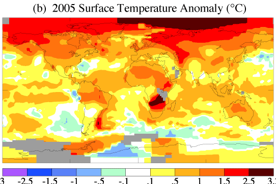 (GISS)
in New York Note the GISS pale brown countouring covering the
bulk of Australia indicates plus 0.5 to 1.0 degrees C, while their most
intense anomaly for Australia indicates plus 1.0 to 1.5 C. As opposed
to the BoM 1.5 to 2.0 and higher.
(GISS)
in New York Note the GISS pale brown countouring covering the
bulk of Australia indicates plus 0.5 to 1.0 degrees C, while their most
intense anomaly for Australia indicates plus 1.0 to 1.5 C. As opposed
to the BoM 1.5 to 2.0 and higher.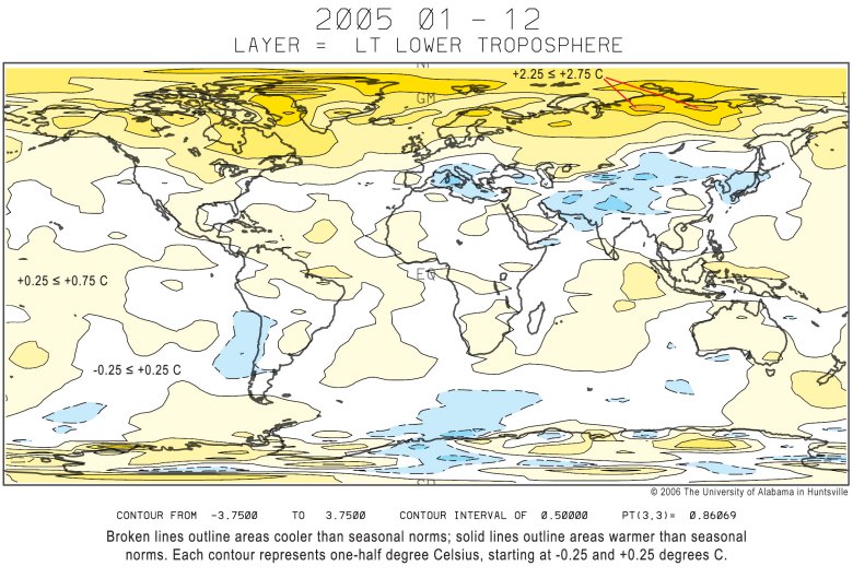