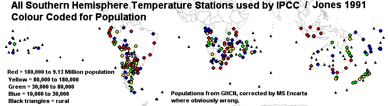
IPCC / Jones Temperature Stations Colour Coded for Population.
A start has been made to portray graphically population ranges in stations
used to generate "global warming".
Population figures have been transferred from the V2 GHCN, amended
where necessary from Map Legend codes used in MS Encarta. Some of the
worst discrepancies in the V2 GHCN population figures were in for example,
Mozambique. where some stations classed "Rural" ( under 9,000) were symbol
coded in Encarta as being over 100,000. New Zealand also looked very
out of date with Auckland listed at 145,000, (corrected to 500,000 but probably
should be more) and I am sure both Wellington and Christchurch should be
coded Red too. In Western Australia Kalgoorlie, and Mandurah
were listed at 10,000. Most populations will still be underestimated,
both because of GHCN and also I have used the lower end of ranges indicated
by MS Encarta symbol codes. But it is a start.
The first map shows the 1991 Jones Southern Hemisphere data that
helped dragoon policy makers to the Rio Conference. Ironic that the
UHI corrupted data from Rio helped the IPCC spin their propaganda.
The population ranges are "software chosen", not picked by me.
Greater station numbers in the Northern Hemisphere mean those maps will be
some time appearing.
We must remember the statement on p 1216 the Jones, Raper and Wigley
paper from 1986, "Southern Hemisphere Surface Air Temperature Variations
1851-1984", J.Clim.App.Met., that;
"...very few stations in our final data set come
from large cities."
In fact 21% of stations fall into my Red population code and of course
it is these UHI affected city records that dominate the century plus long
trend. Not many rural stations with over a century of data in Jones
et al.
How did this statement of Jones, Raper & Wigley pass review ?
Would the Editor of the journal have passed this had he known the true situation
?
Has anyone any comments ?
UHI's from Finland
In recent emails, Timo Hameranta of Finland has raised the issue of
UHI affected records being quoted by the FMI (Finnish Meteorological Institute)
on their web site.
Timo has said that he thinks these UHI affected records, including Helsinki
have been sent to the IPCC.
He is correct there, although they were "sent" by Jones et al not the FMI.
Like all national "weather services", the FMI remained silent about issues
such as the use of Helsinki and others.
He also says that he thinks the use of UHI affected records is worldwide, the Southern Hemisphere map above certainly shows he is correct there too.
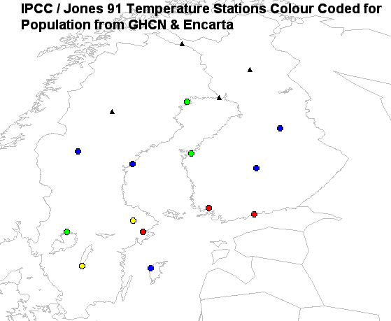
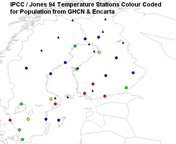
Following are two figures of Finnish & Swedish stations used by IPCC / Jones, first from 1991, next from 1994. Note that the expanded 1994 station numbers, include all the 1991 stations (when you are on a good thing...) and the additions are not very useful because practically none of the new stations are current to 1990 and most are short term "heritage" stations with data from long ago. The main point is, plenty of population in both datasets, population colour coding as per the Southern Hemisphere.
Finland - Sweden IPCC 1991 Stations
Finland - Sweden IPCC 1994 Stations
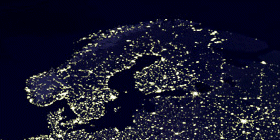
Just to show Scandinavian UHI's in another form, this image shows NASA satellite data measuring earths night lighting, which must be a proxy for the extent of UHI's, if measured on the original images where pixellation has not altered the shape & extent of lit areas.
You saw this first here
Posted 19, February, 2001
© 2001 Warwick Hughes,