Air Quality Graphs for Melbourne
The data used to construct the two EPA graphs below have been obtained from the Victorian Environmental Protection Authority (EPA) library and derive from the EPA's Port Phillip Monitoring Network covering Melbourne and Geelong.
Visibility data for the graphs at the bottom of the page comes from the Bureau of Meteorology (BoM), Melbourne.
Since 1996, air monitoring data for each year are reported separately but prior to that reporting periods and reported parameters vary. Data for 1998 are posted on the EPA web site. Monitoring for multiple pollutants is reported from about 1974 but Smoke and Dustfall numbers were found dating from 1964. The data graphed below is generally that which forms the most complete time series from stations centered on Melbourne and no more than 15 kms from the CBD. The whole point of this exercise was to study data from the most heavily built up areas of Melbourne where traffic densities will be at a maximum. As is obvious from the broken nature of the time series stations often ceased monitoring certain parameters or started new ones or closed altogether. The best stations for longer runs of data are Alphington and Footscray. CBD data have been collected at three main monitoring locations, Parliament, Museum and latterly RMIT but there are many breaks.
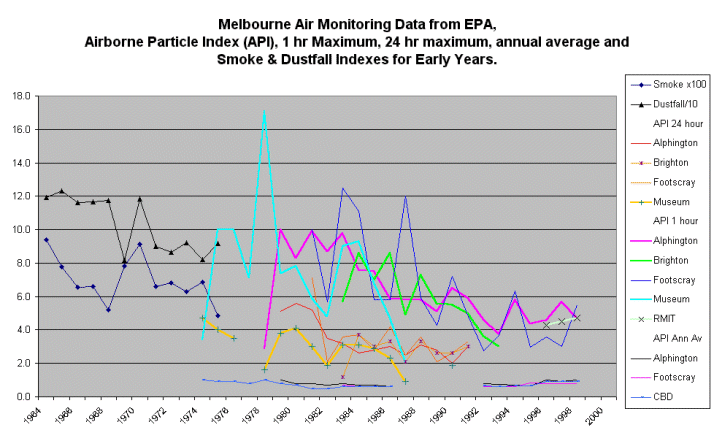
The first graph is for the Airborne Particle Index (API)
post 1974 and the older Smoke and Dustfall numbers from
1964. Round numbers were chosen to scale the 1964-1974 data
so that the traces fitted sensibly into the rest of the
graph. The EPA web site has information about the
monitoring processes and technical issues relating to the various
polluting species. For the colour schemes I have tried to
use reds & oranges - yellows for the 8 or 24 hour data
and purple through blues & greens for the 1 hour
data. The longer the period reported for the maximum
peaks, the values tend to be lower.
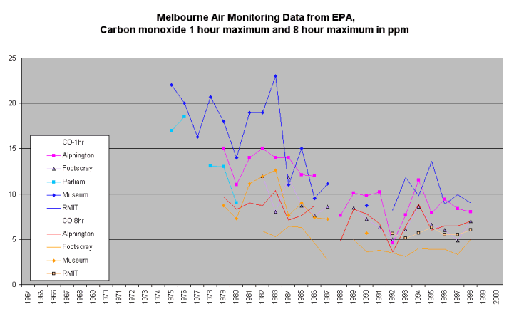
The following graph showing carbon monoxide levels is fairly
typical of graphs that could be shown for nitrogen dioxide,
sulphur dioxide, ozone and lead.
As with most environmental data collected over long time periods,
early outlier values as in the API graph could be treated with
some suspicion. In a few early years there was a small
overlap in reporting periods and where data did not agree I have
entered the later numbers assuming that the later report writer
would have had good reasons for departing from the earlier
numbers. Apart from that small overlap all data is shown
here as reported.
What does this 35 year history of air quality tell us ?
For years we have lived with media / green / planning
dogmas that automobile is a threat to our urban quality of
life through the air pollution caused primarily by vehicle
exhaust emissions. It looks clear from these data
that the steady improvements in car engine efficiency over the
decades plus the introduction of exhaust catalytic converters in
the mid-1980's has all been stunningly successful in reducing
harmful fractions in our urban atmosphere. All the
more so considering that these air quality improvements have been
made against a background of increasing numbers of cars on our
roads and increasing kilometres travelled.
Posted 8, September, 2000
Melbourne Visibility Data
In an attempt to extend measurements of Melbourne air quality
further back into the 20th century, monthly average visibilities
in kms for Melbourne have been plotted. The steep
increase in visibility over 45 years reflects improving air
quality, mainly reduction in winter smogs and on an annual
average basis we are seeing about 8 km further these days
than in 1955. This graph takes us back to
the days of extensive coal burning in Melbourne, not
to mention motor vehicles that emitted dirtier exhaust
gases. The spikes in the graph probably have meteorological
causes and if any plausible reasons come to hand they can be
posted.
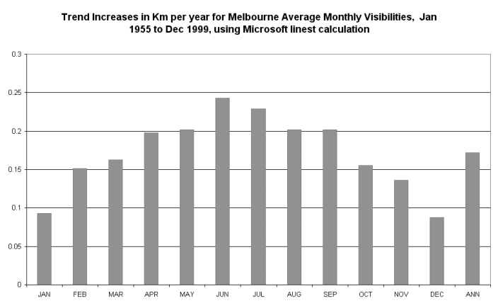
This improvement in visibility is mainly in cool months, to see graph of monthly increase trends clik here.
It is interesting to visit the CSIRO web pages and read the doom and gloom about our air quality. The Victorian EPA site carries more air monitoring information but little about long term time series. Taxpayers should consider whether we need so many of these expensive public serviice atmospheric-meisters when air quality is improving.
Update 17, January, 2001.
The Victorian EPA website now has a page saying that Melbourne air quality is improving, will wonders never cease !!
Update 9, August, 2001
Graphic showing long term air quality history for London
Thanks to Bjorn Lomborg
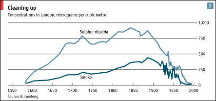
I think Melbourne would show a similar pattern with the worst
polution maybe early 20C reflecting land clearing, coal burning
etc.
You read it first here.
Page first posted 2, June, 2000, updated September and Jan., 2001
© Warwick Hughes, 2000
globalwarming-news.com
Back to Front Page