:based on a paper delivered at the 2001 Lavoisier Group
Conference, 'Kyoto: Dead or Alive?' held on 10-11
September at the Stamford Plaza Hotel in Melbourne,
Australia.
by Bob Foster, 1 18, Sept 2001
ABSTRACT
The Carbon Challenge was designed and produced by CSIRO Land and Water
in Canberra, published by the International Geosphere Biosphere Program
of Stockholm in June 2001, and funded by the EC and US Federal agencies.
The report advocates a substantial start now toward the decarbonising of
energy supply in the western industrial nations. As motivator for
accepting the hardship thus engendered, this authoritative report proffers
three blatant people-scarers:
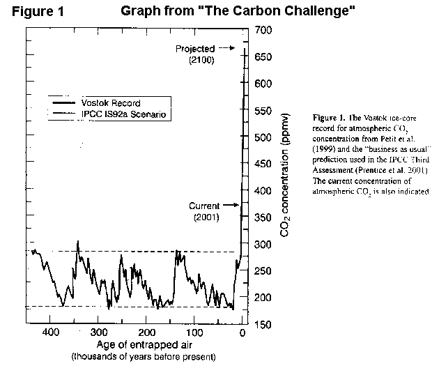
Figure 1 reproduces a decade-old forecast
of CO2 concentration in the atmosphere (now 370 ppm) by AD2100 of 660 ppm.
This Club-of-Rome-style forecast of exponential growth at 1% per year would
have the CO2 concentration increasing by 3.7 ppm in 2000; but in reality,
it only went up by 1.1 ppm. In no year has it gone up anything like
3.7 ppm.
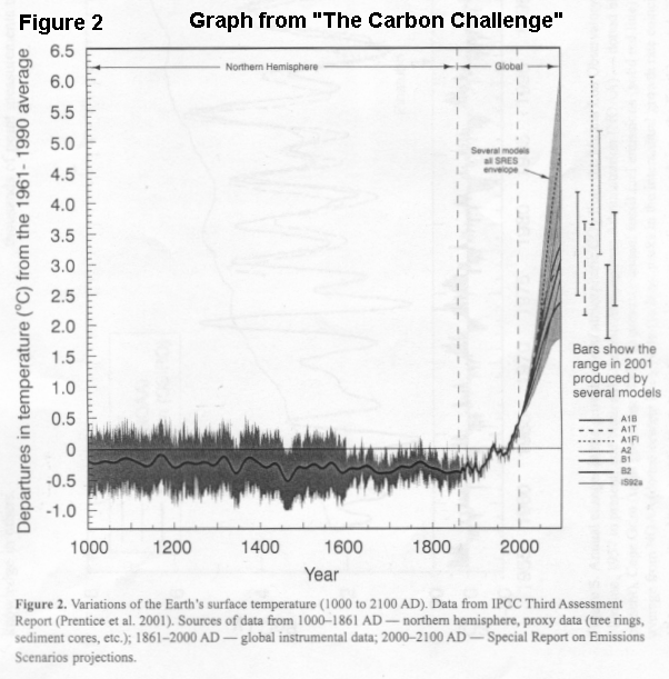
Figure 2 is just plain bad science.
Spring/summer cooling over 900-years, based on a high-latitude/high-altitude
Northern Hemisphere tree-ring proxy, is contrasted with 100 years of global
20th century thermometer-based warming - when most of the recent warming
is in winter. This adds apples to oranges. A spurious forecast
of fearsome additional warming by AD 2100 follows.
The intervening text refers to the recent dramatic increase in CO2 levels (from a pre-industrial 280 ppm) and then makes the insupportable assertion that it is highly likely the observed changes toward a warmer climate over the last century are a consequence of this increase. The 20th century warming of 0.6 0C comprises two roughly-equal tranches at 1910-45 and 1976 to the present, with slight cooling between; and the first tranche largely predates the human-caused emissions. The most prominent climatic event of the century was an abrupt nonlinear transition between climate states at 1976/77. This step-jump in temperature stems from a sudden reduction in the upwelling of cold, deep, water in the eastern Pacific just another inertial event, and unrelated to greenhouse. The 1976/77 climate change is natural variability in action.
Decarbonisation is a canon-shot in many battles. The ready availability of cheap energy drove 20th century wealth creation; but this report is more than a shot in the capitalism vs anti-capitalism battle. It encompasses the US vs EU economic-supremacy war; coal vs gas; fossil fuels vs emergent renewable technologies; and observational geoscience vs computer modelling.
Australia, with its LDC-like economy, is a pygmy in this War of the Giants; and inevitably, it will be the OECD nation which suffers the most collateral damage in terms of living standards and jobs. Here, the battle will open with Latrobe Valley brown coal vs NSW black coal for the supply of power to Victoria. This will cost the Valley dear, for no countervailing environmental benefit. Most observed climate change in the 20th century is natural variability; and the future limitation of human-caused CO2 emissions can never stabilise climate. Worse, the attempt is already diverting money and zeal from pressing real-life environmental needs.
1. Robert J Foster (Ph 61.3.9525 6335, Fx 6345, and email fosbob@bigpond.com) is an Adelaide University engineer by qualification, a Shell geoscientist by experience, a former GM Marketing at BHP Petroleum, and latterly a consultant in energy economics. He is now Hon. Treasurer of the Royal Society of Victoria, Hon. Fellow in the School of Ecology and Environment at Deakin University, and Victorian representative on the Environment Committee of the Australian Institute of Company Directors. Bob is a founding director of The Lavoisier Group Inc (www.lavoisier.com.au), which is putting to Australians a view on climate-change countervailing to that of IPCC.
1. INTRODUCTION
1.1 The story so far
The1997 Kyoto Protocol has but one aim: protection of the environment.
But the Protocol is a single-issue treaty; and its aim is very specifically
the stabilisation of global climate. This is a naive and unscientific
objective indeed; and it has only a tenuous link to the known imperatives
of environmental protection. In its effect, the Protocol is a political
treaty.
We all know that - irrespective of whether we do the right thing about the emission of greenhouse gases - we cant stabilise climate. Past, present and future natural variability includes both extreme weather and changes of climate. Because extreme weather events are endemic, and because future climate changes will include those which are both large and abrupt, mitigation will be needed still. Prevention is a chimera.
However, the sole aim of the Kyoto Protocol is prevention of human-caused global warming.
In my interpretation, the key assumptions driving the Protocol are that:
* Human-caused climate change in the 20th century is of far greater
extent than the natural variability seen since 1000 AD, and to be seen
at least until 2100.
* Human interference with the composition of the atmosphere (ie arising
from the emission of greenhouse gases, and the consequent global warming)
is the main threat to the environment.
The most important human-caused GHG emissions are those of CO2; and by far the largest anthropogenic source of CO2 is the combustion of fossil fuels - principally coal for the generation of electricity. In reality, the Protocol is an anti-coal treaty.
1.2 What IPCC is telling us
IPCCs Third Assessment Report, Climate Change 2001: the scientific
basis, underpins todays post-Kyoto-Conference treaty negotiations.
The Summary for Policymakers of TAR (released at Shanghai on 21/1/2001)
makes three crucial assertions:
* The increase of temperature in the 20th century (ie some 0.6 0C overall,
in two roughly-equal tranches at 1910-45 and from 1976 to the present)
is likely to have been the largest of any century during the past 1000
years.
* Most of the observed warming observed over the last 50 years is attributable
to human activities.
* The globally averaged surface temperature is projected to increase
by 1.4 to 5.8 0C over the period 1990 to 2100.
The first two assertions are not in accord with the available evidence, as I will show below. As for the third, IPCC may well be right; but it has absolutely no way of knowing. Numerical models cant predict what the climate will be like in 2100 or even next year.
Misinformation these assertions might be; but they were not written in isolation by some young academic researcher, desperate for funding.
IPCCs Summary for Policymakers is a consensus document produced by government delegates, ie by science-bureaucrats. No vested interests here; this is Government talking. In these circumstances, who can blame those that believe what they are told?
2. ADVICE FROM THE MEDIA
2.1 Editorial comment
In Melbourne, The Age is positioned at the quality end of the daily
print media. An editorial of 30/3/2001 is unequivocal in its indignation.
It has the heading America puts itself before the Earth and subheading
The refusal of the United States to ratify the Kyoto protocol is selfish
and irresponsible; and it tells us that:
Global warming is not some vague threat to be faced in the future,
but a phenomenon that is affecting the world now. We are witnessing
now retreating glaciers, thinning polar ice and more frequent weather-related
natural disasters. Late last year a report by 2500 of the worlds
leading scientists said that if the burning of fossil fuels and the emission
of man-made chemicals was not reduced, the Earths temperatures could rise
even faster than previously predicted.
A second editorial on 3/4/2001 develops the theme. It is entitled
We should not abandon Kyoto with a subheading Following the US in its
scrapping of greenhouse targets is short-sighted and self-defeating.
It too makes the crucial point:
The problem of global warming is real and apparent, and it will
not go away. The only way of stopping it becoming worse is by an
international consensus to reduce the emissions that are causing it.
The right/wrong distinction cant be much more clear-cut than this, can it? There are no shades of grey here.
2.2 Alarmist press reports
Mina Gerhardsen, in Norways Dagbladet of 24/7/2001 (by a picture of
Mr Bush), says:
Every week 1100 people are killed by climate disasters. The
experts agree that these are caused by human made climate change.
and
Yesterday a massive rainfall in Pakistan had catastrophic consequences.
Ninety-one people were killed and many hurt.
.. The destructive
weather was caused by human made climate change.
Mining the same lode but taking the long view, Bianca Jagger of The
Observer, in her piece of 22/7/2001 entitled America the unbeautiful:
if President Bush refuses to change himself, we must do it for him, goes
further:
Is Bush aware that we face a life-threatening outcome if Kyoto is
not ratified? If we were to follow his advice, we would become the
only species on earth to spend our last days monitoring our own extinction.
The report from the UN Intergovernmental Panel on Climate Change
(IPCC) is described as the most comprehensive study on the subject to date
and warns of large-scale and irreversible climate changes, of devastating
droughts, floods, violent storms in addition to the spread of cholera and
malaria. Earths temperature could rise by as much as 5.8 degrees
C over the next 100 years.
..... if Bush is successful in sabotaging attempts to stop global
warming, he will condemn us all to catastrophe. We do not have much
time left.
One hopes that no-one reads bravely-wed Bianca as really inciting assassination! But, it is not just naive and scientifically-illiterate members of the Fourth Estate who are on this case.
2.3 Companies on the GHG case
A two-page spread in the International Herald Tribune of 21/6/2001,
entitled Business & the Rio Decade: the energy challenge, was timed
to precede the continuation in Bonn of the COP6 conference on resolution
of the Kyoto Protocols terms. The spread was sponsored by the World
Business Council for Sustainable Development, with the logos of energy
giants Shell, Sinopec, Tokyo Electric Power Company, Conoco, and Norske
Hydro, prominent.
WBCSDs lead article As the earth heats up, companies consider options
begins:
For the past century, the world economy has been largely dependent
on fossil fuels as its main source of energy, but now the world is
faced with paying the price in the form of climate change.
and continues
there are signs that decarbonization of the world economy is beginning;
transitions are being made from coal to oil, as well as to natural gas
and renewable energy technologies
The leading article on WBCSDs second page Is there growth without
pollution? takes the theme of decarbonisation much further:
Coal and oil are the horse-and-buggy technologies.
..
The challenge of global climate change calls for no less than a second
industrial revolution. We need to promote new technologies and new
investments that will put the entire world on a path to clean economic
development.
Decarbonisation is in the ascendant. You can be against global
warming; but that has its practical limitations. Decarbonisation
is an issue you can be for. Things can be done.
3. THE CARBON CHALLENGE
3.1 Truth or scare-mongering?
A new document 3 entitled The Carbon Challenge
presents the scientific justification for decarbonisation. This Reports
first Figure (Figure 1 herein) shows a
normal range of CO2 concentration in the atmosphere of 180-280 ppmv over
the last 400,000 years, rising steeply to the present 370 ppm, and skyrocketing
to a projected 660 ppm by AD 2100.
But beware of Greeks bearing graphs! Those of us who work in energy economics dispute the underlying assumption of continued exponential growth pure Club-of-Rome nonsense, and long discredited - in fossil fuel use; and indeed, since this forecast was made a decade ago, projection and reality have already parted company.
If the assumed 1% CO2 increase per year is right, then its atmospheric concentration in 2000 should have increased by 3.7 ppm; instead it only went up by 1.1 ppm. In fact, in no year has it increased by anything like 3.7 ppm. Still, unless we return henceforth to the Stone Age, atmospheric CO2 in 2100 will be much higher than now.
_____________________________________________________________________________
3. The Carbon Challenge is published by the International
Geosphere Biosphere Programme, Stockholm (June 2001, 21 p). This
Report is an IGBP joint project with the International Human Dimensions
Program and the World Climate Research Programme; and funding is from IGBP
plus the European Commission, the Netherlands Organization for Scientific
Research, and several US Federal entities (DOE, NASA, NOAA, NSF, DOI and
USDA). Design and production of the report is by CSIRO Land and Water,
Canberra.
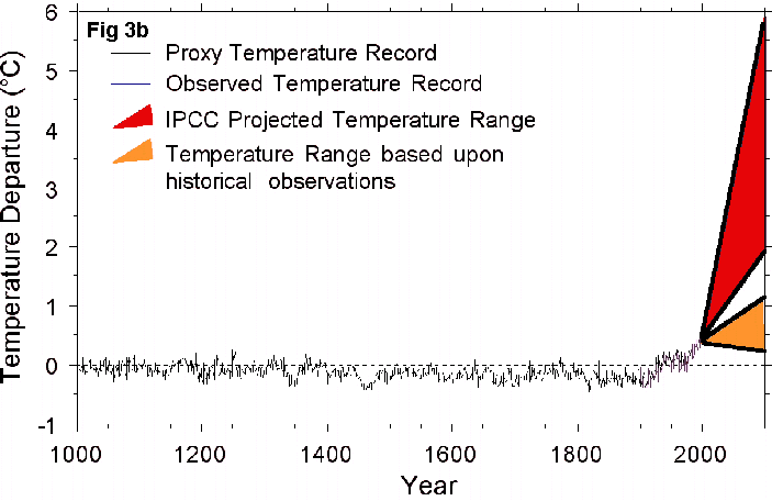
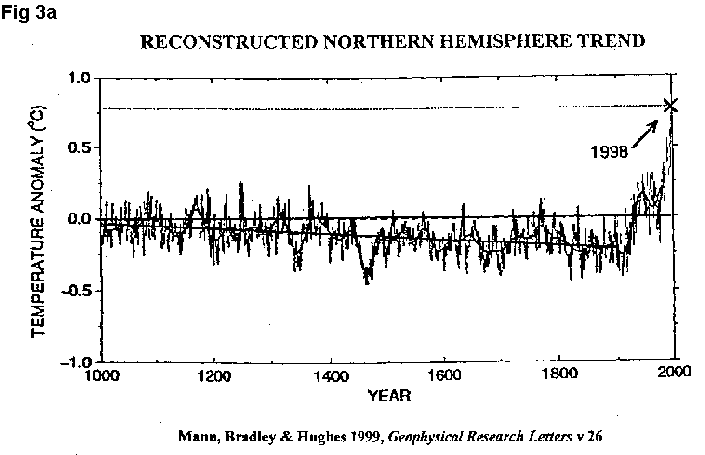
Figure 2 is much worse. This astonishing graph is the cornerstone of the Report. It shows 900 years of trendless temperature variation (perhaps a slight cooling) followed by sharply rising temperatures over the last 100 years. This is the fabled Mann hockey-stick, revered/reviled of palaeoclimatologists. See Figure 3 (a) for its published form (Mann et al 1999).
The text of the Report (p 4), just above the graph, tells us what to
think:
The recent dramatic increase in atmospheric CO2 is unquestionably
the result of human activities. It is highly likely the observed
changes toward a warmer climate over the last century are a consequence
of this increase.
As if the contrast were not yet striking enough, the graph adds to the hockey-stick a range of spurious projections for additional warming over the century ahead as a soaring swath, as in Figure 3 (b). No person seeing this graph for the first time could fail to be scared witless!
In my opinion this graph is not just bad science (of which much more below), but could even be interpreted as scare-mongering. This is hard to accept, I know, in an authoritative document funded by reputable governments - with design and production by our own CSIRO in Canberra. In short, The Carbon Challenge is not some extremist scandal-sheet.
How can we greenies keep the public focussed on the worlds (and Australias) desperate here-and-now environmental needs when stuff like the Reports Figure 2 gets onto the streets?
3.2 Bad news for Australia
Furthermore, which country will be hurt most if the capitalist West
begins a serious program of decarbonisation? No prizes here; it will
be Australia. Table 1 shows tradeable primary energy consumption
in the 2000 year, and the proportions of energy supplied from various sources.
Table 1: World primary energy consumption for year 2000
Total Energy
Percentage Shares
(MTOE)*
Coal Oil Gas
Nuclear Hydro
United States
2279
24.8 39.4 25.9
9.0 1.0
Russia
621
17.8 19.9 54.7
5.4 2.3
Japan
511
19.4 49.6 13.4
16.1 0.2
Germany
329
25.1 39.4 21.7
13.3 0.6
France
258
5.4 36.9 13.8
41.6 2.4
Canada
232
12.6 35.7 30.2
8.1 13.3
United Kingdom
226
16.7 34.4 38.1
10.6 0.3
Italy
166
7.0 56.0 34.6
- 2.3
Ukraine
132
29.4 7.9 46.7
15.1 0.7
Spain
126
17.1 55.6 12.1
12.7 2.5
Australia
106
44.1 36.5 18.1
- 1.3
China/HK
768
63.0 30.8 3.2
0 1 2.5
India
294
55.6 33.2 7.7
1.4 2.2
South Korea
192
22.3 53.0 9.8
14.6 0.3
South Africa
108
75.6 20.8
- 3.2
0.3
* MTOE = million tonnes oil equivalent (see Footnote
4 on the next page).
Listed above are the larger OECD countries committed to curtail emissions
in the 2008-12 period - if the Kyoto Protocol were to be ratified by sufficient
signatories, and come into force as envisaged in 1997. Also included
are the Russian Federation and Ukraine, countries included in the treatys
provisions but not needing action in order to meet their over-generous
targets. Appended for comparison are the largest energy-users not
having a target (China, India, South Korea), plus our neighbour South Africa.
Total world consumption of tradeable energy4 in 2000 was 8750 million tonnes of oil equivalent (of which US 26%) comprising oil 40%, coal and gas each 25%. Non-carbon sources, nuclear and hydro, provided about 7.5 and 2.5%, respectively.
Coal is the most abundant and most carbon-intensive of the fossil fuels. World coal reserves (as is also the case with both oil and gas) are unevenly distributed. USA, Russia and China have 25, 16 and 12% respectively of the world total (Russia has 32% of the worlds gas reserves!). Australia, with 9.2% (cf only 0.3 and 0.8% for its oil and gas reserves) lies fourth, well ahead of India, Germany and then South Africa. Within Australia, there are reserves of 47 and 43 billion tonnes of black and brown coal respectively. Most of the former is sited in NSW and Queensland, and most of the latter in Victoria.
It is clear that Australia is odd-man-out in the OECD. We have a much larger reliance on coal than do other nations who might be required to meet a Kyoto Protocol target. If decarbonisation becomes a reality, Australia must reduce the use of coal for power generation.
3.3 Bad news for Latrobe Valley
A potted description of the decarbonisation task facing Australia,
should we be unwise enough to ratify the Kyoto Protocol, is here included5
as Table 2. Totals are given in million tonnes CO2 equivalent, and
an as-is projection of emission trends to 2010 is included.
Table 2: Australian carbon emissions sectors and targets
1990 1999 2010
Energy sector share, %
Stationary
53.4 56.7 61
Agriculture
22.6 20.5 18
Transport
16.1 16.1 16
Carbon emissions, MTCO2E
Annual output
385 458 567
Kyoto target @ 108%
416
Excess over target
43 151
Excess over 108%
10% 36%
No one could quarrel with Hal Cloughs words of 11/9/2001:
If we continue for the next eight years as we have in the past and
we want to comply with our Kyoto target we have to reduce our emissions
in 2010 by 151.3 mega tonnes of carbon dioxide equivalent. This is
an awesome task.
Indeed it is. How then might Australia meet its carbon challenge?
_____________________________________________________________________________
4. From bp statistical review of world energy,
June 2001. Energy units in Table 1, also from the review, are million
tonnes oil equivalent; one TOE is about 10 million kilocalories, 42 gigajoules
or 40 million Btu.
5. From the presentation by W.H. Clough to the
Lavoisier Group conference on 11 September 2001.
First, we already know that market-based mechanisms will not do the job. Let me repeat: market-based mechanisms will not do the job.
I base this assertion on Australias experience over the past decade with ever-increasing excise on petrol (ie gasoline tax) escalating every six months in line with CPI. Only recently, have automatic increases been suspended in the face of public outcry. We have confirmed (if confirmation were needed) that petrol consumption is price-inelastic; taxes become politically unsustainable before they make substantial inroads into consumption.
As Table 2 tells us, achievement of our 2008-12 Kyoto target (108% of 1990, on average) depends largely on curtailing emissions from power generation. It is safe to assume that, here again, market based mechanisms - such as carbon taxes combined with emissions trading - will fall far short of requirements. A politically-tolerable tax on electricity cannot be high enough to make people go cold in winter and hot in summer; Government will change first.
Direct measures will therefore be required which have more of an impact on emissions in proportion to the immediate misery caused - and therefore less political fallout. Obviously, energy-intensive export-oriented industries will have to go; but this reduction in electricity demand will be nowhere near enough. Also obviously, non-tax (ie dirigiste) measures to curtail the carbon-intensity of the remaining electricity production will be required.
Latrobe Valley brown coal is a much more carbon-intensive source of coal-fired electricity generation than NSW black coal (because the as-mined coal is 70% water). Despite Valley coal being very low indeed in ash and sulphur, despite the minimal release of methane (itself a greenhouse gas) during the winning of brown coal, despite the good safety record of Victorian coal mining vis a vis NSW, Queensland and the wider world, and despite the excellent economics of Victorian power, the Valleys days are numbered. Table 3 shows why.
Table 3: Carbon output from electricity generation
(kg of carbon per kWh sent out)
Solar/wind/hydro/nuclear
nil
Gas, combined cycle
0.11
Gas, open cycle
0.17
Fuel oil
0.20
Black coal
0.24
Brown coal
0.37
If we assume that keeping Australia nuclear-free remains a greater political imperative than preventing global warming, Australian decarbonisation must include priority replacement of electric power generated from Latrobe Valley brown coal by imported black-coal-derived power from NSW.
In the first instance, black coal will substitute for brown as base-load supply, with substantial reductions in CO2 emissions as a consequence. Additional reductions can be made if the intermediate-load end of the natural market, also partly met now from base-load brown coal (because of off-peak-tariff incentives for storage-type hot-water heating), is supplemented by imported Tasmanian hydro-power and, to the extent reserves permit, by accelerated utilisation of Gippsland natural gas reserves.
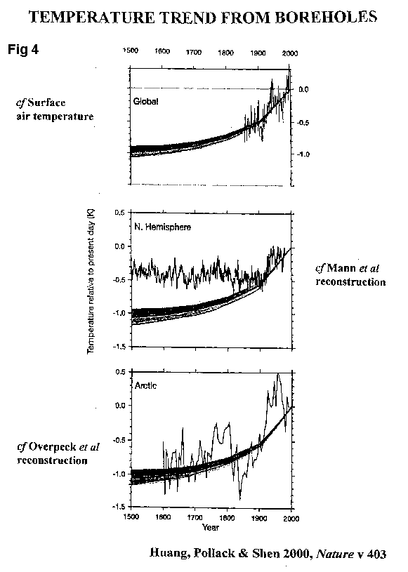
4. THE THOUSAND-YEAR RUSE
I return now to the first and second parts of Figure
2 (ignoring the band of quite spurious forecasts6
for the century ahead no science there, in my opinion), as published
in equally-alarmist form by Mann et al and shown in Figure
3a. Contrast these Figures with the palaeotemperatures shown
in Figure 4 from Huang, Pollack and Shen
(2000). Their temperature record, going back 500 years, is derived
from 616 on-land boreholes from all continents except Antarctica.
This record shows rebound from the Little Ice Age much more clearly than
does that of Mann et al.
Huang et al compare their record with several others. The top graph in Figure 4 gives a comparison with the instrumented record of global surface temperatures since the 1860s as also plotted in Figures 2 and 3. The bottom graph compares it with a reconstruction of Arctic temperatures (Overpeck et al, 1997) going back to 1600. There are no surprises in either of these comparisons.
But now look at the middle graph, where the comparison is with the Mann et al reconstruction - that was chosen for use as the centrepiece of The Carbon Challenge. Could there be something wrong here? It sure looks like it.
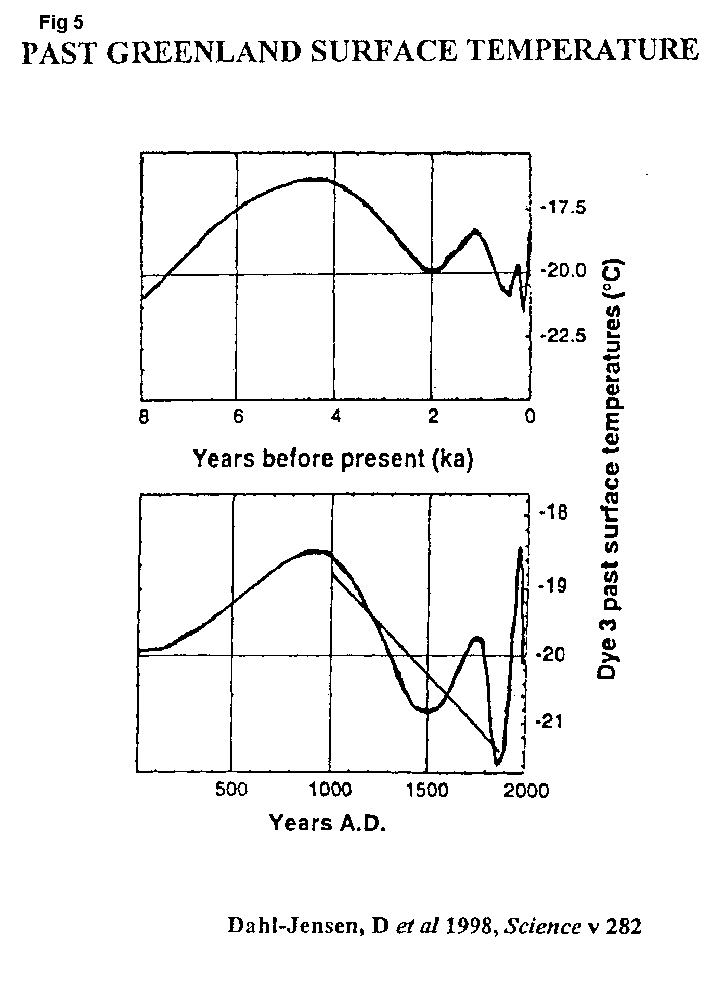
Lets deal with the problem in two parts. First, go back to Figure 3(a). Where did the prominent 900-year down-trend come from? (We are only looking at the Northern Hemisphere here; there isnt enough data available for the Southern.) Figure 5 (Dahl-Jensen et al, 1998) gives us the answer, based on yet another temperature reconstruction - this time from Greenland ice cores.
The lower graph in Figure 5 provides a clear portrayal of the Mediaeval Warm Period followed by a twin-troughed Little Ice Age. As can be seen from the line I have added to the graph, the 900-year handle of the Mann hockey-stick is guaranteed to be downward-trending, because it starts in the Mediaeval Warm Period and finishes in the Little Ice Age. The trend is just an artefact of the times chosen as start and finish.
But second, why is there such a sharp break (see Figure 3(a) again) between the 900-year stick and the 100-year blade of Manns hockey-stick? This break is not nearly as obvious in the bore-hole records of Figure 4, for instance. This is where the problem lies.
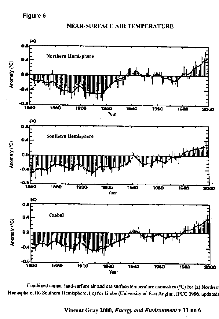
Surface warming in the 20th century, particularly that in the second half, was more pronounced in the Northern Hemisphere than the Southern, as shown in Figure 6 (from Gray, 2000; this information is originally from the Climate Research Unit at the University of East Anglia which is the chief supplier of climate data to IPCC).
At least since WW2, the ratio of winter to summer warming in the Northern Hemisphere is greater than two to one. The blade of the stick largely reflects winter warming.
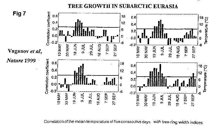
On the other hand, the temperatures in the hockey-sticks 900-year handle
are largely derived from the evidence of growth-rings in trees at high
latitudes or high altitudes (in the Northern Hemisphere). This is
where the trouble really starts. Trees grow in the growing
season.
6. Some might argue that these are only scenarios
or projections. But so what? To policymakers, press, and
public alike, they are forecasts.
Figure 7 from Vaganov et al (1999) makes the point. This chart plots the growth of trees in subarctic Eurasia during sequential 5-day periods. (Only data above the line in each graph is statistically significant.) These trees grow for only about 3-6 weeks in late spring and early summer; and their growth tells us nothing about variations in winter temperature. The Carbon Challenge invokes a graph which adds 100 years of apples to 900 years of oranges!
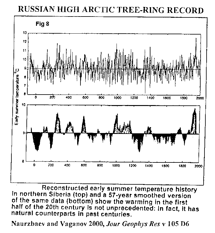
When a consistent set of Arctic tree-ring data, spanning the last 2000 years, is presented in Figure 8 (Naurzbaev and Vaganov, 2000), a very different picture emerges.
By then adding 100 years of worthless climate forecasts7 to its 1000-year graph, the Report adds rambutans to its apples and oranges. Is this science? Do governments know they are spending our money to have us snowed?
5. THE HUNDRED-YEAR BEAT-UP
The opening paragraph of The Carbon Challenge refers to the scientific community, policy makers and the public. What hope have the latter two groups of recognising for what it is, the bad science presented as kosher in the Reports Figure 2 (see my Figure 2)?
But there is more. Have a look at what the Report says about the
past 100 years. The third paragraph introduces the offending Figure
by referring to dramatically-increasing anthropogenic CO2 emissions, and
then continues:
It is highly likely that the observed changes toward a warmer climate
over the last century are a consequence of this increase.
Not even IPCCs TAR says that! I smell a very big rat here.
Lets investigate.
5.1 Two centuries of warming
Over the last century means since 1900. But it would be better
to go back to the start of the Industrial Revolution (lets say, AD 1800),
when atmospheric CO2 concentration was at its pre-industrial level of about
280 ppm. By 1950, it was still only 310 ppm roughly, up 10%.
Why is it highly likely that observed changes toward a warmer climate in the period, whether it be 1800-1950 or 1900-1950, are the result of such small human-caused changes in atmospheric composition? On the contrary, I would say it is highly likely that they werent.
The beginning of this two-century period, 1800-20 was the last cold snap (the Dalton Minimum) of the Little Ice Age. There was a prominent warming thereafter to about the middle of the 19th century, followed by slight cooling in the second half.
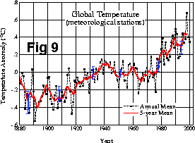
As shown in Figure 9 (from John Dalys
website www.john-daly.com, and originally from NASAs Goddard Institute
of Space Studies), observed 20th century globally-averaged near-surface
warming amounts to some 0.6 degrees C in two roughly-equal tranches from
before 1910 to the mid-40s, and the mid 70s to the present. There
is slight cooling in the intervening period. (Actually, the warming
is more like 0.8 degrees C in this graph of land stations only; when the
oceanic 2/3 of the Globe is included, we find about 0.6 degrees C.)
_____________________________________________________________________________
7. In fact, CSIRO meant to add projections to 2100
to complete this fearsome graph, but on the right hand side of Figure 2
it says 2001.
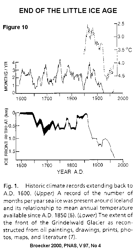
Rebound from the LIA is well illustrated in Figure 10 from Broecker (2000). The upper graph shows the disappearance of winter sea-ice from around Iceland at about the turn of the last century and, in the (reversed) enlargement, the prominent local warming at that time. The lower graph provides a very similar story for an Alpine glacier. Here we have natural variability.
If it wasnt greenhouse, what then might have caused the intervals of warming in the first halves of the 19th and 20th centuries? (I will deal with the second half of the 20th century later.) No-one knows, of course; but there are two eminently plausible candidates. Probably both played a part.
5.2 Oceanic heat transportation
The first is changes in oceanic heat transportation. The Little
Ice Age (ca AD 1300-1900) forms part of a series of warm/cold/warm episodes,
centred on the North Atlantic Basin megaregion, with a frequency of 1500
+/- 500 years. The latest manifestations of this quasi-cyclicity
are the Roman Empire warm period, Dark Ages, Mediaeval Warm Period and
LIA.
This cycle, going back many tens of millennia, is imprinted on the more-pronounced and more-widespread cyclicity of roughly 90,000-year Glacials and 10,000-year Interglacials. Indeed, humans have taken advantage of the 10,000 years warmth in the present Holocene Interglacial to make the transition from hunter-gatherers to farmers.
(One aspect of the 100,000-year cycle, natural variation in atmospheric CO2, can be seen in Figure 1. Here, it is more likely that the observed variation in atmospheric composition is effect than cause.)
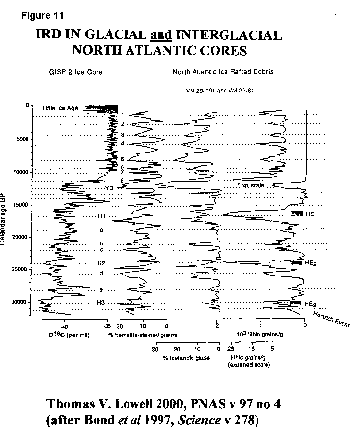
Figure 11 (Lowell 2000, after earlier work by Bond et al 1997) shows a temperature proxy for the most-recent Glacial/Interglacial climate transition, derived from a Greenland ice-core. This is compared with a record of ice-rafted detritus found in North Atlantic sediment cores. Obviously, the climatic cyclicity, in both warmer Holocene and preceding Glacial, is closely related to the launching of iceberg armadas into the North Atlantic. In fact, it is surprising to find that the cycle is robust across the transition from glacial to interglacial conditions.
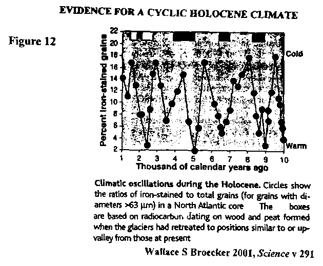
The pattern of Holocene climate change is shown in more detail in Figure 12 from Broecker (2001). Similar variation in the proportion of IRD in North Atlantic sea-bed sediments is plotted here as in Figure 11. In terms of climate in adjacent regions of the Northern Hemisphere, periods when mountain glaciers had retreated as far, or even further, than today are shown as rectangles across the top of the graph. According to this evidence, the longest warm period in the (Northern Hemisphere) Holocene was at 4000-5000 years before the present.
The continental ice-sheets on North America and Eurasia would have supplied the icebergs which transported the sediments recorded in Figures 11 and 12. But they had melted by about 6,000; and the cycle continues. The implication is that most of the ice is now coming from Greenland. (There is present-day surging of the West Antarctic ice-sheet, but that is another story.)
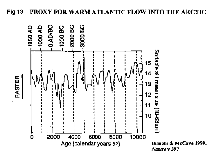
While surging of continental ice appears to underly the warm/cold/warm cyclicity of Northern Hemisphere climate, the direct cause is almost certainly variation in the flow of warm equatorial surface water into the Nordic seas. Figure 13 from Bianchi and McCave (1999) gives a proxy for this flow.
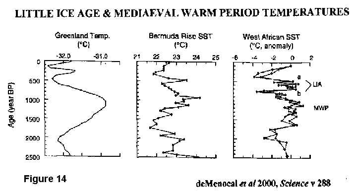
These authors show the grain-size distribution in sediments just south of the ridge running between Iceland and Scotland. It is this sill which separates the Arctic from the North Atlantic at depth; and the velocity of flow across it into the Atlantic is a proxy for the quantity of warm Atlantic surface water entering the Nordic seas. Fluctuations in flow are indicated, including those which may correlate with the MWP and a twin-troughed LIA. Compare Figure 13 with Figure 14 from deMenocal et al (2000) which shows palaeotemperatures in the Atlantic Basin at about 70, 30 and 20 degrees N, respectively.
Rebound from the LIA, ie rejuvenated northerly flow of warm water, is highly likely to have played a major part in observed Northern Hemisphere warming over the past two centuries.
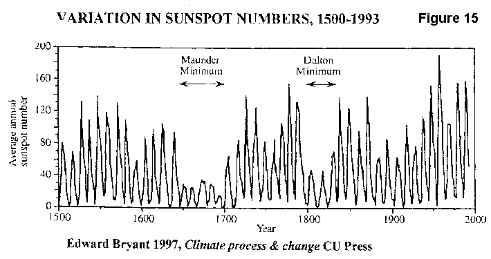
5.3 Solar magnetic activity
Sunspot numbers has been recorded for several centuries now, and recent
work has established a close correlation between their prevalence and the
Suns heat output. The trouble is that the variation in insolation
is small, and could hardly explain the shorter-term climate changes known
to have occurred during and since the LIA, and which appear to correspond
in striking fashion to fluctuation in sunspot numbers (see Figure
15 from Bryant 1997).
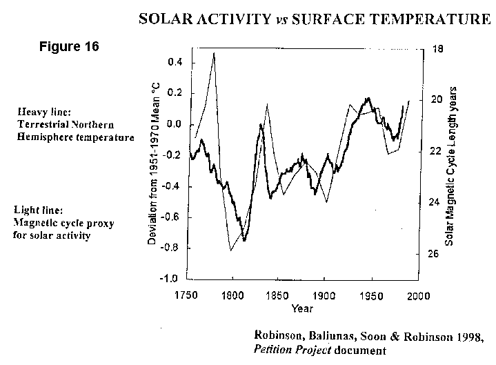
However, recent work suggests that the key is not insolation per se, but fluctuations in the Suns magnetic intensity. This striking correlation is seen in Figure 16 from Robinson et al (1998).
Although there is much still to learn about solar influences on global climate (see for instance, articles by Theodor Landscheidt on John Dalys website), the generality of this explanation seems plausible. At times of a weaker solar magnetic field, the planets enjoy reduced shielding against cosmic rays and this influences Earths climate.
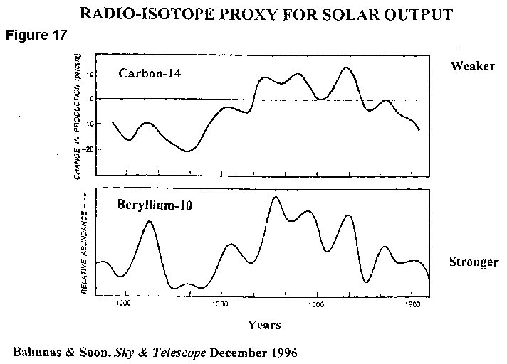
The likely causal relationship is that a greater incidence of cosmic rays causes increased ionisation in the atmosphere, and hence increased nucleation of low-level clouds. These clouds have a cooling effect. The greater impact of cosmic rays also should result in an elevated concentration of isotopes such as 14C and 10Be in the atmosphere, as can then be detected in tree-rings, sediments and ice-cores. Figure 17 from Baliunas and Soon (1996) supports this line of reasoning (in these two graphs, the weaker magnetic field is at the top).
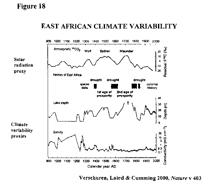
If confirmation were needed, Figure 18 (Verschuren et al, 2000) provides it. Here the 14C in the atmospheric CO2 record is correlated with a twin-troughed LIA in East Africa. Before the break are the Wolf and Spörer sunspot minima, and after are the Maunder and (not identified on the Figure) Dalton minima.
In conclusion, there were two identifiable influences acting on climate in the 1800-1950 period, one ice/inertial (changes in oceanic heat transportation) and one solar/celestial (changes in cloudiness).
To say that it is highly likely the observed changes towards a warmer climate in the first half of the 20th century are the result of human-caused changes to the composition of the atmosphere is belief, unsupported by scientific facts. Indeed, such facts as we have support the contra view. I wouldnt call the highly likely assertion above deliberately misleading; but it is misleading nonetheless. It is a worry when bad science is propagated by a reputable source.
Was it Huxley who said that blind faith is the one unpardonable sin?
6. THE FIFTY-YEAR BLINDNESS
Bad science and blind faith should not be a worry to our consideration
of what might have caused climate change in the period from 1950 onward.
We have far more information here; and for the first time, it includes
a record of temperature in the atmosphere.
Temperature trends in the lower atmosphere are crucial to the recognition of greenhouse warming.
6.1 The greenhouse effect
Greenhouse is a phenomenon of the atmosphere.
Human-caused greenhouse gas emissions accumulate in the atmosphere. But these GHGs are transparent to incoming short wavelength (visible) solar radiation, and hence the quantity of heat reaching the Earths surface is not affected. However, if its average temperature is to remain unchanged, Earth must reradiate to space at longer (infrared) wavelengths an equivalent quantity of heat.
The anthropogenic GHGs absorb some of this outgoing radiation, and the lower atmosphere (say the lowest 8 km) heats up as a consequence. Some of the extra warmth thus accumulated is, in its turn, radiated to space; and some is redistributed by various means back to the Earths surface.
The extra heat reaching the surface causes warming; and this consequential surface warming is the greenhouse warming of which The Carbon Challenge warns us. Let me repeat: it is this resultant surface warming which we call the greenhouse effect.
GHGs dont warm the surface directly; the atmosphere must heat up first. Thus, if there were no prior warming of the lower atmosphere, there would be no consequent greenhouse effect.
6.2 Record from weather balloons
Look again at the graph of surface temperatures in Figure
9. Note the decline from the 1940s to the 70s not much
greenhouse warming here, I would say. But now look at the prominent
step-jump at 1976/77, and the warming trend thereafter. Is this
greenhouse warming?
From 1958, we have an adequate record of temperatures in the lower atmosphere from balloon-borne thermometers. This record is largely over land and largely in the Northern Hemisphere, and excludes the very high latitudes in either hemisphere. However, it is complete enough to allow comparison with that for the surface.
From 1958 to 1976, both atmospheric and surface temperatures trend slightly downward; and both records exhibit a step-jump of about 0.3 degrees C at 1976/77. These changes are not the signature one would expect of the anthropogenic GHGs which have been accumulating slowly in the atmosphere since the beginning of the industrial revolution.
The simplest conclusion we can draw from the observations since 1958 is that neither the cooling to 1976, nor the warming step at 1976/77, have anything to do with the greenhouse effect.
6.3 The satellite-derived record
A virtually-complete global coverage of temperature in the lower atmosphere
can now be derived from microwave sounding units mounted on polar-orbiting
weather satellites. This excellent record covers the 221/2 years
back to 1979 and counting.
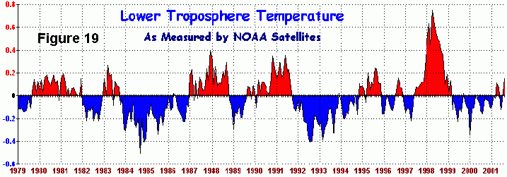
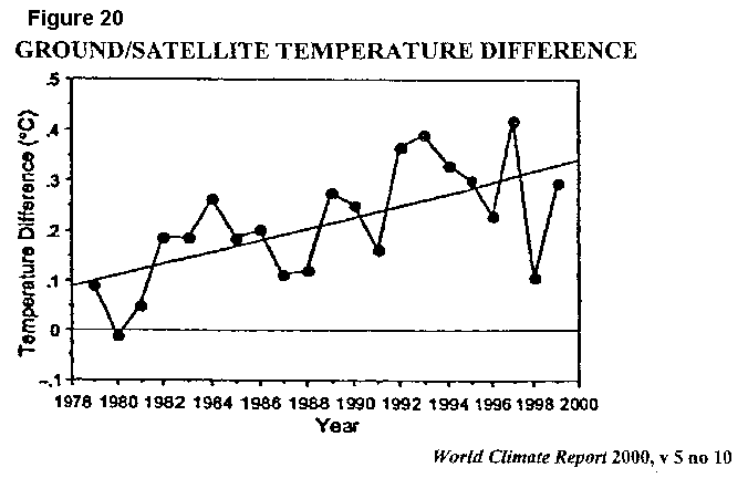
Figure 19 from John Daly, originating at the Earth System Science Laboratory of the University of Alabama at Huntsville, shows that the satellite record includes marked fluctuation (relating to El Niño and La Niña warm and cold events in the equatorial eastern Pacific, and to the cooling impact of volcanic eruptions) - but little trend. In fact, the atmospheric warming trend is below 0.05 0C/decade; and is only about a third of that at the surface over the same period - as emphasised in Figure 20 from World Climate Report. The simplest explanation for the observed surface warming since 1979 is that most of it has some other cause than greenhouse.
But, what is the likely cause of this most? Some of it is known to be caused by over-estimation of the near-surface-air temperature trend in the 2/3 of the globe covered by water (see Christy et al, 2001). The balance (following John Daly) may be largely non-greenhouse human artefacts, such as land-use change, urban heat-island effect 8 and, Daly suspects, poor upkeep of meteorological stations in non-OECD countries.
6.4 Is there any greenhouse warming so far?
The answer is probably yes. (Here I am following Michaels and
Balling, 2000.)
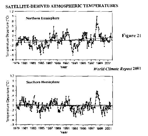
Figure 21 from World Climate Report, shows separately the satellite record for the individual hemispheres. The modest warming trend for the global atmosphere, as shown in Figure 19, comprises larger warming in the Northern Hemisphere, and slight cooling in the Southern. Further divided on a latitudinal basis, we find no statistically-significant trend in the high latitudes of either hemisphere or in the tropics. However, there is cooling at 50-70 0S, and warming at 30-70 0N. Therefore, human-caused greenhouse warming should be sought in the mid-latitudes of the Northern Hemisphere.
The paper by Michaels et al (2000) finds that near-surface warming in
the Northern Hemisphere is almost exclusively confined to the intensely
cold, intensely dry, winter anticyclones of Siberia and Alaska/Yukon.
Using data from surface measurements in the Northern Hemisphere 5 degrees
x 5 degrees (standard) grid cells for the colder half-year during 1946-95,
these authors say:
During this period, the average warming trend in the dry grid cells
(weighted by area) is 0.214 degrees C decade-1. This accounts
for 78% of the total hemispheric winter warming. On an areally weighted
basis, the change over the remaining 74.4% of the hemisphere is only 0.021
degrees C decade-1. Thus the warming rate in cells with mean dew-point
temperatures less than 0 degrees C is almost 10 times greater than
what is observed in cells with dew points above freezing.
The most potent greenhouse gas is water vapour (naturally-occurring,
and responsible for well over 90% of current greenhouse warming).
But there are no worries about a possible masking role for water vapour
here! The simplest explanation for this highly-concentrated winter
warming is the greenhouse effect. Both previously, and still now,
winter temperatures in these bone-dry anticyclonic regions are far below
freezing. Human-caused this winter warming may well be; but adverse
environmental impacts are likely to be minimal.
_____________________________________________________________________________
8. UHI for the USA is well covered in World Climate
Report v 7 no 1 at www.greeningearthsociety.org.
7. DUELLING HYPOTHESES
Excoriating the shoddy science of The Carbon Challenge
is not the only objective of this paper. Having established that
the Greenhouse Effect hypothesis of global climate change is unable
to explain the step-jump of global temperature at 1976/77, what then is
a more-plausible explanation?
There is much, albeit widely-scattered, evidence in the public domain to suggest that this was the most prominent global climatic event of the 20th century - far more prominent than anything related to greenhouse. Yet, the climatological community appears loath to draw the threads together. Let me try.
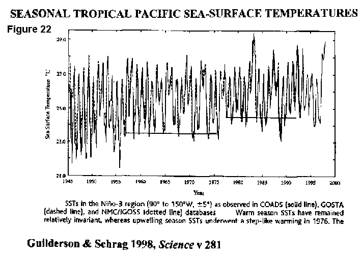
7.1 What caused the 76/77 jump?
The immediate cause is not hard to find. It is an increase in
sea surface temperatures in the eastern equatorial Pacific as shown in
Figure 22 from Guilderson and Schrag
(1998). SSTs in this region vary seasonally in a regular fashion
- except when the normal maximum is exceeded in El Niño years, or
the when the upwelling-season minimum falls in La Niña years.
(Warmer El Niño and cooler La Niña events coincide with reduced
and increased upwelling in the eastern equatorial Pacific, respectively.)
However, as is well shown in Figure 22, the upwelling of cold deep water was particularly strong in the years immediately following 1945, and relatively steady at a reduced level thereafter to 1976; from the following year it was much further reduced, and so it remains.
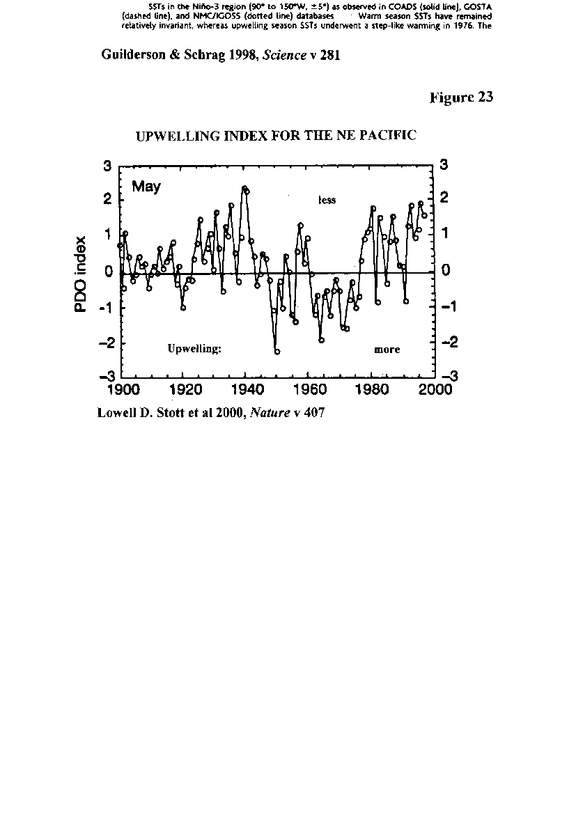
These changes are not one-offs. Stott et al (2000) find evidence
(from sediment cores in the Santa Barbara, Santa Monica and Gulf of California
basins) of similar fluctuations over the past few centuries:
The temporal record suggests.... that there are factors operating
on centennial timescales ..... It is also now clear that there are shorter-timescale
environmental changes that also affect the North Pacific marine environment,
and that these are superimposed on the longer-scale patterns of variability.
In particular, the mean climate state of the North Pacific ..... has varied
between a warm and a cold phase with a quasi-regular decadal oscillation.
This decadal pattern has been referred to as the Pacific Decadal Oscillation.
and
The last clear PDO shift was coincident with a 1976-77 El Niño
event. Since that time, the average sea surface temperatures within
the southern California Current during the months of upwelling (spring/summer)
have increased by 1.5-3 degrees C.
Figure 23 from Stott et al shows the PDO index (for May) during the upwelling season in the NE Pacific over the past century. It is not difficult to identify the increased upwelling which occurred in the mid 1940s, nor the reduced upwelling from the late 1970s. Here again, it is natural variability which is at work.
7.2 Evidence from around the world.
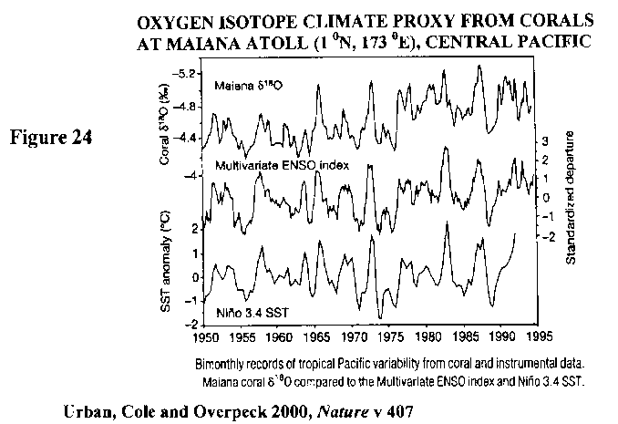
The step-jump at 1976/77 is prominent at many locations in the Pacific
basin; and Figure 24 from Urban et al
(2000) provides an example from a coral-based SST proxy in the equatorial
central Pacific. This record correlates in detail with the centre
graph showing the El Niño-Southern Oscillation index, and the lower
graph showing equatorial SSTs further east.
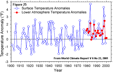
That oceanic influences also drive on-land climate change on the Pacific coast of South America is beyond doubt. Figure 25 (World Climate Report v 6 no 22, 2001) shows annual average surface temperature for Peru over the past century, including prominent cooling in the late 40s and even-more-prominent warming in the late 70s cf the PDO index (Figure 23).
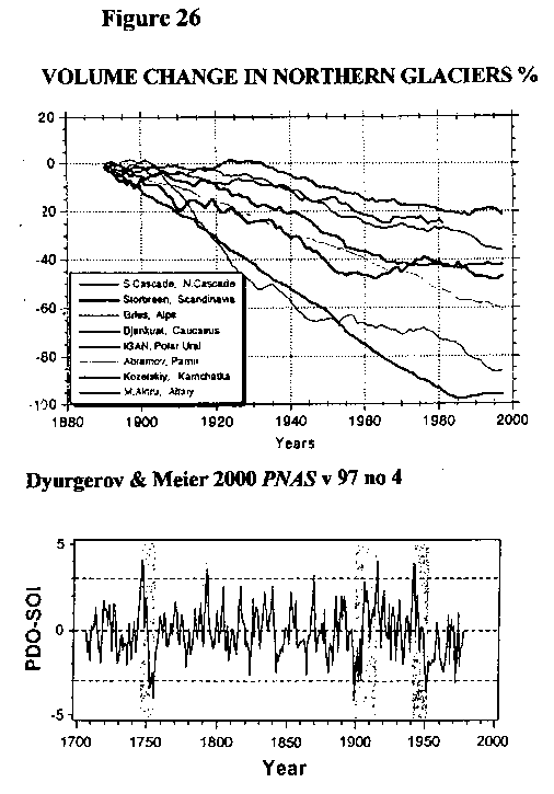
An indication of climate change in the Northern Hemisphere is provided by Figure 26 from a paper by Dyurgerov and Meier (2000). This shows that small mountain glaciers began to melt at 1900-20, their decay ceased from the 1940s to the 70s, and has resumed thereafter. Importantly, there appears to be little distinction between the first half of the 20th century without much anthropogenic CO2 emitted and the period since 1976. The world is warming, but human-caused emissions are not the main cause.
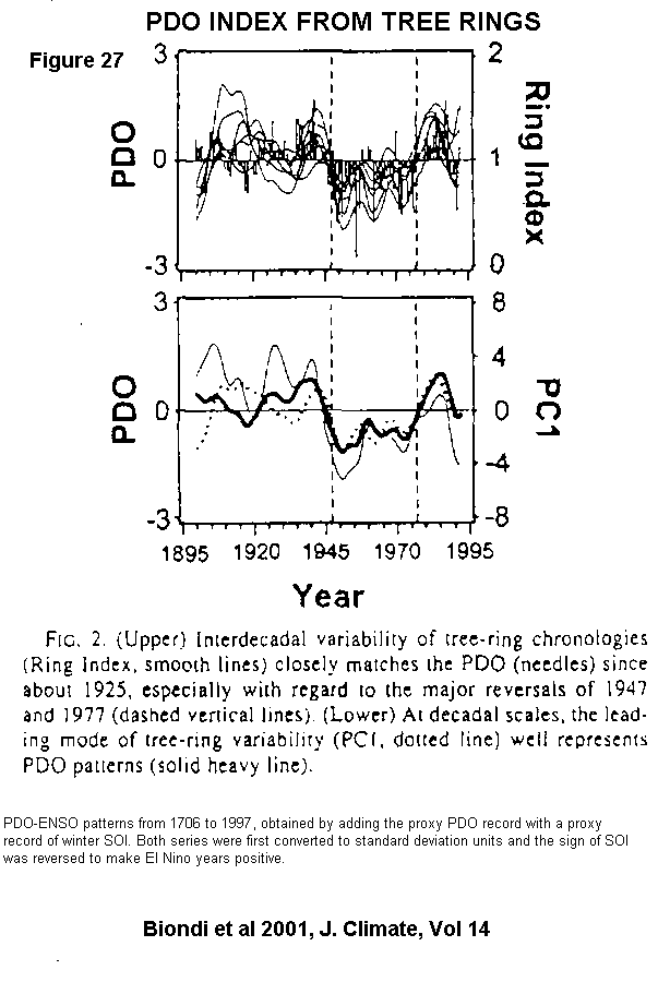
A generalised record from Southern and Baja California is available in Figure 27 from Biondi et al (2001) where, in their first pair of graphs, the PDO index (see Figure 23) is compared with a tree-ring climate proxy. This good correlation during the 20th century is used to derive a PDO index extending back to about AD 1700, based on longer availability of the proxy. So far, so good, it seems.
Now, Biondi et al ask us for a little faith. Their lower single graph shows the sum of the PDO index and a tree-ring-derived proxy for the (El Niño-related) Southern Oscillation index (see also Figure 24) over the last 300 years. Conceptually, one must have reservations about the addition and subtraction of indices. However, if these are set aside, an important conclusion can be drawn: The first (1910-45) tranche of 20th century warming is closely related to oceanic events in the eastern Pacific rather than to greenhouse, as asserted by CSIRO.
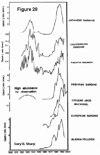
The smoothed PDO index in the second graph of the top pair by Biondi et al shows considerable correspondence to the Pacific fish-catch record in Figure 28 supplied by Gary D. Sharp of the Centre for Climate/Ocean Resources Study at Monterey Bay, California. Unsurprisingly, physical and biological changes march in lock-step.
With so much compelling evidence to the contrary, such as that presented in Figures 22-28 above, what is it that compels expert groups such as IGBP, WCRP or CSIRO to claim it highly likely that human activity has caused the observed changes toward a warmer climate over the last century? Could group-think have over-ridden sound science here?
In the Pacific, at least, what we are seeing is natural variability in action.
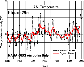
The step-jump in average global surface temperature at 1976/77 is not universally-observable. For instance, the continental United States doesnt show it (see Figure 29(a) from GISS via John Daly). True, two well-separated periods of warming are apparent, but the step is absent, and the temperatures of the 1930s are never exceeded (even though the more-populous states now display urban heat-island effects, see Footnote 8 above.)
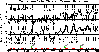
Nevertheless, the 1976/77 jump is sufficiently widespread to be prominent in global averages of surface temperature. Figure 29(b), again from GISS, shows the step clearly on averaged global (upper) and all-tropics (lower) temperature index graphs ex James E. Hansen.
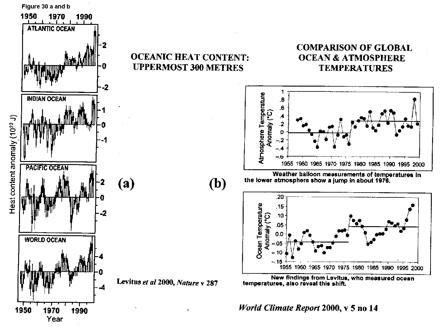
Figure 30 (a) shows a record of heat
content in the surface waters of world oceans, prepared by Levitus et al
(2000). In much of the oceanic world, a jump is detectable in the
mid 1970s.
Figure 30 (b) from World Climate Report (v 5 no 14, 2000)
compares the ocean and atmosphere records over the past four decades.
There is little doubt that the warming step in the lower atmosphere is
a response to abrupt contemporary changes in the oceans and not the other
way round.
The events of 1976/77 are not a response to the long-continuing, and relatively-steady in its rate, human-caused alteration to the composition of the atmosphere. On the contrary, they represent a sudden nonlinear transition between climatic regimes, ie natural variability. We can go even further: IPCCs numerical models cannot predict climate change in a nonlinear world such as the real world.
7.3 Can we identify an underlying driver?
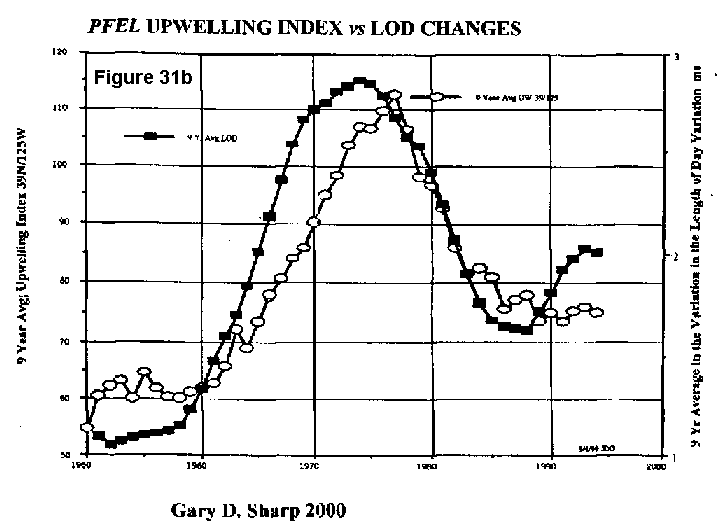
Gary Sharp provides a record of length-of-day variations during the
20th century. Figure 31 (b), in
particular, is a fingerpost. This graph contrasts a 9-year rolling
average upwelling index offshore Northern California with similarly-smoothed
changes in the rate of change of LOD. There is an abrupt change in
this index (open ellipses) in the late 1970s, immediately following the
LOD changes (closed rectangles). Human-caused GHG emissions dont
influence LOD; these upwelling changes are inertially-related.
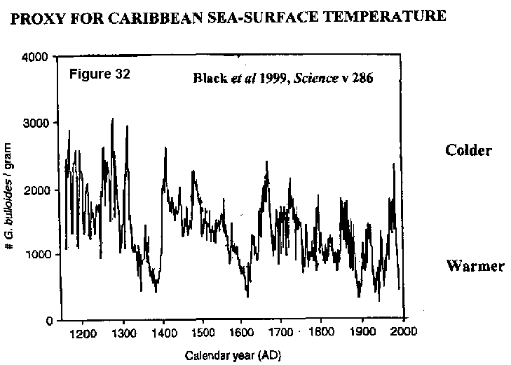
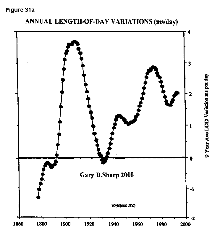
Corroboration is not yet abundant; but there is already a modicum of supporting evidence in the published scientific literature. The Little Ice Age (AD 1300-1900) began with an outburst of icebergs into the North Atlantic. At this time of widespread cooling in the North Atlantic Basin, there was pronounced warming in the Caribbean, as shown in the (upside-down) Figure 32 from Black et al (1999). This is the signature of inertial influence.
When a glacial surge reaches the sea and the ice floats, continental ice at high latitudes translates to water in equatorial seas. The Globes radius of gyration increases as a consequence, and its rate of spin decreases in order to maintain angular momentum, ie LOD increases.
But the mobile oceans are not glued to the stony Earth, and the linear momentum of oceanic water movements must also be preserved. One of the most likely places for oceanic heat transportation to be impeded by a decelerating Earth is in the Caribbean, where warm equatorial water crossing the North Atlantic would now tend to be ponded within the Antilles - rather than continue to turn right into the North Atlantic.
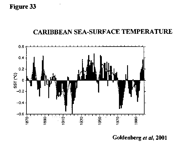
That the same principle might apply at much shorter time-scales is suggested by Figure 33 from Goldenberg et al (2001). This shows that sea-surface temperature in the tropical Atlantic at 10-14 degrees N and 20-70 degrees W, a region which includes the Caribbean, displays prominent cold/warm fluctuations. There was cooling at 1902 and 1970 68 years apart; and warming at 1926 and 1994 again 68 years. (Theodor Landscheidt has the mean length of one of his fundamental solar torque cycles at about 35 years we could be seeing two here; who knows?)
Clearly, these fluctuations have nothing to do with greenhouse. Furthermore, they are out of synch with fluctuations to a similar cyclicity in the eastern Pacific (see Figure 23). In the Pacific, SST fell in the early 40s and recovered in the late 70s.
This lack of conformity is suggestive of inertially-driven impedance in the Caribbean just as in Figure 32, but on a much-less-grand scale.
My suspicion is reinforced by a comparison between Figure 33 and Figure 31 (a). Although it is not yet possible to claim proven cause-and-effect, there were multiple LOD changes during the 20th century; and these are conclusive evidence of inertial changes.
If human-caused GHG emissions were indeed the main driver of observed climate change in the 20th century, one might expect the direction (even if not the magnitude) of the change to be the same almost everywhere. But, it is not only in the Caribbean that the sense differs from that in the equatorial Pacific.
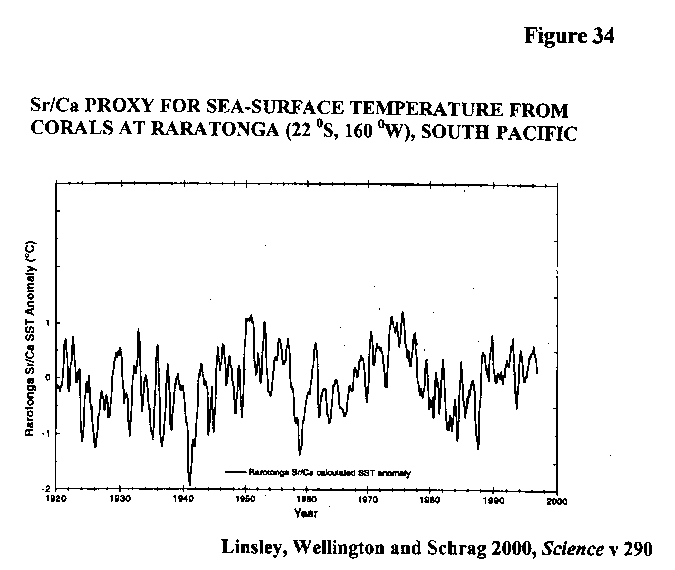
For instance, Figure 34 from Linsley et al (2000) shows a coral-based proxy for SST at Raratonga in the subtropical South Pacific. Here we see a sharp reduction from the mid 70s; and this also looks much like the result of changes in oceanic heat transportation and not a response to changes in atmospheric composition.
The Greenhouse Effect hypothesis cannot explain the most prominent climatic event of the 20th century that at 1976/77. This event was clearly ocean-related in the first instance, although the atmosphere must have played a substantial part in its subsequent propagation around the Globe.
This step-jump represents a major re-ordering of oceanic circulation, and hence a sudden change in oceanic heat transportation. Its underlying trigger is almost certainly inertial either directly, or even as the result of hunting or resonance arising from some earlier inertial perturbation. The original inertial trigger could have come from the discharge of continental ice into the sea, or from lunar or solar influences. The complex basinal geometry of the worlds oceans, of which the Caribbean provides a key example, would have impeded the smooth accommodation by (linear) oceanic flows of changes in the Globes rotation rate.
Only one thing is sure. If as much government money had been put into observational and deductive geoscience as has gone into numerical modelling of climate, we would already be far beyond the Greenhouse Effect dead-end in our understanding of what caused the observed changes in 20th century climate. Government-funded science in general, and not just the Report The Carbon Challenge reviewed in this paper, is trying to shoe-horn the greenhouse effect into a slipper in which it cannot fit.
I propose the Oceanic Impedance hypothesis of global climate change as a much more-plausible explanation for the climatic events of 1976/77 than IPCCs Greenhouse Effect hypothesis.
8. FEARFUL FORECASTS
A conference in Amsterdam was addressed by the IPCCs luminaries and,
as one might surmise, was as much intended to put pressure on wavering
governments as it was to aid the advancement of science. It was written
up by Fred Pearce in New Scientist of 21/7/2001 (p 4) as follows:
Within a century, Europe could be in the grip of a big freeze, the
Arctic devoid of ice and the Sahara covered by forest. These dramatic
possibilities were endorsed by 1800 climate scientists from 100 countries
who met in Amsterdam.
.. Their warning comes on the eve of
new talks on the Kyoto Protocol to stem global warming, and it is targeted
at politicians. The latest findings include the first hint of a slowdown
in the Atlantic currents that keep Europe warm
..
and later
Scientists are also warning of ways in which global warming could
spiral out of control. Besides the death and burning of forests,
they include large amounts of the greenhouse gas methane from melting permafrost,
and a collapse of the oceans ability to absorb carbon dioxide as global
warming makes ocean circulation even more sluggish.
A few thousand years ago, during the Holocene Optimum, a populous Sahara was well-watered and verdant; although I doubt whether, even then, it was covered by forest. Europe was warmer, of course, not colder then; although the Greenland ice-cap was probably much as it is now.
But arguing over details is pointless; IPCC cant predict climate 100 years ahead. Why does it then fail to speak out against blatant catastrophism such as in the quote above?
Closer to home, too, scare-mongering lives. For instance, the Western Australian Government tells us in its recent (2001) pamphlet 9Carbon rights in Western Australia that we are likely to face temperature increases of up to six degrees Celcius (sic) within 70 years.
But why worry? Its all in a good cause that of protecting the environment, remember. The end justifies the means, doesnt it?
9. CARBON CONCLUSIONS
In the warm, wet, Earthly Paradise of the Palaeocene (crocodiles
in the Arctic), atmospheric CO2 concentration was some 2,000-4,000 ppm
many times the 280 ppm which sufficed for our plants in pre-industrial
times, or the 370 ppm now as shown in Figure
35 from Pearson and Palmer (2000). How could this data still
be relevant?
The answer lies in heredity. Our land plants descend from those which evolved to gain benefit from a high-CO2 atmosphere. Literally hundreds of published papers indicate that, even today, plants grow faster in good times, and are more tolerant to stress (such as restricted availability of water) in bad, when grown in an atmosphere enriched with this notorious pollutant. This is why some commercial growers add CO2 to the warm air in their greenhouses.
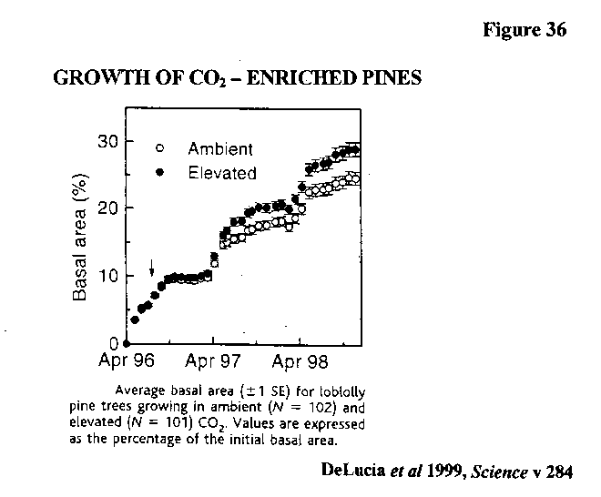
One of the larger-scale field trials was that held in 30 metre-diameter plots in a commercial stand of 13-year-old loblolly pines in North Carolina. Free-air CO2 enrichment of some 200 ppm was provided to three of six plots. As shown in Figure 36 from DeLucia et al (1999), the basal area of trees in the enriched plots increased more rapidly than in the controls.
But the story does not end there.
A battle for hearts and minds is in full swing; and it seems to have
more to do with political than scientific aspects of decarbonisation.
The evidence is in an amazing letter which later appeared in Science (v
285, pp 1850,1). It said of the DeLucia paper:
In the current, post-Kyoto international political climate, scientific
statements about the terrestrial carbon cycle must be made with care
_____________________________________________________________________________
9. This 8-pager is published by the Carbon Rights
Taskforce with Fran Logan, the Parliamentary Secretary to the Minister
for the Environment and Heritage and the Minister for Agriculture, Forestry
and Fisheries as Chairman.
Mihkel Arber, President of the International Council of Scientific Unions,
responded in defence of the scientists thus demeaned (as recounted in World
Climate Report, v 5 no 7, 1999):
Your letter on the need to temper scientific findings with political
considerations
is a chilling testimonial to the current trend to limit
objective reason in deference to political ambitions
The open rebuke
of a scientific, peer-reviewed paper on political grounds is unacceptable
to the scientific community
Your letter confirms
the observation that
a disturbing amount of politically correct research is being done with
little care for scientific accuracy.
I promise I am not making this up! The names of all five signatories to the offending letter appear in the list on the back page of The Carbon Challenge. One is an American (Moore), described as Chairman, International Geosphere-Biosphere Program (IGBP). Two are Swedes (Bolin, Steffen); and the two others are Australians from Canberra: Josip Canadell from CSIRO, and Ian Noble from ANU.
Inside the front of The Carbon Challenge is a statement which bears
repeating:
This Prospectus is the forerunner of a detailed scientific framework
defining an integrated carbon-cycle research-project jointly sponsored
by IGBP, IHDP and WCRP.
I think these people want money - our money. Everybody does, of course; but why do I feel so uneasy, in this case?
Decarbonisation is the tip of a veritable iceberg of contention. The ready availability of cheap energy is driver for the remarkable growth of wealth-creation since WW2. But the contention goes far beyond capitalism vs anti capitalism and modernism vs fundamentalism; or indeed beyond the USA vs EU struggle for global economic supremacy.
The battle extends to coal vs gas (but not coal vs nuclear it seems) and fossil fuels vs emergent renewable technologies.
On another plane entirely, but no less intense, decarbonisation is a battle for state funding of climate-change-related activities vs other intellectual endeavours; and, within climate-change, of economists/administrators vs bench-top researchers (some hope that carbon credits will become a new global commodity), and of observational geoscientists vs the new breed of modellers.
In our national capital, the battle is between ministries covering industry and the environment, respectively, for supremacy over one of Australias crucial economic sectors that which encompasses energy production, conversion and use, and related exports. But much more than the power-base of a few Canberra bureaucrats is at stake here.
In real life, the first major manifestation of this contention is likely to be Latrobe Valley brown coal vs NSW black coal for the supply of base-load electricity to Victoria. If Australia should ratify the Kyoto Protocol, and therefore begin to decarbonise, it will be bad news for the Valley.
But what of the environment?
Remember, the sole aim of the Kyoto Protocol is environmental protection. But here-and-now threats to the quality of the physical environment, and to the preservation of the biodiversity for which we are all custodians, have been ignored or forgotten.
Instead, The Carbon Challenge urges us to concentrate our money and our zeal on decarbonisation, when no environmental harm has yet been demonstrated, and no countervailing environmental benefit has yet been identified.
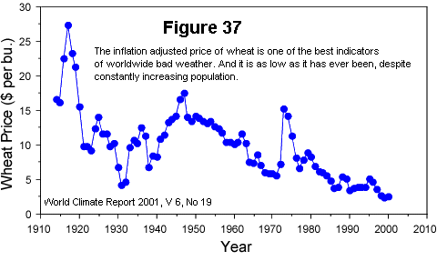
Eloquent testimony that CO2 is not a pollutant is provided by Figure 37 from World Climate Report (v 6 no 19, 2001). This shows declining real-terms wheat prices over the 20th century - in direct contradiction to the supposed harm to climate caused by increasing atmospheric CO2 concentrations during the 20th century.
Harmful or not, the crucial assertion in The Carbon Challenge that it is highly likely the observed changes toward a warmer climate over the last century are a consequence of the recent dramatic increases in atmospheric CO2 is not supported by the evidence. CSIRO is wrong here; these changes are largely the continuation of natural variability.
What then motivated this assertion? In my opinion, it was not protection of the environment.
Whether or not the effective demise of Victorias vast reserve of clean low-cost coal would confer any countervailing environmental benefit, is an issue which needs to be addressed. Up until now, our Federal government spends its money on propagating the message that carbon emissions are an environmental threat.
Show me a sceptical scientist, and I will show you an unfunded scientist.
10. CONCLUSIONS ACCORDING TO NATURE
10.1 Shooting the messenger
The Nature editorial of 12 July (v 412, p 103), ie immediately prior
to the opening of the Bonn continuation of COP6 on 16 July, was quickly
to the point. It was entitled Shooting the messenger and sub-headed
The Intergovernmental Panel on Climate Change has a creditable record
of developing a scientific consensus and delivering it to policy-makers.
What its critics really object to are the facts.
Nature is a booster of the dominant (greenhouse effect) paradigm of
global climate change; and its very-well-timed editorial is quoted below
as an example. This will be a long quote, I am sorry to say; but
then, as you will see, this is no ordinary editorial. It begins:
The drumbeat of diversionary noise that US coal and oil producers
have created around climate-change science has a certain inevitable rhythm,
all of its own. Take this years events, for example (although those
of any one of the past 15 years would do). The Bush administration,
short of scientific advisers of its own but keen to justify its premature
dismissal of the Kyoto Protocol on climate change
says of IPCC:
Why, then, is it embroiled in so much criticism? If the IPCCs
record is set against its critics charges, it soon becomes apparent that
the answer to this question lies in the latter groups unscrupulous determination
to defy the facts on climate change to the bitter end.
Right from the outset, the approach of certain industrial lobby groups
in the United States has been to resist, resist and resist again the mounting
evidence
continues (with my emphasis added)
To this end, they have championed specious scientific findings and
worked to establish a bogus scientific debate between their own experts
many of whom are not even atmospheric scientists and the consensus
view of climate researchers. In doing this, they have deliberately
set out to take maximum advantage of media gullibility, ensuring that stories
on the problem include both sides of the debate.
Science can only progress through its strong tradition of debate and dissent. But this particular debate discredits the notion of scientific dissent. Some of the climate-change dissidents bring to mind the Aids dissidents Others resemble the tobacco-industry dissidents
and concludes
The IPCC should continue its valuable work in the knowledge that
its integrity and adherence to the facts will ultimately prevail, bringing
credit to both its architects and participants.
The atmosphere rules, OK?
But its good for us to know that this great journal keeps an open mind on complex and multi-disciplinary scientific issues.
10.2 A look at the facts
In the climate-change debate, Nature is a partisan 10
fighting alongside the atmospheric scientists. Forget the vituperation
above; lets look at the facts which, Nature asserts, are already conclusive
enough - but which it doesnt then enumerate.
Two of the most crucial put out by IPCC, at least in terms of their attention-getting, are that the 20th century is the warmest in the last 1000 years, and that up to 6 degrees C of additional warming is predicted by AD 2100. These arent facts at all; nevertheless they were combined to make the Goebbelsian montage used by CSIRO in The Carbon Challenge (see Figure 2), and hence to scare us.
What has caused the world to warm since the last cold snap of the Little Ice Age at 1800-20? For the first two periods of warming, in the mid 1800s and at 1910-45, facts are scarce; but we do know this warming largely pre-dates the human-caused build-up of CO2 in the atmosphere. There is much circumstantial evidence pointing to twin causes (which could well be related, in ways we dont yet understand) increased solar activity, and increased flow of warm equatorial water into the Nordic seas.
But, for the last 50 years or so, we have many more facts available.
The world cooled abruptly in the late 1940s, and temperatures remained
depressed until the third period of warming began abruptly at 1976/77.
Crucial to the case of the atmospheric scientists is the cause of this
nonlinear transition between climate states at 76/77 - the most prominent
climatic event in the 20th century.
_____________________________________________________________________________
10. Nature is a good journal (I have published
in it myself on palaeoclimatology). Its fundamentalist position
on greenhouse may have as much to do with its German ownership as its English
domicile.
10.3 Atmosphere vs oceans
Was the prominent step-jump in average global surface temperature at
76/77 confirmation of IPCCs Greenhouse Effect hypothesis of global climate
change? And is the warming at a lesser rate thereafter, greenhouse
warming?
Greenhouse is a phenomenon of the atmosphere. If the lower atmosphere doesnt warm, that warmer atmosphere cant cause greenhouse effect warming at the surface. GHG emissions dont warm the surface directly.
From the start of adequate weather balloon coverage at 1958, right up to the step-jump, both atmosphere and surface cooled slightly hardly a compelling indicator of greenhouse warming.
But both atmosphere and surface warmed abruptly at 76/77. This warming coincides with a prominent re-ordering of oceanic circulation, as indicated by a sharp reduction in the upwelling of cold, deep, water in the eastern Pacific (see Figures 22, 23).
It is much more plausible that the observed atmospheric warming at that time is a response to the oceanic warming, than vice versa.
As corroboration of this line of reasoning, the prominent cooling in the late 40s coincides with a time of increased upwelling.
Recently Hansen et al (2001) have found evidence of a declining (deep) flow of cold dense water out of the Nordic seas, and across the Greenland-Scotland sill into the Atlantic, over the past 50 years. This adds to the evidence suggesting that the main climatic driver over the past half-century is much more likely to be changes in oceanic heat transportation than changes in atmospheric composition.
Oceans one; atmosphere nil.
But what of the continued warming since 1977?
There is even more information available for the past two decades. In particular, we have a comprehensive coverage of satellite-derived atmospheric temperatures since 1979. During this time (now 221/2 years), the atmosphere has warmed only a third as fast as the surface.
The simplest explanation for the discrepancy is that most of the surface warming during this time is not greenhouse warming.
Looking now in more detail, there is no warming of the lower atmosphere in the Southern Hemisphere. This seems logical enough. The dominant greenhouse gas is (naturally-occurring) water vapour, and it will tend to mask the potential warming impact of lesser GHGs such as anthropogenic CO2. Where does water vapour come from? It comes from evaporation; and this hemisphere is 80% ocean.
The only observed atmospheric warming trend over the period is in the mid latitudes of the Northern Hemisphere. The crucial clue is that most of the observed warming is over land, in winter.
It is the intensely-cold, bone-dry, anti-cyclonic cells over Siberia and Alaska/Yukon which enjoy most of the warming although temperatures remain far below freezing.
This may well be greenhouse warming. Oceans 11/2; atmosphere 1/2.
10.4 Hello Nature!
Hello Nature journal! Are you listening, up there in your
ivory tower of Goodness?
How can you support the advancement of science, when you object to scientific debate having two sides?
How can you justify limiting the scientific consideration of climate change to atmospheric scientists only?
Why do non-atmospheric scientists who question IPCCs autistic fixation with the atmosphere make you think of Aids and tobacco?
Have you allowed your dislike for the US, for President Bush, for coal and oil companies, and for anyone with a view different from your own, to colour your judgement?
Finally, why is it immoral to dissent from the stated scientific justification
for decarbonisation?
11. REFERENCES
Baliunas, Sallie L. and Willie Soon 1996, The SUN-CLIMATE connection,
Sky & Telescope December, pp 38-41.
Bianchi, Giancarlo G. and I. Nicholas McCave 1999, Holocene periodicity
in North Atlantic climate and deep-ocean flow south of Iceland,
Nature v 397, pp 515-7.
Biondi, Franco, Alexander Gershunov and Daniel R. Cayan 2001, North
Pacific decadal climate variability since 1661, Journal of Climate
v 14, pp 5-10.
Black, David E. et al 1999, Eight centuries of North Atlantic ocean
atmosphere variability, Science v 286, pp 1709-13.
Bond, Gerard et al 1997, A pervasive millennial-scale cycle in North
Atlantic Holocene and Glacial climates, Science v 278, pp 1257-65.
Broecker, Wallace S. 2000, Was a change in thermohaline circulation
responsible for the Little Ice Age? Proceedings of the National
Academy of Sciences v 97 no 4, pp 1339-1342.
Broecker, Wallace S. 2001, Was the Medieval Warm Period global? Science
v 291, pp 1497-9.
Bryant, Edward 1997, Climate process & change, Cambridge University
Press 209 p.
Christy, John R. et al 2001, Differential trends in tropical sea surface
and atmospheric temperat- ures since 1979, Geophysical Research Letters
v 28 no 1, pp 183-6.
Dahl-Jensen, D. et al 1998, Past temperature directly from the Greenland
Ice Sheet, Science v 282, pp 268-71.
DeLucia, Evan H. et al 1999, Net primary production of a forest system
with experimental CO2 enrichment, Science v 284, pp 1177-9.
Dyurgerov, Mark B. and Mark F. Meier 2000, Twentieth century climate
change: Evidence from small glaciers, Proceedings of the National
Academy of Sciences v 97 no 4, pp 1406-11.
Goldenberg, Stanley B. et al 2001, The recent increase in Atlantic
hurricane activity: causes and implications, Science v 293, pp 475-9.
Gray, Vincent 2000, The cause of global warming, Energy & Environment
v 11 no 6, pp 613-629.
Guilderson, Thomas P. and Daniel P. Schrag 1998, Abrupt shift in subsurface
temperatures in the tropical Pacific associated with changes in El
Niño, Science v 281, pp 240-3.
Hansen, Bogi, William R. Turrell and Svein Østerhus 2001, Decreasing
overflow from the Nordic seas into the Atlantic Ocean through the
Faroe Bank channel since 1950, Nature v 411, pp 927-30.
Huang, Shaopeng, Henry N. Pollack and Po-Yu Shen 2000, Temperature
trends over the past five centuries reconstructed from borehole temperatures,
Nature v 403, pp 756-8.
Levitus, Sydney et al 2000, Warming of the world ocean, Science v
287, pp 2225-9.
Linsley, Braddock K., Gerard M. Wellington and Daniel P. Schrag 2000,
Decadal sea surface temperature variability in the subtropical South
Pacific from 1726 to 1997 A.D., Science v 290, pp 1145-8.
Lowell, Thomas V. 2000, As climate changes, so do glaciers, Proceedings
of the National Academy of Sciences v 97 no 4, pp 1351-4.
Mann, Michael E., Raymond S. Bradley and Malcolm K. Hughes 1999, Northern
hemisphere temperatures during the past millennium: inferences, uncertainties,
and limitations, Geophysical Research Letters v 26, pp 759-62.
Menocal, Peter de et al 2000, Coherent high- and low-latitude variability
during the Holocene warm period, Science v288, pp 2198-2202.
Michaels, Patrick J. and Robert C. Balling Jr 2000, The Satanic Gases:
clearing the air about global warming, Cato Institute Washington
DC, 234 p.
Michaels, Patrick J., Paul C. Knappenberger, Robert C. Balling and
Robert E. Davis 2000, Observed warming in cold anticyclones, Climate
Research v 14, pp 1-6.
Naurzbaev, M.M. and E.A. Vaganov 2000, Variations of early summer
and annual temperature in east Taymir and Putoran (Siberia) over
the last two millennia inferred from tree rings, Journal of Geophysical
Research v 105 D6, pp 7317-26.
Overpeck, J. et al 1997, Arctic environmental change of the last four
centuries, Science v 278, pp 1251-6.
Pearson, Paul N. and Martin R. Palmer 2000, Atmospheric carbon dioxide
concentrations over the past 60 million years, Nature v 406, pp
695-9.
Robinson, Arthur B., Sallie L. Baliunas, Willie Soon and Zachary W.
Robinson 1998, Environmental effects of increased atmospheric carbon
dioxide, Petition Project document, Oregon Institute of Science
and Medicine, 8 p.
Stott, Lowell D. et al 2000, Increased dissolved oxygen in Pacific
intermediate waters due to lower rates of carbon oxidation in sediments,
Nature v 407, pp 367-70.
Urban, Frank E., Julia E. Cole and Jonathan T. Overpeck 2000, Influence
of mean climate change on climate variability from a 155-year tropical
Pacific coral record, Nature v 407, pp 989-93.
Vaganov, E.A. et al 1999, Influence of snowfall and melt timing on
tree growth in subarctic Eurasia, Nature v 400, pp 149-51.
Verschuren, Dirk, Kathleen R. Laird and Brian F. Cumming 2000, Rainfall
and drought in equatorial east Africa during the past 1,100 years,
Nature v 403, pp 410-4.
Posted 7, October, 2001
Copyright 2001 Bob Foster.
This paper can be found on Warwick Hughes new website: www.webace.com.au/~wsh.
Back to Front Page