Cincinnati
Various methods can be used to try to correct for urban heat island effects in temperature records. None are perfect, but some are better than others. This site often compares city records with those from nearby rural stations, a standard procedure in the literature.
The Climatic Research Unit of the University of East Anglia has come up with an interesting new method that is guaranteed to leave a nice hefty warming signal in the data. When validating their figures on Ohio, they took the uncorrected temperature record for Cincinnati (population 1.8 million) and compared it to the record from Columbus (population 1.3 million). Hardly the sort of comparison to reveal non-climatic trends!
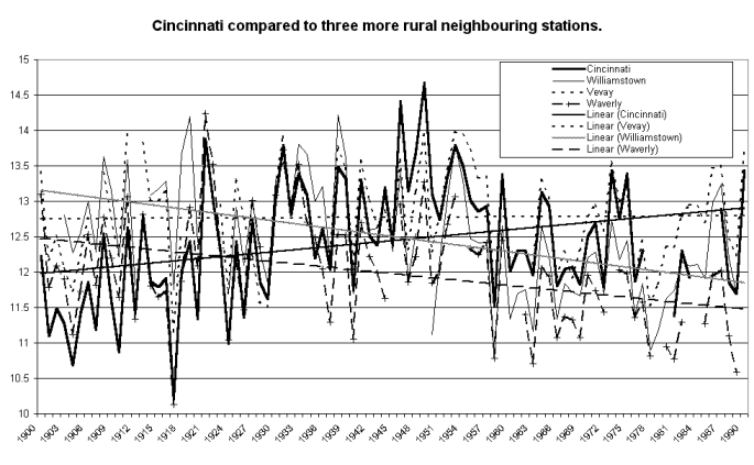
What would have happened if the CRU had used the more traditional procedure? Figure 1 shows Cinncinnati compared to three nearby rurals and you do not have to be a rocket scientist to see that the heavy black trendline for Cincinnati starts off just cooler than the rurals in 1900 but by 1990 is warming its way up through the heap. A quick test of this kind using that hard-to-obtain instrument, the human eye, would have caused the Cincinnati temperature record to be given the flick.
[Fig 1]
The Microsoft-drawn trendlines show that Cincinnati
warms by roughly 0.9 degrees C over the 90 years, Williamstown cools at about
1.3 degrees, Vevay has no trend and Waverly cools by 1.0 degree. A
close inspection of the traces shows that Cincinnati takes a step up about
1946, comes down again around 1951, and then makes another cooling step around
1979, which reduces its warming trend relative to the rural stations. These
three steps could be caused by any number of changes to instrumentation,
the surrounding environment, or even moving the equipment, e.g. to the airport.
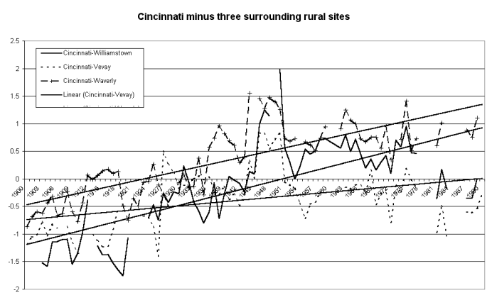
Figure 2 substracts the rural records from Cincinnati’s. This brings out both the steady warming in Cincinnati up to 1946 and the non-climatic jumps mentioned above, finishing wit h the step down before 1990 which trimmed the overall UHI effect in the record. It is interesting that something happened in the Waverly record in 1944 to insert a non-climatic cooling in a year when other district temperatures rose over 1943. That causes the jump in the Cincinnati minus Waverly trace a couple of years before the jumps in the other two comparisons reflect the Cincinnati site changes in 1946.
[Fig 2]
The greenhouse industry likes to claim that station temperature data has been rigorously cleansed of all local heating effects and other non-climatic anomalies. Yet Cincinnati shows yet again the familiar pattern of a hefty uncorrected warming trend in a city-based station where obvious discontinuities in the record have been totally disregarded.
What are the real temperature trends in southern Ohio?
The three rural stations suggest the the region cooled by around 0.75 degrees
over the 1900-1990 period. But the CRU data used by the IPCC includes Cincinnati’s
apparent warming of 0.9 degrees. So Cincinnati inserts about 1.65 degrees
of UHI warming into the 90 year period — nearly three times the IPCC estimate
of "global warming". How many other CRU stations show similar fraudulent
warming?
Check the rest of this site and make your own assessment!
Posted 2, July, 2000
Updated 4, June, 2001
You saw it first here.
© Warwick Hughes, 2000
Back to Cities List
Back to Front Page