This is an updated version of the Hotlanta page originally posted in May 2000 before I had the Jones 1994 data.
We are talking here about the Urban Heat Island (UHI) over the cities of Atlanta and Macon, where the temperature record was used by Jones 1994 uncorrected !
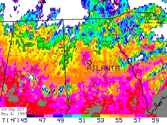
The term Hotlanta was coined by NASA who have published on one of their web sites the processed infra-red satellite image below. It is a snapshot of surface temperature contrasts over part of the south east USA in 1997. [For more images and links, click on Satellite Infra-Red Images on my main page.]
The main feature of the Hotlanta image is a prominent oval-shaped warm anomaly over the location of the city of Atlanta. There are a few smaller but distinct warm anomalies that correspond with towns. Colombus is one example - perhaps readers familiar with local geography can pick out others.
On their website, NASA do not mention any other UHI's on the image nor could I find any comment on the implications of the Atlanta UHI for long-term temperature records. This is the usual attitude of most big climate research organizations when up against data that goes against IPCC dogmas. Obviously this UHI did not just materialise on May, 6, 1997 just in time for the satellite. It has been growing for more than a century, gradually contaminating the Atlanta temperature record for all that time and contributing to the exaggerated global warming trends published by the IPCC.
Atlanta and related temperature records:
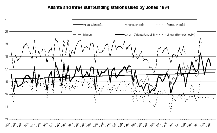
It is interesting to consider the CRUs selection of data series and
periods in this region. Jones 1994 used records from Atlanta, Macon,
Rome and Athens starting 1945. Now Macon is a city of 100,000+ population
while both Rome and Athens are in the 30-40,000 range. None of them
is really rural, yet as the graph below shows, there are plenty of genuinely
rural stations available from southern Georgia.
The rurals show clearly that the region has cooled over a century. Even Rome cools by over 1 degree meaning that the UHI contamination inserted by using Atlanta is nearly 2 degrees per century. Yet the first graph shows Atlanta warming nearly a half degree C per century - good one for the IPCC! Macon is very similar in trend to Atlanta while Athens also warms at a rate close to Atlanta.
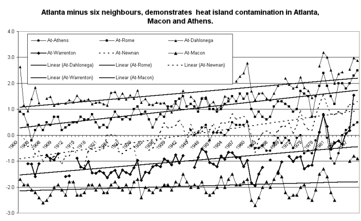
A more sensitive way to compare temperature records is to subtract
one from the other. If both records are sampling the same regional
climate and neither is affected by site changes or equipment problems,
than the resulting difference graph, while zig-zagging slightly to
reflect minor annual variations, should be broadly flat over time.
In the graph below notice that Atlanta minus Macon is very flat, reflecting similar UHI-affected trends in both places. The traces of Atlanta minus the three rural records - Newnan, Warrenton and Dahlonega - all indicate the steady UHI growth in Atlanta. (Note that the Atlanta-Newnan difference before 1933 could be affected by a discontinuity in Newnan.) The small town of Rome used by Jones also shows Atlanta to be warming. Why was this overlooked? Why was Atlanta left uncorrected in the data set when nearby rural stations provided clear evidence that Atlanta was undergoing rapid UHI warming?
The sudden drop in all three traces suggests that the Atlanta recording
station experienced an abrupt cool correction post 1960. This may
reflect a site change such as a move to an airport or urban fringe location.
The drop has the effect of moderating the non-climatic warming in the Atlanta
record. However, the Atlanta record immediately resumes its warming
trend, and the non-climatic warming in Atlanta versus the three rurals
is about 1 degree C just in the period from 1967 to 1991. This shows
how rapid and severe UHI contamination can be compared to a claimed "global
warming" of only ~0.6 degrees per century.
It is clear from comparison with rural stations that the Atlanta, Macon and Athens temperature records all have non-climatic warming trends. Not only that, but both Atlanta and Macon fall within warm IR anomaly signatures on the Hotlanta satellite image from NASA, and the new NASA satellite image of the earths night lighting shows all three stations are associated with strongly illuminated urban areas.
All this surely adds up to the obvious conclusion that Atlanta, Macon and Athens were unsuitable stations to measure long-term climate variations. Using these three stations generates a spurious warming trend in a region where there is clear evidence of long-term cooling.
Click here and go to the USA East image
You read it all first here.
This page posted 2, January, 2001, updated 12, January, 2001. Re written
9, June, 2001
© Warwick Hughes, 2000, 2001
globalwarming-news.com
Back to Cities List
Back to Front Page