A reference to this graphic would be great – downloadable pdf even better.

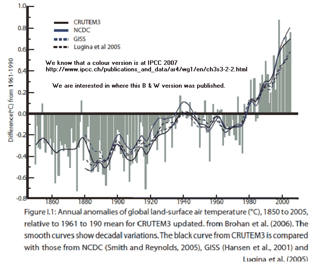
It looks like a black & white version of the graphic in IPCC 2007 – link in comment 1 below.
Thanks
WSH
A reference to this graphic would be great – downloadable pdf even better.
It looks like a black & white version of the graphic in IPCC 2007 – link in comment 1 below.
Thanks
WSH
Was it made up for the AR4 at the IPCC? It looks like the graphic here
3.2.2 Temperature in the Instrumental Record for Land and Oceans
I haven’t found the exact image, one using the black and white dashed line. The caption of other versions mention the colors, and searching for the colorless description above finds nothing. Searching with the erroneous date phrase also finds nothing.
There is a version in “Part II Section C
A BASELINE APPRAISAL OF WATER-
DEPENDANT ECOSYSTEM SERVICES, THE
ROLES THEY PLAY WITHIN DESAKOTA
LIVELIHOOD SYSTEMS AND THEIR POTENTIAL
SENSITIVITY TO CLIMATE CHANGE” on PDF page 24 which credits “Source: Trenberth et al. (2007), p. 242.”
Looks like another copy, without a source given, is at www.ipcc.ch/publications_and_data/ar4/wg1/en/ch3s3-2-2.html
Thanks to you both for tracking this original down to our dear old mates at the IPCC.
The copy I have was remade for B & W – is Fig 1.1 not 3.1 and the caption has been altered taking out refs to colours. Who knows, the source for the B & W version might turn up too.
The 1978-present variation is about 2.5 times as large as satellite data. Why is this obviously wrong set of information of any possible interest?
Added 4.30am 10 Feb: Remember Leonard – this is land only. Surely the IPCC could not get a prominent figure like this wrong. I am very busy today but will check datasets later. Thanks.
I first saw the black and white version here:
www.greenworldtrust.org.uk/Science/Curious.htm
The text before it reads:
“I noticed doubts in the AGW forums that I’d passed over before. I noticed unexplained anomalies in the most basic data. IPCC (Intergovernmental Panel for Climate Change) use the following graph showing global temperature rise from 1860 to now. Their original bright red/blue vertical bars are actually highly distracting, so I’ve toned them all down to pale gray. ….”
I took it from that that the webhost had recoloured the graph herself (sorry I know it was a woman but I can’t remember her name)
Margaret shes a blogger named lucy skywalker she posts from time to time on watts up, bishop hill and the air vent.