Many of us have seen the article by Willis Eschenbach over at the Anthony Watts site, “Smoking gun at Darwin Zero” (SGDZ) . I disagree with Willis that the strongly warming GHCN Darwin 0 data has been used by CRU.
Fig 1 in SGDZ shows a small IPCC diagram with a sketch temperature trend for Northern Australia for the period 1900’s to 2000. Willis found that the GHCN adjusted Zero version for Darwin warmed very strongly post 1940, see his Fig 8.
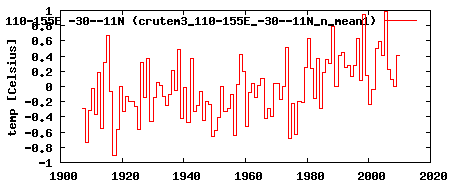
That trend in Fig 1 looks to me to agree with the land only CRUT3 trend that anyone can generate for that Northern Australia region using the useful KNMI Climate Explorer page which lets you interrogate many monthly global databases – enter link on right to Monthly observations.
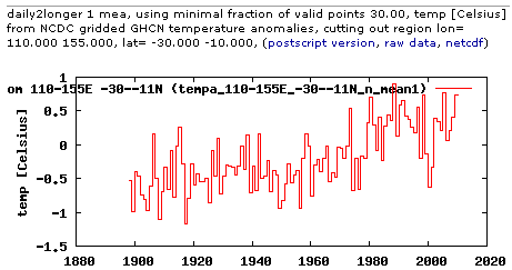
Downloading CRUT3 and NCDC GHCN for the period 1907-2000 I get trends over the 94 years of 0.48 for CRUT3 and 0.87 for NCDC GHCN.
Following four graphics all from KNMI Climate Explorer
IPCC Northern Australia region – trend for CRUT3
IPCC Northern Australia region – trend for NCDC GHCN
Darwin grid cell – trend for CRUT3 (I think they are wrong to join Darwin Post Office to Aiport like that) No sign of Darwin Zero here.

Darwin grid cell – trend for NCDC GHCN

To wrap up this section re Darwin Zero, I am saying the GHCN Darwin Zero data is not used in CRUT3. What a shambles the global T datasets are.
Willis says in SGDZ “One of the things that was revealed in the released CRU emails is that the CRU basically uses the Global Historical Climate Network (GHCN) dataset for its raw data.”
IMHO you have taken this idea too far Willis and this has lead to the mistaken impression that GHCN Zero is causing the trend in the Fig 1 IPCC graphic at SGDZ.
Jones et al 1986 constructed their foundation data before GHCN was even published !! We have Jones et al station documentation for those 20 year old versions of CRUT (they included Darwin from 1882) – that provided global warming trends for the commencing of the IPCC at the end of the 1980’s – the Rio Conference in 1992 – Jones et al 1986 was in every way the BIRTH OF GLOBAL WARMING as we now know it. The GHCN followed along afterwards and basically agreed.
Sure, from his Jones 1994 update – Jones inserted many more stations and common sense tells you many of these must equate to GHCN sites. But I would bet my bottom dollar that they were all carefully sifted, scrutinised and altered where required by Jones / CRU before being used. Remember we do have the Jones 94 station data – but we do NOT have 1994 station documentation equivalent to the 1986-1991 TR022 and TR027 books published by the US Dept of Energy, CDIAC, refs here
These books are out of print, I hope people ask CDIAC to do another print run of the 1991 edition. It would be great to ask CDIAC for updated documentation books with all current station data too. Remember the DoE have been funding Jones / CRU from the early 1980 and I bet still do.
Back to Willis’ contention that “..CRU basically uses the Global Historical Climate Network (GHCN) dataset..”.
The Jones & Moberg 2003 update was a monster cut n paste n fill – mix n match, as stations numbers blew out to over 5,000.
There was no station data or TR022-27 type documentation for this version – but we have to assume their methods were basically as set out in TR022 and TR027. IMHO around this time senior UKMO people got uneasy at the developing shambles that was CRUT2 and planned the ending of that series in 2005 and the migration of the project across to the UKMO / Hadley Centre as CRUT3 with Jones as the “tail end author” in the Brohan paper.
See my; Huge variations now between the 3 main global T datasets
An example in detail: Hadley Centre inserts more warming into New Zealand climate history
I notice 24 Nov 09 statements by CRU saying, “It is well known within the scientific community and particularly those who are sceptical of climate change that over 95% of the raw station data has been accessible through the Global Historical Climatology Network for several years”. IMHO that was a classic example of misinformation and obfuscation – of which there are many examples in the last 25 years of climate saga. We should not be lead astray by CRU / Jones attempts to divert us from requiring that they reveal all their station data. As I say above, any GHCN stations incorporated in Jones et al data would have been “..carefully sifted, scrutinised and altered where required by Jones / CRU before being used”.
Let me just finish by saying, nobody will ever understand what Jones / CRU have done by studying the GHCN – which is riddled with its own errors.
Good work Warwick and more power to your arm. You say “What a shambles the global T datasets are.” Even the Australian high quality network data is pathetic. Many of the stations, as you would well know, don’t even cover 60 years, many are at airports and collection details, instrument/site changes are not documented for the public.
There seems to be a discrepancy in the BOM records re raw data and their anomaly graphs in their
Australian high-quality climate site data. A blogger on Andrew Bolt’s site noticed that when the mean temp for Cape Otway Lighthouse station was calculated from the raw data it was not reflected in the anomaly map.
I checked Yamba Pilot Station and found a similar discrepancy straight away.
1915 had a max av temp of 23.6C and a min av temp 0f 15.9C.
2008 had a max av temp of 23.6C and a min av temp 0f 15.5C.
Clearly, 1915 has a slightly higher mean av temp than 2008.
Yet the anomaly graph shows 2008 higher than 1915 by 0.2C. Eh! It should be the other way around.
These discrepancies (which also show up in Cape Otway) give a false impression that the recent warming is greater than it really is. There must be many examples of this (NZ, Darwin, Arctic stations, etc).
A review is definitely warranted of all BOM data.
Anomaly data at:-
reg.bom.gov.au/cgi-bin/climate/hqsites/site_data.cgi?variable=maxT&area=aus&station=058012&period=annual&dtype=anom&ave_yr=10
Raw data (max temps) at:-
www.bom.gov.au/jsp/ncc/cdio/weatherData/av?p_nccObsCode=36&p_display_type=dataFile&p_startYear=&p_stn_num=058012
and min temps at:-
www.bom.gov.au/jsp/ncc/cdio/weatherData/av?p_nccObsCode=38&p_display_type=dataFile&p_startYear=&p_stn_num=058012
I agree, Warwick. I made a similar comment, with graphs of the CRU data for Darwin from the recent MetOffice release, in Willis’ WUWT thread at 8 Dec (16:48:04). This data shows no rise at Darwin, and no GHCN-like adjustment. He hasn’t responded.
Ian, note in the URL for the “Anomaly data” the folder /hqsites/ – well I think that is BoM code for what I would term, stroked, tweaked and altered data.
Nick, there certainly is widespread misinformation around about the makeup of the global datsets. A well worn furphy is this notion that Jones / CRU use the GHCN. It is surreal that even the CRU authorities are taking refuge in this, knowing that it will lead researchers to no valid conclusions. Remember too how the UKMO’s Geoff Jenkins is revealed in the Climategate emails asking about the Jones et al 1986 methodology – re did Jones et al “correct” for UHI. They NEVER did – as Geoff was told.
Marvellous stuff – worth framing.
Further to my post above, I did some more checking. Using the the av max temp raw data for Lismore, NSW, Australia, I found there had been changes when the data was used to create the official long-term temp and anomaly maps. The early raw data records have been ‘dumbed down’ as follows.
Temperatures prior to 1940 show a discrepancy of between 0.4c to 1.0C.
Temperatures from 1940 – 1979 show a discrepancy of about 0.3C.
Temperatures from 1980 are consistent with the raw data.
Thus when the max temperature and the anomaly graphs are produced they both show a continuous warming from 1910. When the raw data is plotted, there is no warming apparent. Some examples are:-
1919 – raw data av was 27.4C Dropped to 26.7C for official graphs.
1940 – raw data av was 26.4C Dropped to 26.1C for official graphs.
1980 – raw data av was 26.1C No change at 26.1C for official graphs.
2002 – raw data av was 26.5C No change at 26.5C for official graphs.
Ian, I think what you are tracking here is the BoM quietly adjusting our temperature data – which happens to fit the IPCC view of the past.
Warwick,
Here’s another piece of research I’ve been doing – if you can bear with me.
I looked at four data sources for Lismore (058037) – the BOM raw data (the weather station data), the BOM Annual Mean Temp graph on the high-quality climate site data page, NASA gistemp Stations (combining sources at same location) and NASA data (after homogeneity adjustment).
Year Raw mean Data BOM AMT(graph) NASA (cs@sl) NASA (aha)
1910 19.45 18.5 19.38 18.88
1915 20.45 19.7 20.67 20.17
1940 19.8 19.3 19.82 19.32
1960 18.95 18.4 19.12 19.62
1980 20 19.6 20.27 19.88
1992 19.15 19.2 19.16 19.15 (The NASA records end at 1992.)
Notice that the later the time period the closer the ‘adjustments’ become relevant to the raw data, both with the BOM graph and the NASA data. I don’t know if this is just this station (I’ll look at others later) but the effect of this is to make the anomaly graph look as if there has been a steady rise in mean temps for this site when in fact there hasn’t been.
Sorry, 1960 NASA (aha) should read 18.62, not 19.62.
Don’t you hate it when you make a typo?
And the table I started with did not turn out the same as in the ‘leave a comment’ box (gaps closed up).
I have been analyising Halls creek.
Can anyone explain how they managed to merge two stations with little trend into a “quality”station that has 1.3 degees per 100years warming?
Warwick, hi,
It really is quite confusing and the house is built on shifting sands. I have looked at Darwin a few times. About a year ago I downloaded a KNMI graph that attributed its source to GHCN Version 2 adjusted. The Tmean start in 1885 is 25.5 deg C and the end in 2008 is 27.7 deg. If this matches one of the Willis graphs, then that is good because the provenance is listed as above.
In many sites I have examined, there is a coming together of data atreams, as if there had been an IPCC meeting coming up, with a request that the major adjusters get their ducks in a line.
s260.photobucket.com/albums/ii14/sherro_2008/?action=view¤t=HallsCreek.jpg
Sorry, wrong graph stored. Here is the intended one:
i260.photobucket.com/albums/ii14/sherro_2008/Spaghetti_darwin_necking.jpg?t=1260953900
Another example of adjusted data to show warming.
The Annual Max Temp graph 1910-2008 for Kent Town (023090) shows a dramatic rise for the last two decades. But Kent Town only commenced in 1977. All previous data must therefore have come from Adelaide West Terrace (023000) which started in 1839 and closed in 1980.
When one compares the raw data we see some discrepancies. For instance, the raw data for WT shows 1914 had a yearly max temp of 23.6C but appears on the graph at 22.9C. 1921 was 23.4C but is graphed at 22.8C.
When you get get to the 1940s the difference is less. Then lo and behold, raw temps match the graph from around the mid-70s.
By ‘dumbing down’ previous raw data, you must get a warming trend when you apply the raw data as per the record in later years.
Another point – Kent Town and West Terrace overlap for one year – 1978. Kent Town was 0.2C hotter than West Terrace in that year which raises the question – shouldn’t the WT raw data be adjusted up 0.2C when the two stations have been joined?