Remembering all the propaganda and media hype about endless temperature records and heatwaves during our hottest ever summer courtesy of the BoM.
Plus our Angry summer courtesy of the Climate Commission. It is pertinent to recall how the BoM maximum (daytime) temperature Outlook visualized summer.
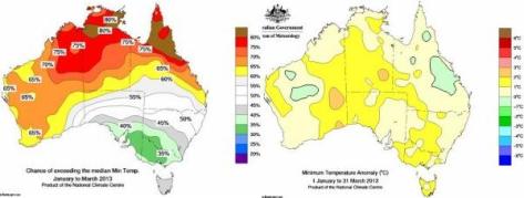
Can you believe with a huge cool trough running east-west through the centre of the continent – almost the exact opposite of the real world weather. What fantasy land does the BoM inhabit ?
All 4 map panels have Outlook forecast on left and real world weather temperature anomalies on the right.

The minimum (night-time) Outlook has many failings.

The maximum Outlook for Jan-Feb-Mar failed to forecast the prominent cool anomaly in far Eastern Australia.

The minimum Outlook for Jan-Feb-Mar failed on more points than the maximum Outlook
You can check the BoM Outlooks archives for temperature and rainfall.
BoM temperature and rainfall anomaly maps for various parameters and timescales can be made at their Maps – Recent & Past Conditions page.
The ABOM chalks up yet another Epic Fail. What are we paying them for?
Sorry to break in off-topic, but an internet friend has just posted an article which I think will interest many here.
judithcurry.com/2013/04/10/historic-variations-in-arctic-sea-ice-part-ii-1920-1950/#comment-310689
By the way, Warwick, thanks for keeping numerous maps and graphs which can be surprisingly hard to track down on official sites like the BOM. Try getting a rainfall skyline graph for NSW, for example, to get a comparison of the post-1950s with the pre-1950s. All this should be prominent and at everyone’s fingertips, but it’s usually easier to search for such material using the name of this site, even if it’s the BOM’s own material.
It’s like when the pre-Reformation church didn’t want just anyone reading the Bible!
Warwick
Do you understand statistics? If the above and below temperature anomalies areas perfectly matched the above and below percentages THEN the graphics would be a fail.
An 80% chance that the anomaly would be above average means that 20% of the time the anomaly would be below average. For every 1 in 5 points on the graphic – at 80% – you should expect to see the opposite.
Unless of course there is a conspiracy.