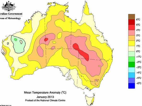
On page 10 of 23 the BoM “Special Climate Statement 43 – extreme heat in January 2013” – Updated 1 February 2013 – says –
“2.5 Monthly mean temperatures for January
January 2013 was Australia’s hottest month on record. Averaged nationally, the
maximum temperature was 36.92°C, 2.28°C above the 1961-1990 average, and 0.11°C above the previous record of 36.81°C, set in January 1932. The monthly mean
temperature (day and night combined) also set a record. It was 29.68°C, 1.77°C above the 1961-1990 average and 0.27°C above the previous record of 29.41°C, also set in January 1932.”
Now making graphs for each of the States and Territory at this BoM web page. When you check out what I have done, make sure you set the page to Mean Temperature – choose your State – then pick January.
New South Wales & the ACT – no record January 2013 here

Queensland yes a tiny win for the BoM by 0.1°

Victoria shows no record warm January 2013

Tasmania likewise shows no record January 2013

South Australia likewise shows no record January 2013

The Northern Territory did set a record mean temperature for January 2013

Western Australia set no record mean temperatures for January 2013

What on earth is wrong with BoM data ? According to the web-page these charts use the brand-new-you-beaut-adjusted-warmer ACORN data.
If anybody has an explanation of how an Australia-wide record hot January can be claimed that does not show up in 5 of the 7 State/Territory regions, please let me know.
Where do you get the up-to-date ACORN data because I really don’t know which stations the BOM uses to arrive at these figures.
For instance the BOM summary for NSW in Feb says that we had a 31.6C max average which is 0.2C above the average.
But when you look at the data supplied you find the following.
Of the 157 stations listed, the average temp is 27.7C.
If you calculate the 81 stations that have the anomaly listed, the anomaly is -0.53C (the anomaly listed stations are usually those with long-term data).
Of the anomaly listed stations, there are 55 stations below average and only 22 above average, with 4 stations listed as right on average.
So how can that possibly be above average?
Does the Bureau take the temperature from the gridded maps? But if one looks at the max temp deciles map even that doesn’t show above average temps.
Maybe I should check the ACORN listed stations and check against the normal BOM data for that station – may take awhile.
Can anyone enlighten me?
See summary here.
www.bom.gov.au/climate/current/month/nsw/summary.shtml
If you click on the link “About time series” in top right you see by scrolling down that the ACORN dataset is used. By taking the Tabs there wou find downloadable station data.
Yet on the anomaly maps if you click on the link “About the map” you read that they use data from ADAM not the highly adjusted ACORN.
Here is the anomaly map for January and it is obvious that most hot anomalies are in areas where stations are the most sparse.
And also would have been more sparse going back over the decades. I think the BoM must rely on pretty tenuous statistics to get their outcome. Too many ACORN stations are UHI affected – imagine if we had this big city satellite scanning research extended to Australian country towns. They would all have UHI shown by the satellites.
As you’d be well aware Warwick, those who’d plant an ACORN do so with the expectation that it will grow into something much, much, bigger. Now I’d be the last to cast aspersions concerning the methodology and motivation of the climate truth-seekers at the BOM, but then I guess when the slipper fits you just gotta wear it!
This is what ACORN adjustments look like. This is raw data for Bourke in Jan, 1939 compared with the adjusted ACORN temp. Every temp over 30C has been adjusted down, every temp below 30C has been adjusted upwards. There is no rhyme nor reason for these adjustments.
Jan raw Jan ACORN
1st 38.9 38.4
2nd 40 39.1
3rd 42.2 41.9
4th 38.1 37.9
5th 38.9 38.4
6th 41.7 41.5
7th 41.7 41.5
8th 43.4 43
9th 46.1 45.7
10th 48.3 47.9
11th 47.2 46.8
12th 46.2 45.8
13th 45.7 45.3
14th 46.1 45.7
15th 47.2 46.8
16th 46.7 46.3
17th 40 39.1
18th 40.1 39.1
19th 40 39.1
20th 41.9 41.7
21st 42.5 42.1
22nd 44.2 43.8
23rd 36.7 36.5
24th 40.3 39.2
25th 36.6 36.5
26th 29.4 29.5
27th 29.3 29.4
28th 28.8 28.9
29th 30.6 30.5
30th 35.6 35.4
31st 38.6 38.3
This reduced Bourke’s monthly max average mean from 40.4C to 40C and reduced a 17 day +40C heatwave to 11 days.
If ACORN has done this to other stations much of the present warming could be explained.
Ken Stewart has just posted in a similar vein but on mean summer temperatures.
The BoM media release is here – the link below to The Conversation has more information.
Can I just point out – summer of 2012/13 was not a record in any State or Territory. So what I am saying is the claim for an all-Australian hottest summer must indeed be tenuous – particularly taking into account the characteristics of our historic weather station data.
Readers can easily check for themselves – set the graphs to Mean Temperature – Choose your State – set Summer. Now tell me was summer of 2012/13 a record in any State or Territory ?
Warwick,
You ask whether it is possible for the national average to be a record in 2013 even if none of the states, or only a small minority of states, have a record in 2013.
I think it is possible, though I am not sure I can prove it mathematically. Look at it this way, however: if 2013 is not the record year, which other one is? That other one is hard to find because the other candidates for the national record are different years in different states.
For example, taking just the January numbers you posted, I looked at Queensland, where that month was just marginally a record, and then checked the second warmest year – it was 2006. So was 2006 warmer nationally than 2013? It was warmer in NSW by a lot, so 2006 was warmer in NSW and Queenland combined than 2013. What about the other states? Victoria – also warmer in 2006. So 2006 was definitely warmer than 2013 in the three eastern states. Same goes for South Australia. But Tasmania and the NT were cooler in 2006 than in 2013 and Western Australia – the biggest state – was a huge amount cooler in 2006, more than 2 degrees. So 2013 would still be warmer than 2006 nationally.
Then I looked around for other candidates. 2008 was the warmest in Western Australia, and it was pretty warm in the NT too, and about the same as 2013 in SA – but it was far colder in QLD and NSW, so it would not beat 2013 overall. Other candidates – 1939 was the hottest year in NSW, but it’s no good because in WA it was 2 degrees colder than 2013.
I could go on but you see the point. I can find years hotter than 2013 in states other than the NT and QLD, but they are different years in each state. Every year I look at as a candidate for “warmer than 2013” is very cold somewhere, so is not going to make it.
All up, I’d say the BoM’s claim is likely to be statistically correct, on their statistics. If they had not tampered with those statistics so much before they did the comparison, then I might even believe them…
Are we seeing an example of Simpson’s Paradox – Google gives you plenty of examples.
You ask whether it is possible for the national average to be a record in 2013 even if none of the states, or only a small minority of states, have a record in 2013.
It’s certainly possible, but fairly unlikely.
Whoops – a mistake by the BOM or …..?
Has 2009 been relegated behind 1998?
In the 2011 Annual summary, 2009 was listed 2nd hottest year on record. The anomaly was 0.9C and consistent with the 2009 Annual summary.
See here (scroll down to Annual and Decadal Mean Temps).
www.bom.gov.au/announcements/media_releases/climate/change/20120104.shtml
Now check 2012 summary – more like 0.6C. Someone get the ‘9’ upside down.
www.bom.gov.au/announcements/media_releases/climate/change/20130103.shtml
This is akin to the claim of Mackay having their hottest temp in Jan this year at 39.6C – it was actually 36.9C and not the hottest.
So has all this hottest summer been a mistake???? Someone make a mistake???
Whoops, sorry – 0.8C (not 0.6C). I’m a victim of my own criticism.
Yes Ian, you are right to point out that in the BoM “Annual Australian Climate Statement 2012” the 2009 anomaly has been relegated lower than 1998.
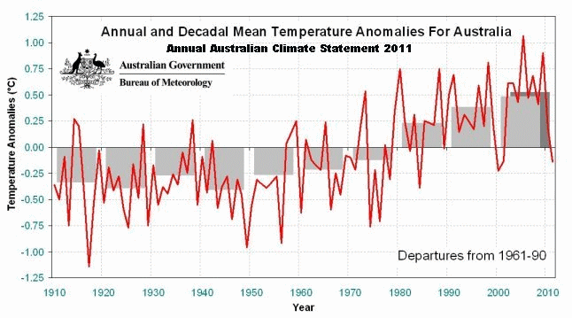
That is confirmed at this Time series graphs page too.
Obviously the BoM fiddles constantly with our data – I suspect to the point where most of them could not keep up with what has been done. Ian’s find was worth a new post.
The Time Series Graph seems to confirm that 1998 was warmer than 2009.
www.bom.gov.au/cgi-bin/climate/change/timeseries.cgi?graph=tmean&area=aus&season=0112&ave_yr=5