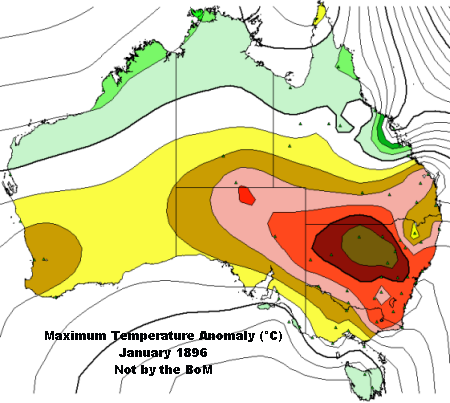
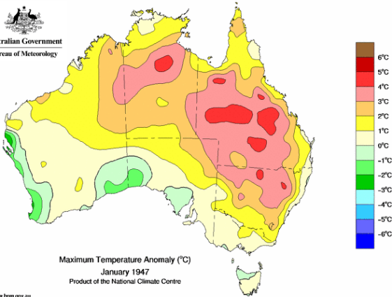
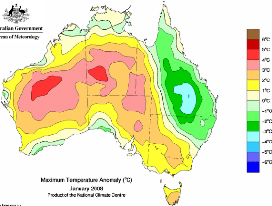
15 hot Januaries in Australia since 1896 - or Januaries where heat waves have made the news - monthly mean maximum temperature anomalies.
In some of these examples while there might have been areas experiencing heat waves which make the news - there were other parts of the country where cool anomalies prevail which as we know in most instances makes no news.  Or maybe heatwaves were in sparsely populated areas and made little news.
It is easy to use the slidebar to quickly get an impression how these maps compare.


1896 turned out similar to 1939 but with larger +3° area - Standout difference with all other maps is the persistence of the +4° anomaly to the NSW coast - which is never seen in subsequent maps.
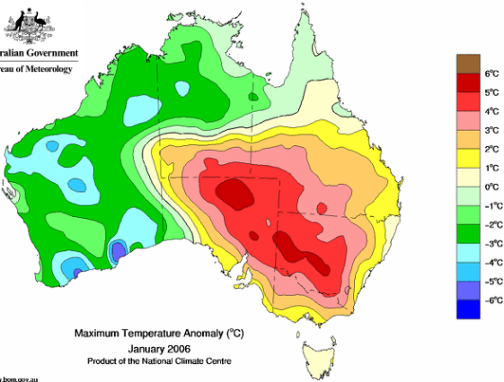
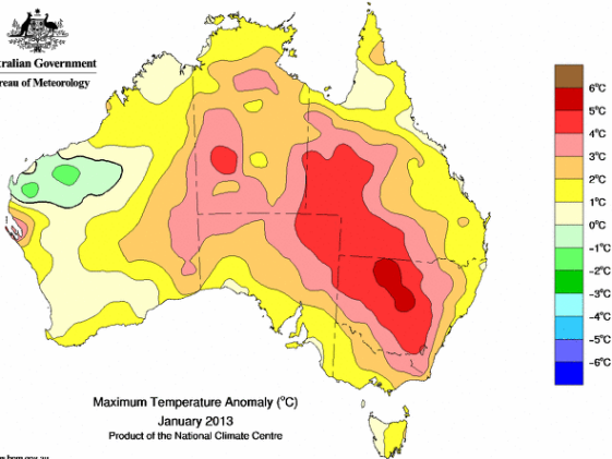
Compares well with the much spruiked 2013 - which has no +6 anomalies. 
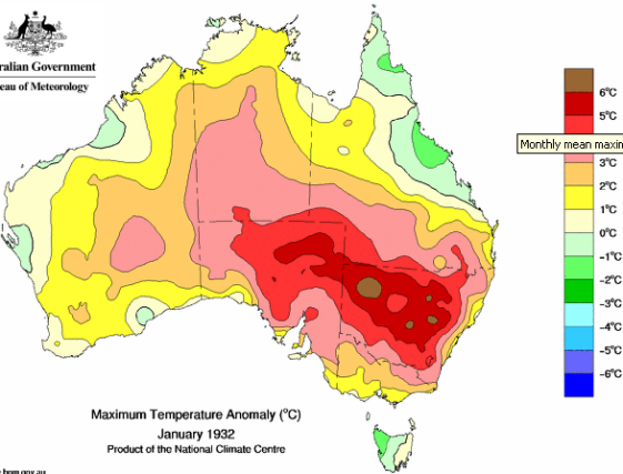
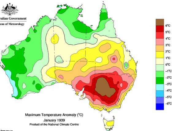
Largest area of +6°C anomalies by a country mile - Jan 1939 saw our greatest loss of life in bushfires - cool anomaly in far north and west.
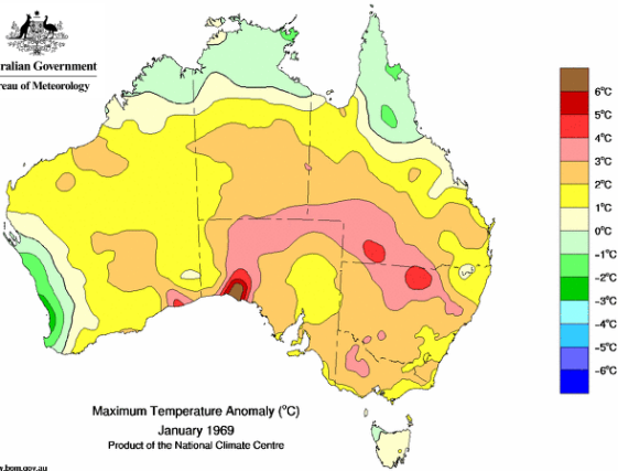
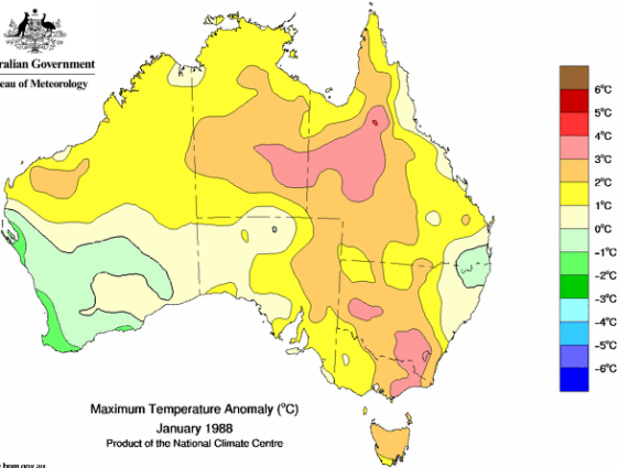
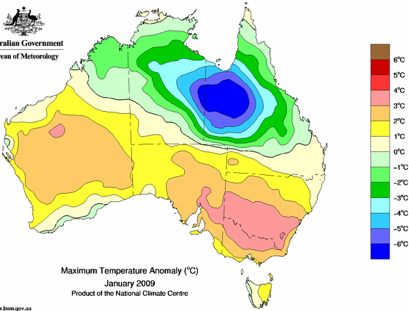


Unusual pattern cool in SE. Note the error in BoM contouring near Charleville indicated by the repetition of the buff contour zone between pale blue and dark green.


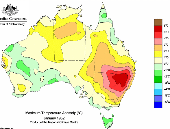
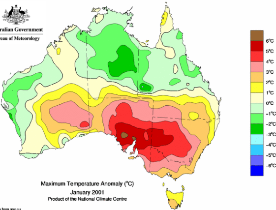
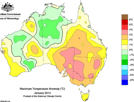
Major bushfires in Feb - you never hear about that colossal cool anomaly in the north. 
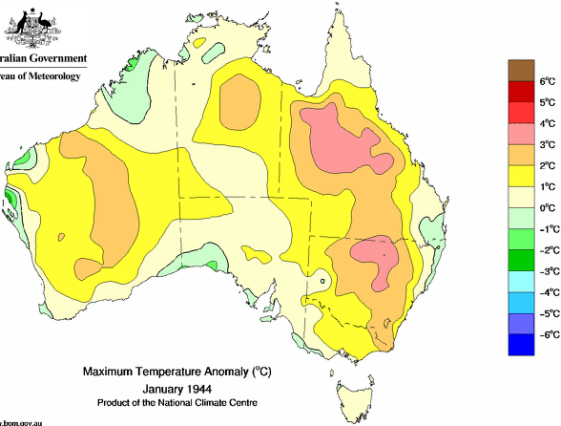
How many trees have been cut down for the news stories beating up 2013 as our hottest January EVAH.  Note zero area of +6° anomaly.
Notes re the 1896 reconstruction which was contoured by a kind reader - notable stations outside their colour bands are - Broken Hill, Omeo, Wagga and Goulburn all have +5° anomalies - Bundaberg and Gayndah have +4° anomalies as does Yamba, Armidale and Deniliquin.  York has a +3.
The data is 99% from CDO - "normals" are taken from there so are for varying periods.
No doubt the BoM could do a better reconstruction if they wanted to. 66 stations data on xls